An expansion/overhaul mod of epic proportions, with entirely rebalanced gameplay, expanded factions, new gametypes, graphical overhauls, and five new factions; stealth-based Confederate Revolutionaries, tower defense-inspired Atomic Kingdom of China, economy-focused Mediterranean Syndicate, DotA-esque Order of the Talon and spammy Electrical Protectorate.
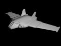
Achillies In Action
(view original)

Post a comment
Description
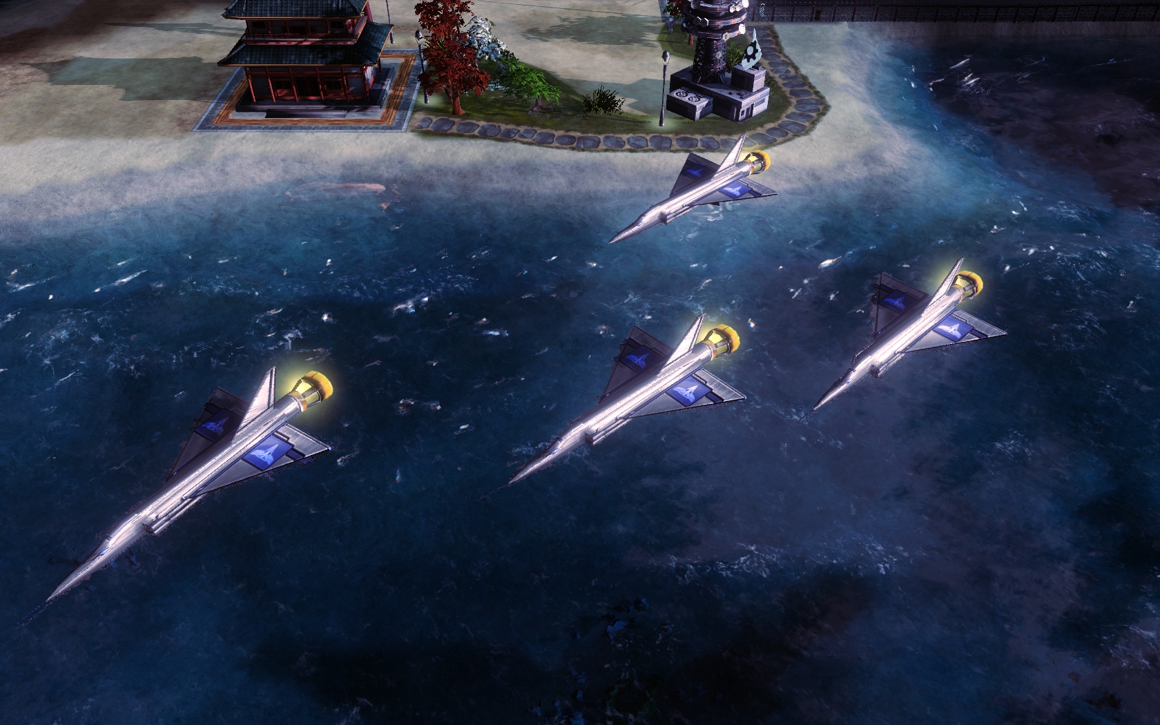
As can be seen here, the Achilles is a sleek and potent war machine whose unparalleled speed and offensive power must be seen to be believed.
Note the Achilles will not be constructed at the Airfield in normal gameplay but rather in a more specialized structure called the Aeronautics Complex.
Texture is bad...but nice progress!
Sorta bland, yes, but it's really awesome, no?
texture is awesome this picture is awesome
Yea the texture needs some work, but I'm sure this is just a temporary fix just to show a unit decently ingame. Lookin good so far.
What's so bad about the texture? Yes, the unit in general is a work in progress, but do you have any criticisms regarding the texture itself?
It does not compliment the model in creating a believable unit within the RA world. It's current appearance makes it look like a pewter metallic toy.
I see that in the model you have made (or at least it appears to be) separation for a cockpit, but there is no shift in color or specularity to compliment this change. There is too much of what I can "Single-Tone Syndrome" in which there are not very many shifts in both hue or the amount of light. Adding more variation in the light and dark, and occasionally staggering the hue will create a better sense of a palpable material and help define and compliment the model.
The wings are far to simplified; so much little detail can be rammed in there. Take a look a the wings of the Apollo or vindicator in detail and see if you can replicate it. The harsh black lines with the steep normals makes the wings themselves appear to be very brittle.
Edit: There is a color shift for the canopy; my bad on that one. Although, I would possibly consider going with a darker color for the canopy, because it will still be reflective via the spec map, but it will differentiate itself from the rest of the body better in light.
The more I look at it, the more I'm pointing at that big block of blue with the Allied logo on either side of the wing; I think that specifically is where this texture could make it worlds better. Get rid of the blue, and use a simplified version of the allied logo so it is a unified color. Also add some more detail to the wings themselves like suggesting the apearence of wing flaps and air brakes.
This is my fault, at least. I wanted the Achilles not to have any of those things; it's not so much a plane as it is a rocket ship with wings. I do see where you are coming from, however. Thanks as always for the help.
Well, I guess since I was the one texturing this I suppose I should admit to a bit of laziness on my part for the main section, but then again it's hard to think of little details that would make sense on the Achilles. The wings don't actually have flaps or air brakes and rather uses the dorsal(?) wing for turning (mental note: draw hinges...). I don't quite see what you mean about the block of blue, but it's there to display team colours which is more a practical decision from a gameplay perspective (i.e. does the player recognize the team's owner right away) rather than an artistic one. I'll try playing a bit more with the details there. Back to the body: As you've already noticed, there's a lot of detail there that is lost with the bloom lighting/poorly done normal maps.
Thanks for the help again, we're trying our best.
Aye, I've had that happen before :).
Try an all-black spec map to start with, and then paint in a few areas with red. In cnc3, even a semi-dark amount of red would make it light up like a Christmas light where you didn't want it; I've found the best to be black for items out of the light (light the inset area of paneling), near black for the rest of the body and sharp red for the highlighted areas, and never have too much "highlighted" at one time or you will get the light bulb effect. Hope that helps :)
I think the Big Allied Simbol doesn't fit well. This kind of designation was abandoned since WW2...
1) WW2 was different since Hitler ad Einstein were both killed
2) if you look really closely,the vindicator has allied symbols on its wings
i personaly think that the texturing is pretty good in compariosn to what ive seen from the modding community so far- saying that- I think that the only reason thsi unit has pulled of te texture because of its very angular design. texturing is one of the hardest things to do imo for modding- and we will need to improve - but atm im still super stoked we havea unit in game that actualy looks like a RA unit =)
Its not too bad actually..
It looks like the french aircraft fighter Mirage.
what do you want? a rainbow textured one? i think it looks sleek and silver, awesome job
What country is it from?
Quebec, Canada. I know, two Canadian units right out the gate... it's just a concidence.
The design reminds me of the CF-105 Arrow.
you know that no allied units in vanilla RA3 is Canadian. There can only be 2 possible solutions to this:
1) USA doesnt trust Canadian soldiers so Canadas place in the allies is ONLY finacial support (from maple sirup export).
2) With its social comunity system like national healthcare and higher tax (<-> sharing resources between rich and poor=Comunism) So Canada is infact a part of the Soviet doctrine.
Because EA games is an U.S. company, both sulotions are possible.
Or quite simply, Canada provided some unit that didn't get a profile, or simply didn't win any defense contracts. Besides, Europe is far more liberal than we (Canada) are, but they have units, so it's not the Communism bit.