NovaCor: The Fringe is an exciting Sci-Fi adventure with a blend of FPS combat and Puzzle Solving. Collect items, solve puzzles and blast your way to the center of the mystery surrounding NovaCor.


Mapping Screens
(view original)

Post a comment
Description
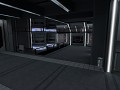
Quick update on mapping progress for Jan 18, 2012. Progress on the Engineering Levels is being made, though slow, because I need to design and model all of the props for these areas as well.
Still a wee tad bright; I will be toning it down in the future.
Also, note the Plasma Container model on the lower right. Yes, its explosive :)
* WIP as well, far from done :P
Looks very sterile. I love it.
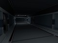
Actually the dark red and white stripe really stands out and kind of distracting, well it loox like you have some piping or something in those walls that goes to the ceiling in the distance, but at a glance on the ceiling (recessed) loox like it might be an overhead light in there. Then the lines going up the wall (next to door in foreground and glass platform) loox like these are illuminated lines, same on the floor right in our face.
I would like to see how it loox w/out the lines going up the wall near the foreground door and w/out the ones on the floor ..
I agree, they do look a bit odd. Especially the ones on the floor.
They are already gone. Most of the time when theres a solid color, its just there until I make a new texture for whatever it is on. I have this weird issue with using dev textures; I just dont like to do it.
The beams are also no longer the same texture as the roof and floor, which is what I though people would point out first anyway :P
Also, the lines, which are neon light strips, are not in the floor anymore as it contributed to the brightness. I am, however, leaving them in the walls because its part of the overall design of the engineering decks.
Nice, nice, well done.
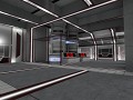
A minor detail but still I want to say that I don't like the black-and-yellow stripe on the plasma container. The container also somehow fits in quite poorly.
Maybe it is about granularity if you are familiar with the concept. The main architecture is quite plain with not so many corners and layers of structures visible. In other words, it could be made out of quite big blocks. And all of the sudden you have this little thing that has so tiny details that you'd have to use blocks that are thousand if not million times smaller than main architecture. You should either adjust the model for "thicker" look or have something of "medium size" in between or around that container model and the main walls.
And black and yellow stripe is just so traditional and - especially in this context - something very low-brow or unsophisticated. Don't you think they should have some NEW sort of danger indicators in this day and age, in space? Perhaps something fitting better in the overall style that is very strongly present in this mod?
This may sound a little sharp, but it is in no means a 'mean' reply.
By that logic, not a single model in the Mod would have detail in it and would consist of a small number of blocky parts...that would look horrible. I think the models are simple enough as it is, and if we went any farther with it everything would be so blocky it would look like an N64 game. Also, though there arent many details in place yet, there are lots of large containers and pipes that go in that room. Everything cant be big to match the big rooms; otherwise there would be no point in it being big. You need the little details too, no matter what the environment around them looks like.
As for the striping, it will remain as is. Caution striping is the universal standard for danger. While humankind may indeed come up with a better scheme to denote danger in the future, Im not going to make one up and force it on players. There are still keyboards in this Mod too; and believe me I thought about how in the future we might no even have traditional keyboards anymore - but right now, in 2012, we do. No one would know what they were looking at if I made some motion device that goes on your hand or any other wild idea for an interface and set it on the table.
I personally feel taking a part of what we might see in the future and what we see in the here and now and mixing the two would give the best results. It doesnt look notably dated, and it doesnt confuse the player with lots of odd gadgets and gizmos whose uses arent clearly defined.
As always, I do appreciate suggestions and always take the feedback into consideration. However, this time, I will have to politely decline the changes.
It seems you didn't really get the concept of granularity.
I'm an architect and in my job it is very important to be able to match the granularity in order to avoid making buildings look like they dropped in from the sky without any relation to the surroundings. So how can one match a private house to a skyscraper next to it? You either have to go with very blocky (if thats what the skyscraper looks like) OVERALL design and small details that don't disturb the general shape too much, OR you have a residential areas with apartment houses between them that have medium scale (which is the usual case...).
Well, just think about it in the future.
Look, everyone knows black-and-yellow is a universal standard. But there are many such things especially regarding the safety, and if you wanted to follow them, you would need huge ugly warning signs everywhere, exit lights at the doors, additional railings, regular doors for emergency exiting... The fact that you use the sole thing relating to this time and age suggests that it is the only thing you really know about industrial design.
In most of the mods it would look awesome and I know it's a trick you've taken in your bag from other mappers. But here it is too cheap for you mod and it saddens me that you refuse to see my point.
You do realize that this mod takes place on a ship/station in space right?
By the way, he does NOT refuse to see your point, he clearly see's your point and even politely declines the changes you suggested, which is very nice as a number of people from my experience would just ignore you or just tell you how wrong you are from their perspective in a rude manner.
One main reason the maps are a more simple and non complex design is to fix any frame rate issues on older computers as much as possible. That and its the mod's style to be simplistic.
I do however see what you mean by needing some warning signs and such, I will certainly talk to Kevin about that and see what we can do.
Also please don't forget this is a WIP! Prop placement and such will most likely be changed.
No >.<
I don't mean you need warning signs. Please don't go there, you can't make this "realistic" like that without some serious reference material to space stations, which well, isn't available.
If you guys would calm down and THINK about the great games and series like Halo, Stargate SG-1, Battlestar galactica, whatever floats your boat, the important thing is not to use the common factory standard as a starting point but to develop your own style and stay true to it.
Well, whatever. I see I've already made someone cry and downrank my comments. I wish the person could forget about me some day in the future.
For starters, this is a mod meant to be fun. Not realistic.
Secondly, calm down? We're not angry, upset or anything, I'm not sure how we would calm down if we're already calm :\ .
And we have got our own style and are sticking to it. This is ONE room and is heavily WIP. I know where your getting standard factory from. But this is an engineering room, of course its going to seem factory like.
Halo is also a rather bad example, most of the buildings in Halo are very bland, empty and factory like.
Regarding the downranking, whoever did that is doing the wrong thing, no one should vote down your comments. You have good points. However as we said before we have to politely decline the changes you suggested.
Thank you for the feedback anyway. :)
"It seems you didn't really get the concept of granularity.
I'm an architect and in my job it is very important to be able to match the granularity in order to avoid making buildings look like they dropped in from the sky..."
Skyscrapers vs Houses are in no way a logical comparasin to the inside of a Space Station. In making such a comparasin, I highly doubt you are an Architect.
"... The fact that you use the sole thing relating to this time and age suggests that it is the only thing you really know about industrial design."
There are indeed railings in many places, among other things to denote safety, many of which are not in place as of yet, because they have not been created yet. Besides that, (if it even were true, which it is most certainly not) what other type of design would there be in a Space Station? Should I design a research station and its accompanying power plant in a residential fashion?
"In most of the mods it would look awesome and I know it's a trick you've taken in your bag from other mappers. But here it is too cheap for you mod and it saddens me that you refuse to see my point."
Nothing in this Mod was taken from anyone else's 'bag of tricks'.
Your reply seems more like an attempt insult to my design abilities and credibility more than it does constructive criticism. Your points were just completely illogical; even more so in the following replys to our team member.
Its not about 'granularity', which I assure you I fully understand; its about gradation, which are two completely different things. You dont want everything to be one size and style; thats boring and it doesnt really pull things together. You just cant make a large area with all large, undetailed objects in it and expect people to enjoy playing it, or even looking at it. The detail level in the props and models is the same across the board, no matter where in the station you are. Anything else would be nonsense.