NovaCor: The Fringe is an exciting Sci-Fi adventure with a blend of FPS combat and Puzzle Solving. Collect items, solve puzzles and blast your way to the center of the mystery surrounding NovaCor.

HUD Concept V3
(view original)

Post a comment
Description
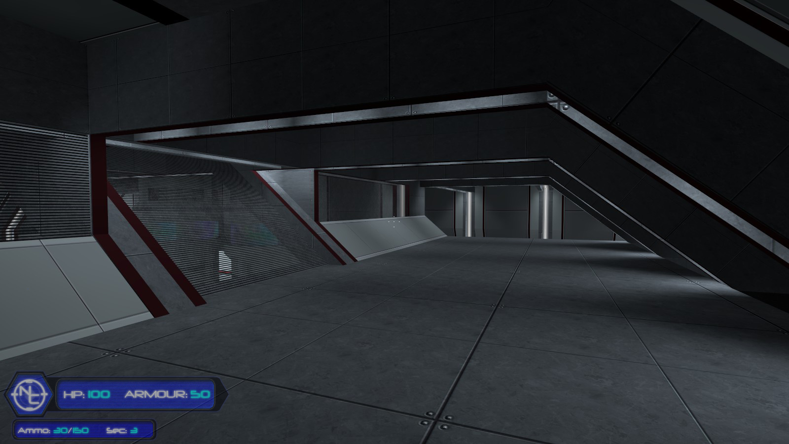
Removed noise on the black borders. Made a Novacor logo and replaced the word with it. Edited transparency a little. This will be the last concept uploaded for a little while. Go "view original" to see in better quality.
I personally really like this one.
Looks a lot better than the first one. I would suggest using the NC logo in the hexagon a colour information window. Logo flashes orange for radiation, blue for running out of oxygen etc.
They have no coder.
I think that (until they find one) this is beyond their possibilities. Would look cool though.
more you keep moddifiyng the closer your getting to a good hud that works for this game.
Looks very good, although I'd dim down the NC logo a little bit to make it a little less catchy, since health, armor and ammo are the only things that really count on this HUD. It already looks awesome though.
I'm not really diggin' this HUD setup :( Looks kind-of PS X-ish in the layout, size, and opacity. Honestly though, I would love it if there wasn't so much empty space on the blue bars. Change the height of the text, and maybe the font or color, and it can go from looking very dated, to very modern. :) Also, perhaps change the color of the bars from dark blue to something more light so that it seems less in-the-way.
Well, the font is pretty much the mods official font. The dark blue colour is also in style with the mod. The opacity if it were any lower the glow effects and colours would pretty much cease to exist. We also have limited abilities into getting something rather complex in game as currently we have no coder. So I tried to keep the HUD basic enough to do in game. Even this may be too complex for us right now. However we really are not too concerned about the HUD at the moment. We are more focused on mapping, weapons and various other things. When we get a coder we'll try to get an in-game HUD selector so everyone can choose one of their liking. That and we'll most likely be able to come up with some more complex designs. To be honest though, whats wrong with a bit of old school stuff? A lot of games these days take themselves too seriously. Not to say those games aren't good though.
Thank you for the feedback however, its much appreciated! :)
Loox nice man, the other ones I can read but what is that denoting across from the ammo count ?
Definitely better than the last one.
However, I recommended you to adjust the alpha channel arround the text, so that the gridlines get transparent.
I find it hard to describe in words, so I did it myself to show you what I mean.
Was kinda bored:
Img828.imageshack.us
PS: I don't know the font, so I just used the Half-Life² one.
Man your HUD is way better than mine haha. I see what you mean now, I'll give it a shot. Thanks :)
How did you do it exactly? I can't seem to get it like that. (not an expert in photoshop)
paint.net + GIMP
I never ever used PhotoShop, because I think that it's better to know everything about a simple application, than to know a bit about a complex one.
I cannot recall how I did it exactly and I deleted the pdn file that contains all the layers and settings. I thought I won't need it anymore. :(
As for the HUD itself. I (like others) don't like the whole design idea too much. My "contribution" was to make something I won't like, at least better IMO.
When I'm bored again, I'll create one to let you know what I would like. Maybe you'll like it too.^^
Okay I'll give them a shot. Also regarding the overall HUD, we're most likely going to have a bunch of HUD choices. So everyone can find one they like :)
both looks great but mix them both umm try paint.net i have done stuff with it i've thought i would not be able to do.
To be honest, I'm not a fan of any of these. I think it's because they're uh... I dunno, they look really cartoony :s
Much more clean and it flows into the atmosphere. Looks great.