Tiberian Sun Rising is a total conversion for Command & Conquer 3 Tiberium Wars! Tiberian Sun Rising brings back GDI and Nod battling it out during the Second Tiberium War, retelling Tiberian Sun as never before. This isn't just a remake of the hit title C&C Tiberian Sun. It is a mod making Tiberian Sun as it should have been originally so expecting lots of new fun and originality while sticking to the feel Tiberian Sun had. Taking the mindset that this is the first time Tiberian Sun is being made and using the original game as a design concept. This mod will also include the additions made in Firestorm so it is a remake of Tiberian Sun and Firestorm as one to what they should have been.New abilities and units will appear in Tiberian Sun Rising as well as new kind of gameplay altogether.


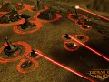
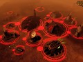
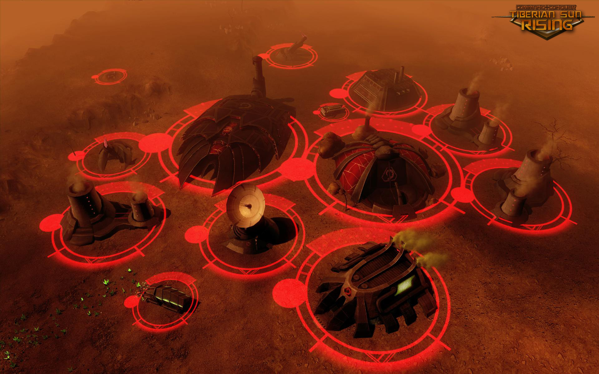
The most sacred structure within the Brotherhood of Nod, a new Temple of Nod has been constructed on this battlefield marking Brotherhood dominance in this sector.
Damn impressive.
i still cant see where the harvester unloads its cargo in the refinery :P it looks very temple-ish. btw, is there a con yard in there?
Yep the structure with alot of Red on it, *structure to the left of the Temple of Nod* thats the Construction Yard for Nod.
u mean right dont you coz on the left there is a obelisk of light.
the conyard is something like a TS con yard with TW affection and ur own thought of it in it. i like it very much, reminds me of temple prime in the TW campaign
I think there should be more Red on the power plant.
Just curious, are those selection rings there all the time? Cos they are damn distracting.
We'll be making them less bright relax, that is very apparent to us do not worry :). But the rings will be visible all the time yes, but we'll be adjusting them for the next update dont worry :). Be less IN YO FACE they are at the moment.
Just didnt wanna delay this update longer due to just that.
May I ask why exactly you decided to use permanent decals instead of having housecolor on the structures themselves?
I think it somewhat disturbs the visual impression of the mod.
That aside, the temple of Nod looks great, and the conyard fits Nod's style very well.. but I'm not particularly fond of the refinery.
I agree,
the temple of nod is amazing! (the other things too) but in comparison the refinery (I mean the power stations) is not built in the same quality like the other buildings.
How so whats wrong with the Refinery in your view? Constructive feedback please.
Also why Housecolor rings? well look at our screenshots then go back and play some normal C&C3. Look at how housecolor painted onto the units just ruins there visual appeal completely. Housecolor painted on is also just a gaming convention used in RTS it has no role beyond that.
Our choice in Housecolor decals is one, we can keep GDI and Nod looking there cool realistic selves and maintaining there proper coloring despite what color they choose. Two, it looks way better then painted on does. Three, its also goes with the game world of 2030/story. The idea is its an augmented Reality interface. The Commander is sitting at a terminal with the HUD buildmenu, the Housecolor rings are overlayed by EVA or CABAL respectively onto the battlefield so you know who own's what. Infact what you'll notice in our next update that EVA and CABAL render different housecolor rings over objects depending on who you play as GDI or Nod.
Sorry, I didn't put it clearly enough. I did not mean to be rude. What meant to say is that, unlike the construction yard, I don't think the refinery fits Nod's style that well.
It's hard to point out exactly why, but the design just seems more blocky than that of the other structures. There are 2 things I can point out:
- The structure ends abruptly with what seems to be a straight and vertical wall. This doesn't quite fit the smooth curves that are typical for Nod's structures.
- The legs don't follow the curves of the walls they are attached to. There is not a smooth transition from wall to leg. It could also help if they were pointy (like you see on the temple or the back of the obelisk).
From a pure aesthetic point of view, I also think the docking bay looks a bit too simple.
As for housecolor, I agree that it ruined C&C3 a bit, but mainly because there was very much of it, it had a very strong glow, and housecolored areas had no interaction with the lighting in the scene. This is something that can be fixed by shader coding and better texturing.
I don't mind the rings, it's just that it would be nice to be able to turn them off (like you would with actual Augmented Reality). If you have a shader coder, this could actually be possible by using stencils (which are used in C&C3 for merging selection decals) on a map-wide object (with no Z test) that is visible only to the player.
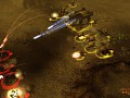
How about the rings only appear on mouseover? It takes a little more effort to check the team, but between things like whether they generate LoS and how they appear on the radar, it does the same job of helping announce friend or foe. The only disadvantage I can see is potentially losing units into the terrain, which this screenshot and its fog shows.
I like it!
Can't the rings only be around selected buildings/units? Kind of like how the lame yellow outline works in RA3.
How would you tell who owns what?
The idea is its Augmented Reality Interface.
You could use Housecolors the way it was in TS for example, which TBH is better than these rings.
Amazing!
If you ask me the refinery and the conyard looks like another temple next to the temple of nod. Its like refinery is the temple of tiberium research, conyard is temple of nod's religion and the temple of nod is like temple of war. None the lest great work!
I love the rings idea, but I agree with frosted storm, it could be nice to see the rings only when selecting the building/units, that way we can appreciated better the non-housing-colorness of the models design.
PS
all the buildings look awesome dont know what some ppl complaining about.
I prefer the rings, they don't affect the stuff so much and it is really clear what player they belong to.