An expansion/overhaul mod of epic proportions, with entirely rebalanced gameplay, expanded factions, new gametypes, graphical overhauls, and five new factions; stealth-based Confederate Revolutionaries, tower defense-inspired Atomic Kingdom of China, economy-focused Mediterranean Syndicate, DotA-esque Order of the Talon and spammy Electrical Protectorate.

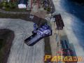
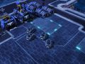
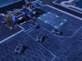
The Subhunter Frigate originated as a ocean-going cruise ship that, due to high-powered engines and copious internal space was pressed into service as a "Q-ship"; appearing unarmed, it would lure a Soviet Submarine to surfacing for an attack, then retaliate with torpedoes of its own. So successful was it at this role that the design was reborn as a dedicated warship towards the end of the war, the excess weight lost and significantly upgunned. Partnered with an Assault Destroyer it makes a deadly combo; though the weak armour of the Subhunter Frigate cannot stand up to enemy attacks it can dish out impressive damage, while the Assault Destroyer can draw enemy fire. In addition, the Subhunters secondary depth charge torpedo slows and damages enemy unis and forces enemy submarines to surface.
The combination could prove to be very effective....
i think so too~
They will make a hell of a combo.
Epic air force will beat them down unless they have anti air too. :)
Oh, then get some of those... Those... Those allied anti-air ships XD
Hydrofoils. In addition, you could always patrol the air with Apollos or, if you have the cash, Achilles.
Only thing, the texture seems kind of bland compared to the Destroyer...
That's not really helping, it's stating the obvious. What do you think it should look like? I mean, it's a converted yacht (http://yachtvvs1.com/images/VVS1yacht.jpg) so what should be added?
Some more contrast on the bow deck wouldn't hurt and combine that with self-shading (ambient occlusion). Also, throw in a wee bit of grime or slight base-color differentiations.
Also, are the units from the same team? Because, if so the House areas are a lot lighter than the assault destroyer.
The model looks great, however.
We put the teamcolour sections on white areas, thinking it would make it stand out more. Turns out it lightens it to a degree we didn't expect, so we'll be going over that and fixing it in the units we have so far. We'll add some grim and detail then.
Yup, already on most of that - The detail on the bow seems flat because of the lighting environment and the angle at which the model is. If you looks at the other screens, you can see how much contrast the normal maps already do. The team colour thing is bizarre, I'll look into that... Also, nobody pointed this out, but on closer inspection the scale of the model seems a bit off, but that can be fixed easily.