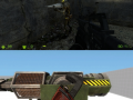
The game takes place in the eve of the Seven Hour War. Fighting against blood shedding synths and frightening aliens, Adrian Shephard has to struggle his way with his fellow comrades from the Phoenix Command, with the main objective of stopping the construction of a Combine Citadel. In his journey he will find what has happened to the world, moments before the Seven Hour War.
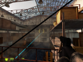
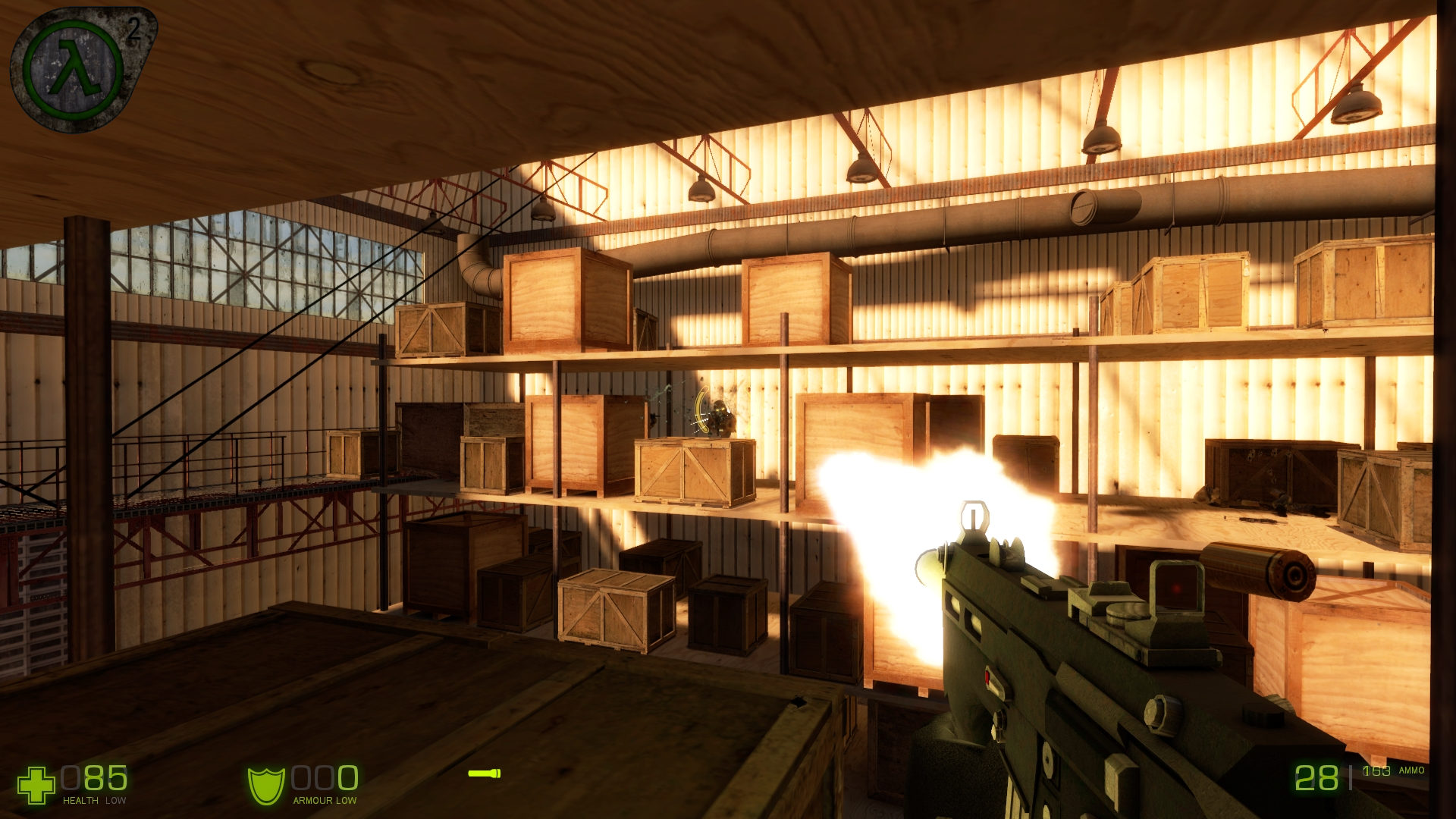
OF2 - HUD
(view original)

Post a comment
Looks cool. ^^
Is Cool!
Can you explain me why is your mod so goddamn GREAT?
Seriously,i freaking love it
Effort, dedication, talent, great leadership. Just a few of the reasons why.
you guys are ******* great too since we spend like a quarter of our time fixing stuff based on your criticism here on moddb.
Nice :D
Simple, sleek, and stylish.
:me gusta face:
Very good.
Look's cool and unique. Kind of captures the HL1 HUD style and HL2 HUD as well. Cool and unique looking gun too, what gun is that?
H&K SMG II.
Nice HUD, nice map, nice gun.
NICE MOD!
Smexy.
nearly everything about this screenshot looks great. wonderful lighting and shadows, awesome HUD and weapon, cool evil enemy. but i have to resist the urge to say "that pipe seems to lead to nowhere"
oops
Simple, yet to the point. Good job.
amazing
A.W.E.S.O.M.E.
Seriously,I just love the HUD that is coming in this mod.Nice job.
I love this mod in general, and raptor jesus agrees
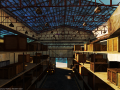
What's in the crates? I've always wondered what it's about games + crates.
maybe it's because it's a warehouse?
cool
do a better job than valve
Love the hud! Also I love the lighting aswell!
AWESOME! But a side note, I think that the zero(0) on the hud should have a kind of a slash through it. Ill look more 'digital'.
are the shelves made of wood? >_> that doesnt seem safe
joke: what? health meter? where is my regenerating health, where is my cover system? why does this difare from CoD?!
reality: OMG!!! I FREAKIN LOVE IT!
Very very nice, nothing to complain about
this is awesome dont change a thing, and the wep looks cool, and the map
This is awesome! You are making a great work.
Little bit weird,but ok.
It looks totaly awesome, no doubt, yet, I would be glad if You would change the default croshair, I hate it.
gun: awesome
HUD: FRIGGIN AWESOME
great
Yay ! i like that.
Ahhh, i can feel both the nostalgia, and the new.
Sorry, guys, this is epic and all, but I just think the OBM one is better, overall. https://www.moddb.com/mods/operation-black-mesa/images/april-media-release9#imagebox
But this one's color is definitely better.
too bad theirs isn't in game.
I don't think our coder cares about the HUD all that much right now.
I couldn't disagree more; the hud there doesn't fit in at all, not that it doesn't look good, however, this looks better.
I want!
Great. Nice pic ;-)
HUD symbols can be shown without the wordings. Any way if you can eliminate the wordings on the health, shield and ammo, just like what all HL1 games have?
we think it looks great as it is except for the crosshair.
That is just plain awesome. Got me excited, great work!
This mod reminds me to expect unexpected.
This has to be the best HUD I've ever seen! Even better than Smod's!
Hey, now that is pretty.
i love the hud but why is the red dot backwards
Impressive work; it looks quite amazing! :)
****** A, could you guys be any more pro? I mean, is it even humanly possible?