NovaCor: The Fringe is an exciting Sci-Fi adventure with a blend of FPS combat and Puzzle Solving. Collect items, solve puzzles and blast your way to the center of the mystery surrounding NovaCor.
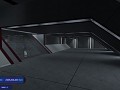

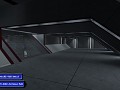
HUD Concept V2
(view original)

Post a comment
Description
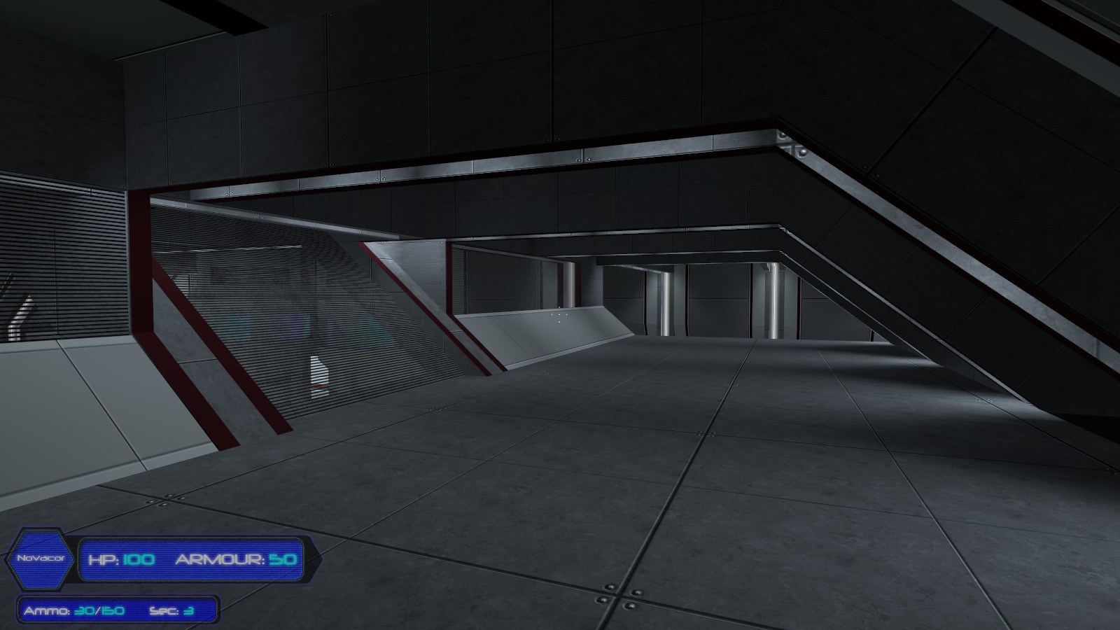
Changed layout slightly. Made the numbers a different colour. Made more translucent and holographic looking. Removed bevel and emboss. Changed some overall colours very slightly.
This one looks VERY nice.
Eh, not a fan.. But that's just me.
Very nice! However I wouldn't mind the novacore symbol being smaller and on the right of the ammo bar and below the part of the hp bar that sticks out. But that's just me
Maybe you could make a symbol to represent the mod, and have tat instead of the words Novacor.
I could probably do something close to this without coding it in, which is the whole problem wih the HUD: we dont have a coder. I have been pretty innovative in ways to get around coding so far, but theres only so much I can do to alter the HUD without coding new panels in.
We have quite a while until release though, which gives us plenty of time to work it out once more of the major stuff is complete.
Getting better, but there still are points that I don't quite like about it.
1. I don't think you need to tell people that they are playing Novacor non-stop. I'm very sure that they are aware of that fact. It's just a waste of space IMO.
2. It seems that you implemented my idea of a little bit of noise on it. I meant only the blue parts. The border should remain free of noise. <- just a small side note
I have a technical question:
You say you don't have a coder. So I presume you're doing this with textures, am I right? If yes, I think that this might backfire when playing with different aspect-ratios. The smaller problem would be streching. It would only result in a quality-loss, but nothing fancy. The worse thing would be that the font-size scales differently from the texture-size. In that case, it could happen that everything ends up out of place.
Please check different resolutions/aspect-ratios. I think it's better to make sure a method works, then to put time & effort into it, only to find out it does not work in the end.
One last note:
If you're using textures, you could use a gradient instead of just a blue background. The gradient should lower the alpha-value, having most the alpha in the middle (where the font is) and the least on the borders (where nothing is displayed). I hope you understand what I mean. IMO that would drastically improve the looks of it.
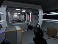
1. Novacor is not just the name of the mod. Its a company which is largely part of the story. 2. I'll change the noise now. 3. This is not in-game at all, I made it with Photoshop and placed it on a screenshot.
Yes, all of these are concepts. We will do some brainstorming in the future, get together a series of concepts for the HUD, the put them up for vote in a news post, allowing the community to choose the default HUD :D We may also include extra HUDs as downloads, if at all possible. Time will tell :)