Updated Main Menu Concept [WIP] image - Sins of the Prophets mod for Sins of a Solar Empire: Rebellion
A Halo mod for the critically acclaimed Sins of a Solar Empire, that aims to capture the fast paced intensity of the Halo series.
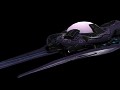
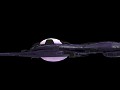
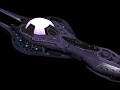
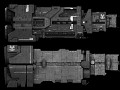

Updated Main Menu Concept [WIP]
(view original)
![Updated Main Menu Concept [WIP]](https://media.moddb.com/cache/images/mods/1/12/11043/thumb_620x2000/MainMenu7.jpg "Updated Main Menu Concept [WIP]")
Post a comment
Description
I'm taking the chance to re-do the UI while there's a lull in art assets. Hopefully, I can capture the Halo 3 quality eventually, but it's slow going.
Think this looks the scribblings of some sort of crippled, illiterate serf boy? Good, throw suggestions out! Your criticisms are what's going to keep this mod looking even better.
Wou nice!
Halo 3 style? I like it!
Is it possible to have ships moving in the background like in Halo 3 or is the engine too limited?
I don't think that is possible. If you have played vanilla sins you would sometimes go to planets with ships that would not move when going thru menu screens.
But the camera itself does move, it pans to different ships. Maybe try something like that?
Make the logo writing bit more prominent. Other than that it's a good start.
Yeah, tough to make it stand out while still keeping the official color tints that Bungie used for the title.
Updated. Any better?
try making the font larger? if its to large across the screen, "Sins of the" and then "prophets" below it?
What happened to the concept i did a while ago?
Obviously decided not to go with it. Don't know why, it looked awesome.
I honestly forgot where it went. Post it up on the GUI thread on the forums?
I really like the concept. However, as I recall (and I'm being really picky here) the text/font of the different tabs seem a bit too thin. From what I remember the font was more bold compared to the size. Also, perhas you could add some tiny Forerunner-ish edges to the menu, just to slightly "spice it up?" Other than that, it looks great.
Very nice!
Is that implemented or just what it will look like? I would propose renaming skirmish to Real time combat simulation like Spartan assualt. To give a sort of canon reasoning as to how commanders can load battles or start new ones fresh.
What does desertion mean? exit the game?
If you click desertion you can never play the mod again.
Naw but, seriously that's probably what it means
Nice change
Wow. Definitely looks awesome. The idea of moving ships in the background can be a good idea, but I do not know if it'll be too much. Keep up the awesome work you guys are doing! :)
I'm really unsure about this to tell the truth. On the one hand, it's great that you're keeping so faithful to the source material. On the other, I never really liked the blue overlay in the first place. It always seemed to take away from the background too much, to the point where I never really cared what was being shown.
Anyway, for the work done in changing the menu screen you did a fantastic job. Though the menu box could possibly use some refinement as the gray and the sharp corners don't really mesh all that well.
Don't get me wrong, it does look good but it's just a matter of personal opinion on my part.
My favorite menus have been reach and halo 4. I like the more vivid backgrounds.
I have to admit, I do love the orange, seems to fit really well.