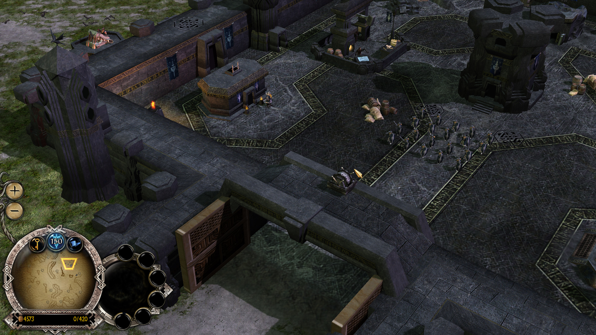
Improved Widescreen Interface image - Edain Mod for Battle for Middle-earth II: Rise of the Witch King
The Battle for Middle-earth has just begun! The Edain Mod returns to the classic gameplay of the first Battle for Middle-earth, reimagined with countless new heroes, units and abilities. Journey deeper into Tolkien's world than ever before, relive the movies through meticulously crafted visuals and forge your path to victory in epic strategic battles. Follow your destiny... Middle-earth awaits.
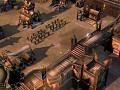
Improved Widescreen Interface
(view original)

Post a comment
Description
In Edain 4.0, we have adjusted the ingame interface so it's no longer stretched in widescreen resolutions. Furthermore, each faction now has their own distinct interface design where before it only differed between good and evil factions.
Looks great, keep up the good work!
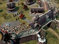
As much praise as I want to give you on your great work so far, if you are going to use text on the ground textures, make them high res enough so it doesn't absolutely clash with everything around them, because they really do. Great idea poor execution on that, otherwise no critique, rest of the fortress looks very good.
mmmm What text are you talking about?? I don't see anything clashing with each other :/
totally agree, there's jot a thing wrong here
The runes, If enlarged, the runes on the ground are slightly pixelated. It is much better than anything vanila game has to offer, but in comparison to all the briliant textures around...
Everything looks fine, there's no clash between textures. They already said they give more vibrant colours to the Dwarves' faction's buildings and ground.
We have to keep the ground textures of the camps and castles as low as possible, because they are one giantic texture and so the textures getting really big.
I agree with you that it is not perfect, but I would not notice it myself.
Also, you might see it this way: Due to the fact that this letters are on the ground dwarves are walking over them again and again and so destroying the letters and making them unreadable, similar to letters or mosaics on the ground in historic buildings. ;)
If you're having issues with texture sizes you can always symetry the uvw map on the ground of the castle to overlap with the other side of the uvw. Seeing as the ground looks already mostly symetried it's a great way to be able to increase texture resolution on the ground without increasing the actual textures resolution. This fixes the issue.
That's already done, but the problem still remains. ;)
I'm curious Gnomi, how did you guys create the new interface outlines for each faction?
good job but where are misty mountains¿?
I would make the colours a bit more colourful, joyful. Increase the "clair-obscur" contrast to make them a bit more "flashy" (not in the bad meaning), alive.
Making the black of the floor blacker, and the golden of the decoration "goldener".
So far, despite your game is very good, the colours seemed a bit drab and sad to me.
You felt this impression of "light" in the vanilla game, that makes you want to play the game. The light has disappeared a bit from your game. Bring it again :)
Qu'en pensez-vous ?
One of my favourite factions! I'd wish you'd add the dwarven lamps, as described in the book!