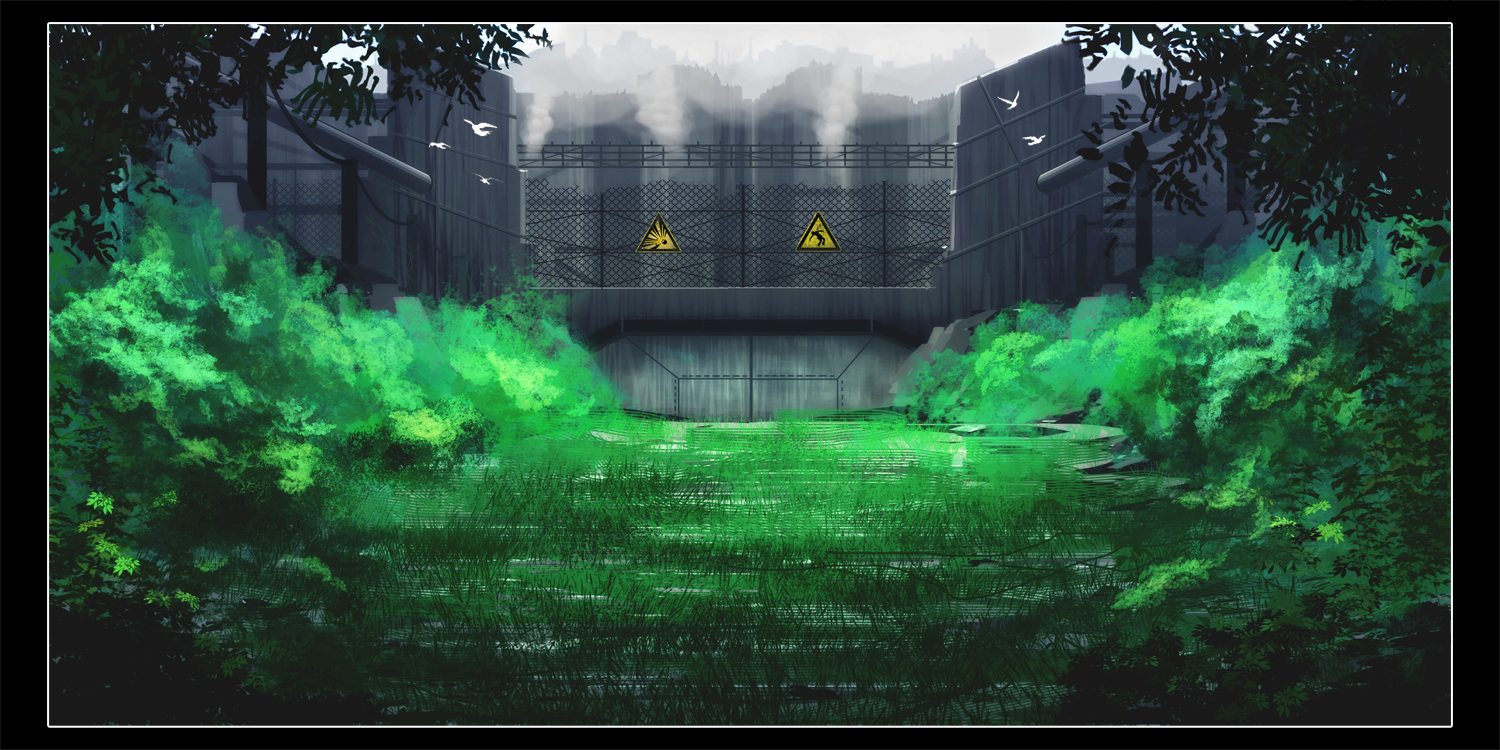
Secret Laboratory
(view original)

Post a comment
Description
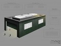
I didn't want to go to sleep, so I started a painting instead. It went quite well, found out about some new techniques myself that I will keep in mind.
Took about 4,5 hours.
Another well-made sci/modern painting. :-)
very cool. Great contrast of color from green to gray. Very lush to very cold and lifeless.
Really good but lacks some sort of feeling that is present in your other paintings
I think you're just not used to the fact that I did a non-dramatic painting this time. My other paintings always have a lot of motion or emotion in it, this time I concentrated more on the landscape itself and wanted it to be more calm and peaceful.
I still get what you mean though. I added the birds to have a little more life going on, because the intense lifelessness of the industry is quite powerful. To be honest, I didn't really know what to add to make it more vivid without using effects or too much work (I was in a 'this is finished in a minute' state of mind).
Not too shabby Q ! Good to see you changing it up a bit. Interesting technique used for the plant life in the canal bed ( would that be accurate ? ). Also, very nice lively mix of shades for the shrubbery in stark contrast to the dead steel grey of the facility.
That's what I'm feeling from this shot anyway - the clearly direct opposition of two simple, yet quite powerful themes. I'm a fan of this one for that simple reason alone.
The one thing I'd critique is that with respect to distance, as the shrubbery becomes more distant ( closer to the structure more specifically ), some darker shading would be appropriate. Again, nice work.Keep at it man !
The further away something is, the less contrast it has. In addition, things become more blue, as more and more atmosphere keeps getting added ontop of the object (f.e. mountain shots). Also, the object gets more and more blurry with distance.
So, I don't really understand what you mean by darken the shruberry in respect to its distance, can you help me on that one, please?
i really like ur works.
the notable thing about this one is the green colors used,they are temting.especially in the background u have that industrial sealed area which gives u the idea of the whole place being infected and then at the fore u have this vivid green plants and grass,and the whole scene is screaming TOXIC.but the green color is too healthy and temting...
i thought this would be better than a "amazing".
and if ur wondering,im seeing ur works backwards.