
Ultimate Apocalypse Mod
Competition - Logo Event
Good morning/afternoon/evening everybody! The Apocalypse mod team wants your help in choosing a primary logo for our main display. Our logo as current isn't good enough, and some fans of the UA mod has created some very useful logos for the upcoming mod, "The Hunt Begins" and its future remnants! So we ask the audience in making the decision for us, based on a poll of popularity to choose a permanent or temporary (to be reworked in the future) logo for the Ultimate Apocalypse mod! Each and every person is able to vote upon which logo is the better for the Ultimate Apocalypse mod to use. Its contents and detailed descriptions are posted on all three submitted images below!
To summarize:
- You vote on a logo you like best.
- We will use this logo as our main logo within the future, based upon the most popular choice.
So let's get started:
We want your help to choose the best of the three logos!
#1: By Lord_Cylarne (me) and Tyrantarmy6
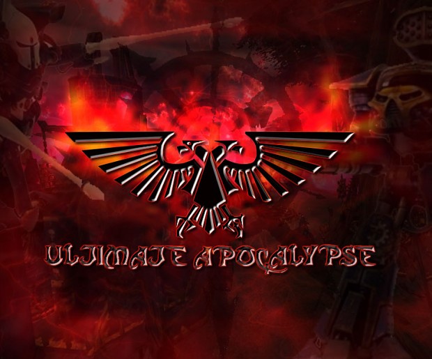
I took the image within the background. Yay. As you can also see, some of the aspects within this image is very familiar. The two titans layed upon the right and the left are used in our current logo, but everything about it was changed, from a recycled ugly green background, to an evil and twisted flame of fury bam in your face Ultimate Apocalypse mod! ... logo.
We had this logo actually for a long time, and we don't know why we haven't used this one instead yet... ah well. It is catchy and not bland. Vote for this image if you like it!
If I were to recommend the image, I would state that it looks really cool and suits this mod tons better than current. If I were to criticize, there is no frame for it. It looks like an image placed on top of another.
More links: Moddb.com
And in some of the news and downloads of UA mod.
#2: By Elric

Elric worked on this logo for a while and he put his heart into it like no tomorrow! Listening to our critics, he came up with this logo above! It is light and you can see everything. The star in the middle points to most of the interesting aspects about the image, and 95% of the image is covered in colorful fx. The bottom layer signifies the burning and purge of the Imperium, while the top is covered in warpy evil. The star and symbol race choice most explicitly states with making it almost obvious that you will be seeing Inquisition Daemonhunters and Chaos Daemons within the mod!
If it isn't obvious enough, then the logo says "Ultimate Apocalypse: The Hunt Begins" right in front of your eyes. This logo is for the Hunt Begins, and he says that he has the capability to make the awesomeness appear in later future grand releases. So revamping this image to whatever he likes is easy.
If I were to recommend the following image, I'd say it is obviously clear that the awesomeness of the Inquisition and Daemons with all of their wrath and titans approaches with hype! If I were to criticize, way too much was added in the image, feels like a big clump of stuff in it, and a tone down of those fx might do the trick.
More links: Moddb.com
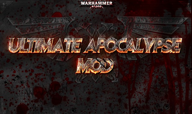
This logo was the most recent logo that was for months remained unfinished. Finally as of recently, lots of work was put into it. The intention was to not make the logo overcrowded, and simple but straight to the point easy to read "Ultimate Apocalypse mod" with a grim and dark look that catches the eye of the title in the center. It now includes a bucket of blood and bullet holes to fill in the bland with its gory texture. The blood drips with an eerie feel to the image and it leads all the way down and to the top again, with a good flow of your eyes moving through the center and right hand side.
There are actually two versions of this image. One without the Inquisition concrete lines going across, and then one with, found here: Moddb.com . This one is obviously a WIP, but it pretty much gets the job done, showing off that there is an inquisitorial presence within the mod!
If I were to recommend the image, I'd say it captures the feel of the Ultimate Apocalypse mod. If I were to criticize, the bottom left corner of this logo feels a bit empty.
More links: Moddb.com
and
Now I know what you are all thinking, "how do I even vote?" Go here:

I hope you enjoyed our logos! For more information, please leave a comment below and we may respond to it asap! Contact the makers to improve x, y, and z, + feel free to leave any suggestions below. Definitely vote! It takes two seconds, and do not be shy today!
Thanks and have a great day, folks!
First one is the best.
VOTE here folks: Moddb.com
THIRD ONE FOR THE GLORY OF THE IMPERIUM!(it's more similar to the original logos of the WH40k franchise)
Third one.
First one i think
Third by far
Yea gotta go with 3 here. The original is good however I feel it's time for a change.
number 2 by Elric, I think it is perfect
2nd one
Second one is the best, if it was bit more subtle, it would be much better but even overall it´s best the pick imo.
I think the third one is perfect
- it's plain, but not boring
- it's not as...visually aggresive as 2 (kinda hurts the eyes, if you look at it too long)
- it definitely fits the franchise
- it's a change (makes it better than 1)
still, if anyone else objects, i'd be happy to hear his reasons (propably too late to change vote tho XD )
I vote for №3.
Nr 2 for sure!!
1: best letters
2: best logo
3: best background
For me, it would be perfect combined...
Maybe in Grand Release Gold Edition mate ^^
i made a wallpaper that you can use in that edition if you are interested. you can check it out in my image section
it needs only ultimate apocalypse font that you made
This comment is currently awaiting admin approval, join now to view.
I have to go with #3. Nice to job to those who created it.
2
3
2 (Because Inquisition ^^)
#3for me would have been #2 but is a little to in your face
3 is so brutal!
Looks like 3 is going to win.
Third although I'm tempted to make my own for this...
What do you mean? You can do voice acting and logos? :O
XD I know you're buried in personal messages atm but I mentioned that I'm working on an icon painting mod for UA. So in a way, I like to do voices AND artwork. You can see some samples on my image page. :D
Sweet! I'll look at the PM first thing tomorrow. ;)
I'd say the third, if we could maybe move it down a little so it doesn't make the bottom half look so desolate.
The voting will end February 7th. 26 hours from now.
Vote for 2nd one :)
I like them all
I cant vote
2nd one is best by far.
First one.
2nd i think
the first feels original i recommend the first logo
all of em good
I have great respect for the excellent work on the main font in the third one. My draft has become a bit crowded, but we can obviously work on that if it does get nominated.
The first one with the letters of the third one it would be perfect !
This. Combine em the two most wanted for best results!
Ahahah how the hell do I get credit on the third one ? I only gave editing advice on it. Voted for it anyway, I agree that the three of logos have (really) good stuff for them, but in my opinion the third would be a total killer as the loading screen ingame, so I'm pretty sure of my choice.
Ah. My bad mate. I thought it was you, Tyrant, and Necronguy who was involved in discussion but you also added in the IDH strips?
Well anyways, sorry 'bout that. ^^ :P
Yeah he came up with the idea of using those strips and also did a quick addition of them to show the idea. After that I added them subtly to the top corners. Without the original psd they ended up standing out too much after all xD
Of course he also gave other kinds of advice on it ;)
Ghost Riders style, #3!
#3 feels legit and is pure in its appearance. The other two though very good seem like they were made by modders. Where as the third feels like it was made by relic or a professional company.
Voting time officially closed.
Moddb.com
Congratulations logo 3, you are the winner by 53% of the vote!