I've had several people ask me on how to get into concept art, and drawing environmental level concept art. So I assembled this tutorial on how to do some simple techniques. Keep in mind there are 'hundreds' of ways to do anything in the field of art. This is only one way that I've learned.
---
I started off with the idea of a multiplayer map for Crimson Crow centered in a war-torn city. Instead of having overly large and massive skyscrapers, I aimed for smaller buildings with large buildings in the distance. I came up with this sketch:
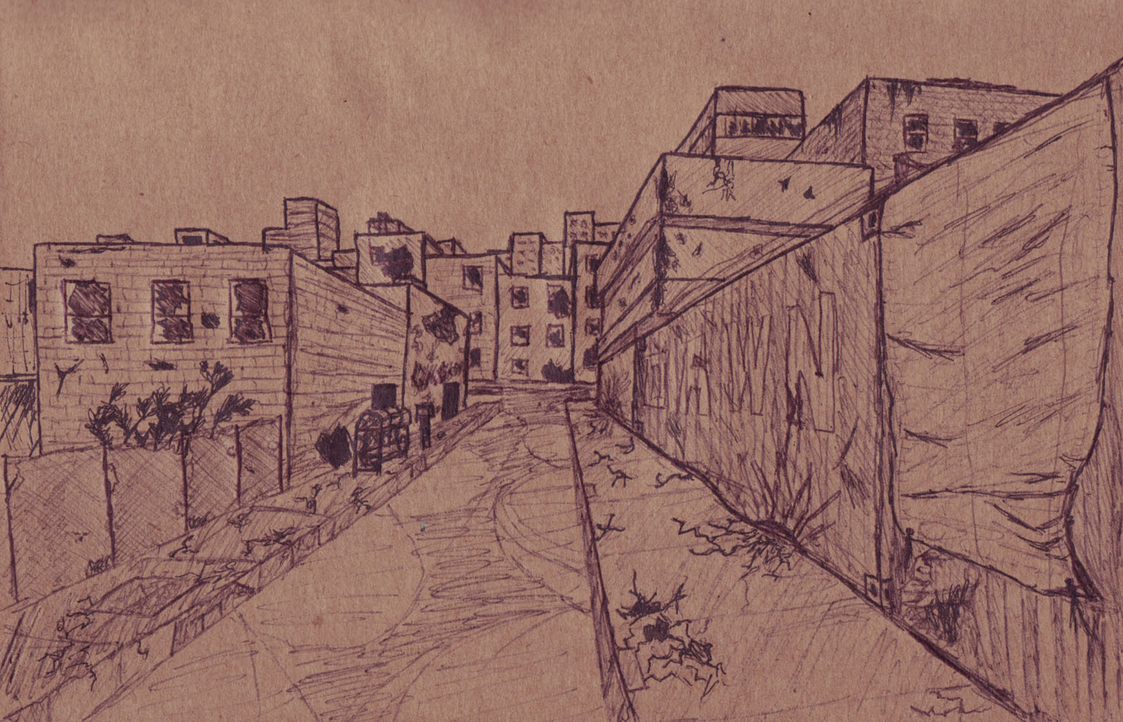
I used one point perspective to set the perspective correctly. Great for this situation. During the sketch, I found that cement usually cracks in a sort of geometrical shape. I found this oddly interesting. Although the scale is a bit off, this sketch will do quite perfectly for coloring and shading. I chose it specifically as geometrical shapes are easier to work with.
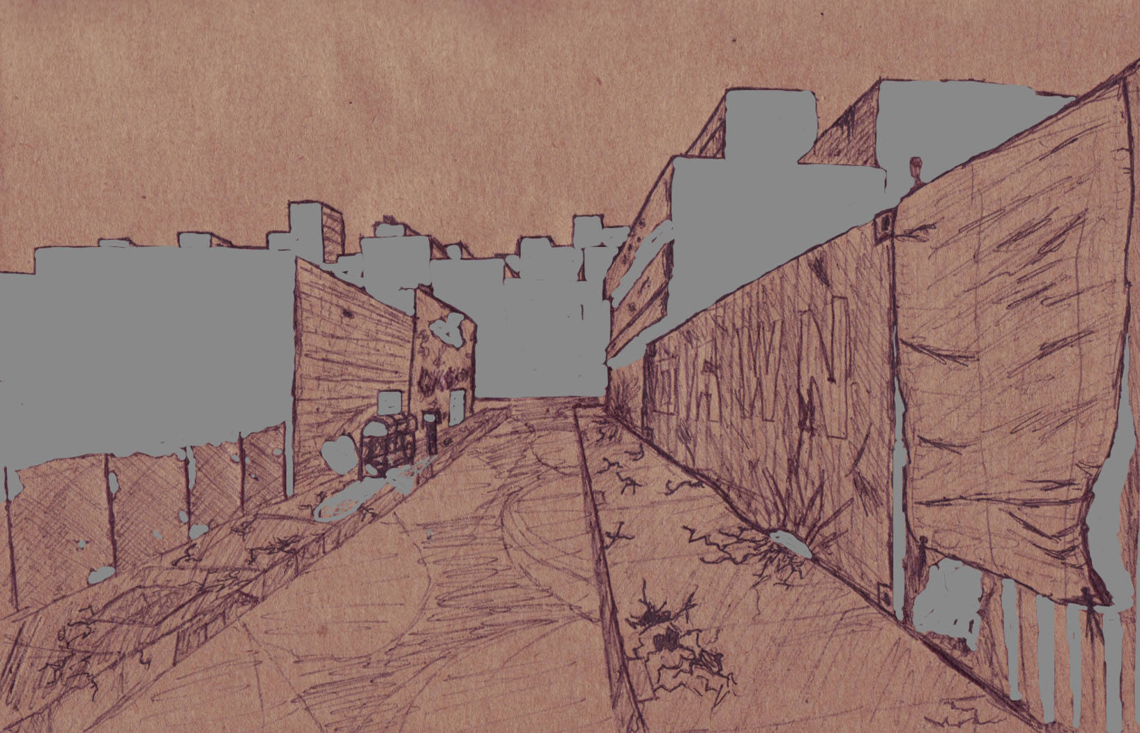
At first glance, this looks like a mishap in photo-shop. What I did is use gray (Around 50%) to do all the shadows. I call this sort of shading 'two tone' shading. As its either shaded or its now. If you were aiming for something smoother, you would blur the shadow's edge to create a more realistic look.
I'm going to change the layer type to 'multiply' to make the shadows actually look realistic.
Much better! Make sure to keep all the shadows on a separate layer so they do not mix with colors. Also leave them at the very top, so they're always on. When doing the actual brush work, start around the edges and then use a large brush to finish the center. If you want to take the shading one step farther, blur the shadows more and more as they go from their point of origin. Especially in a day-light scene like this. I didn't go as far to do this, but I very well could have for the tarp on the far right. Is it somewhat hard to see? It will be easier to notice with some color!

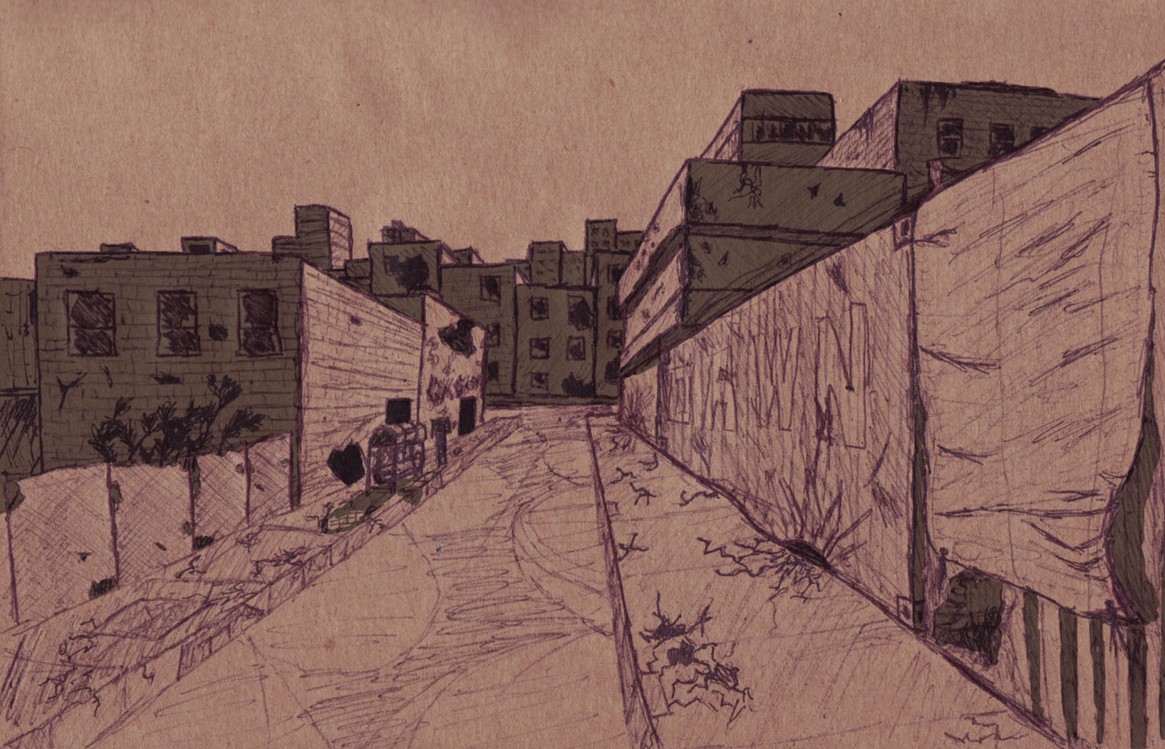
Much better? I simply use the polygonal lasso tool to select the area. Paint bucket a nice shade in, then make the layer multiply against the original sketch to let the pen lines go through. Each object 'should' be on separate layers, and also be sure to name each layer as this can get real messy and cluttered. Neutral-ish colors do well for this scenario. We don't want desaturated urban city look and we also don't want too bright of a color. Selecting the right color can be much more difficult than it looks.
I personally prefer the polygonal lasso as its much easier to use compared to many of the other tools.
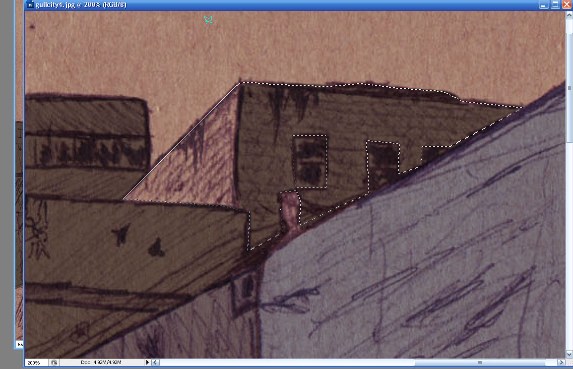
Its all preference though. Notice the shadows, as they are on another layer, are never to be worried about when adding color. Smaller details, such as the window I've selected around, will actually be done later. Right now I'm focusing on a nice brick color to work with.
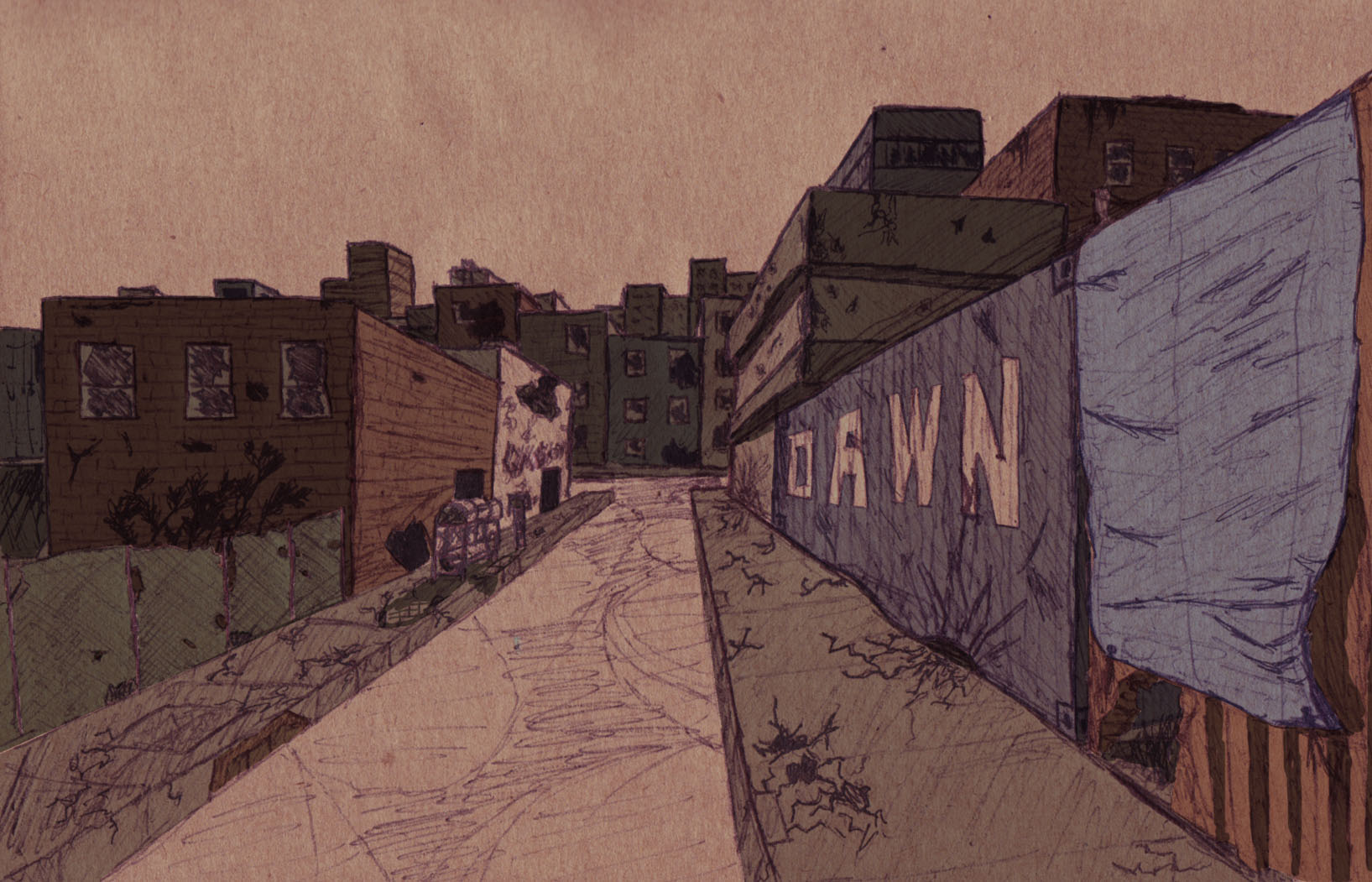
I've mixed the colors to get slight variation without making the colors go way too over-board. Now that most of the colors are finished, I just need to wrap up the road. If you noticed, I have these odd looking circle things on the road itself. This originally was placed for the lighting of street lamps. I felt the lights were going to clutter the scene just a little bit too much, so I decided against them later on. I find 'pre-drawing' out specific lights like these before even touching the scene in photoshop proves helpful for more detailed scenes.
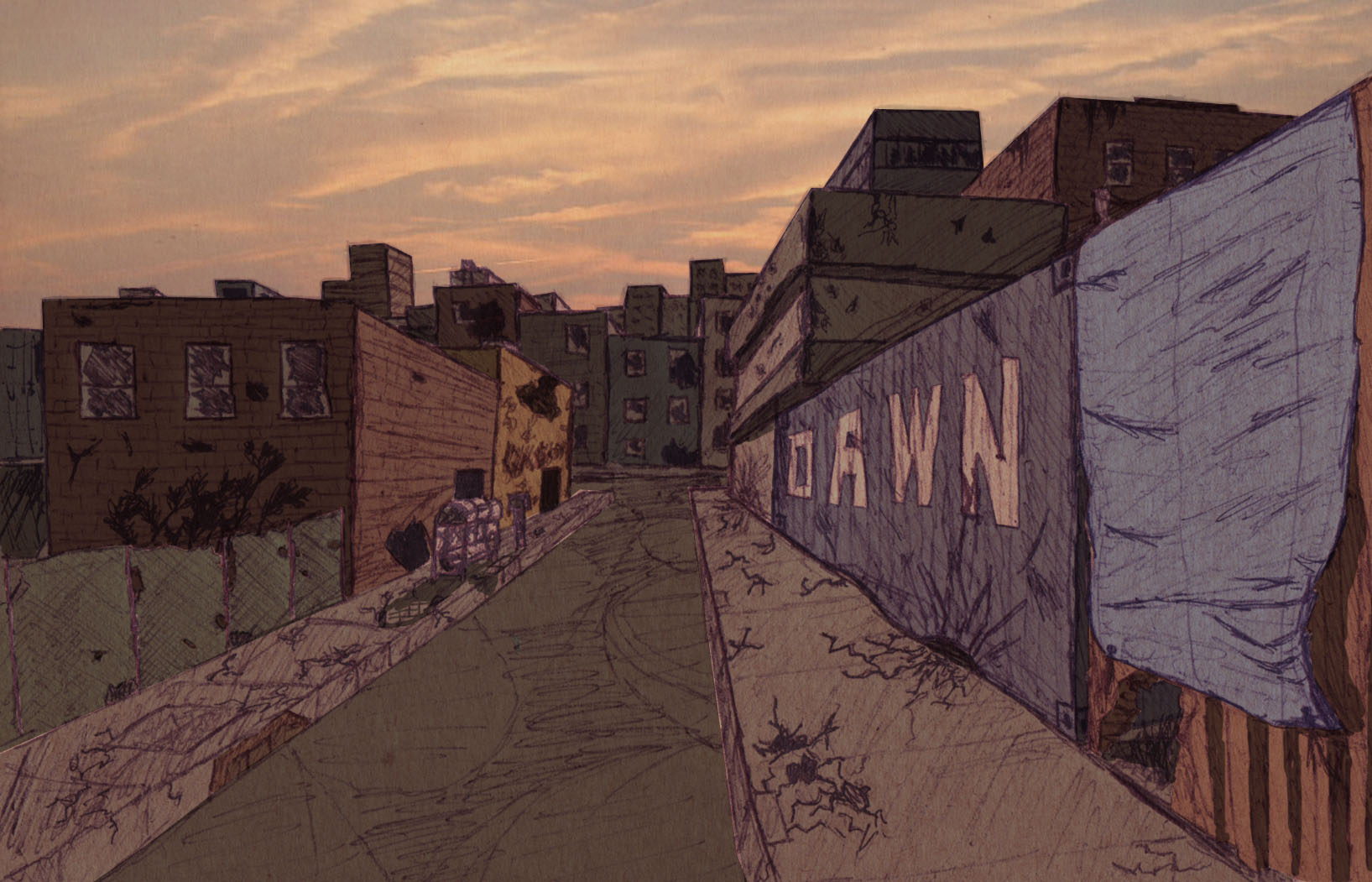
Finished! Skies, alone, are amazingly detailed. They require many different drawing techniques to even make them look remotely correct. I have not yet learned how they are created, so I took a photograph of the sky, made its tone correct, and placed it over the city. I wish I could go into detail over the sky and, more specifically, water refraction and distortion.
Thats for another day and another time.
I've found concept art to be a powerful tool in the development community. It is by far, one of the most effective tools to getting a look and design down for practically anything. That might seem like common developer sense, but even I greatly under-estimated how helpful it can be.
I hope you've learned a thing or two. Thanks for reading.
-'Ninja'Dave


WELL DONE!!!
This is So epic. Another Awesome article from NinjaDave!
Thanks!
Great work!
Nice! Great work bra!
bra? lol
I watch the leet world alot Chet is my fav :)
Leet World FTW NINJA FTW
Nice one. Lacks composition, but nice.
Very well done! Gives off the mood nicely.
Well done, good explanation, not too detailed and not too shallow :)
Thanks, this'll help a lot :)
Thank you for sharing this info, it will help me in the future!
I will try this out and see how it works for me, thanks so much!