Star Trek: Armada III begins with the first stirrings of the Dominion War and allows players to take command of five unique factions, the United Federation of Planets, the Klingon Empire, the Romulan Star Empire, the Cardassian Union/Dominion Alliance, and the Borg Collective. Explore strange new worlds, seek out new life and new civilizations, and boldly go where no one has gone before.

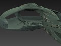
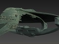
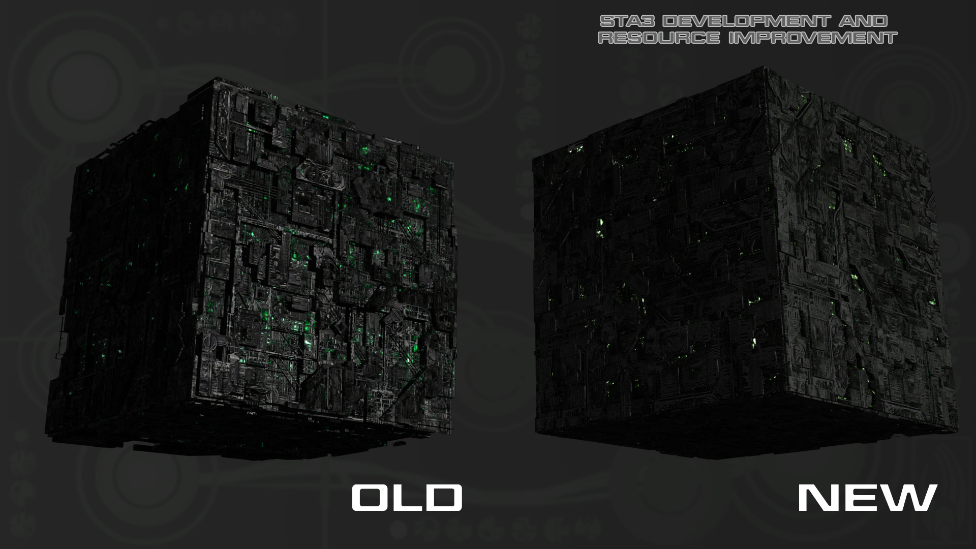
Here at STA3 we are dedicated too bringing you the very best that we can offer in terms off visual fidelity. After all us Star Trek fans are a fiddly lot when it comes to how something looks. Some of you have asked to see some side by side comparisons of the newly overhauled ships and this is one of them, the terrifying Borg Cube.
As you can see the difference is very noticeable and looks more like the fantastic First Contact cube we saw in well, er, First Contact.
Hmmm. Both are quite good.
Hmm, both seem valid, the left one looks like the Voyager cubes. Right one is def film version. Can't choose....self destruct in 5, 4, 3....
The one on the right looks more solid(less lights showing through) and much more like the Borg from first contact. the one on the left looks more advance and futuristic due to more variety of textures.
I have a feeling the one on the right may be harder to see, depending on how bright and how much non-black backgrounds tend to have.
Yeah, there is definitely an issue with lighting in this game, I only use the light purple and light blue backdrop because everything becomes so dark otherwise. Dark green backdrop for Rommies and Borg though, emphasizes the coool.
^this
The old one looks better for me! I was impressed with the fact that it didn't looked like just a simple cube, it had a nice shape. I hope you guys at least keep the old one in some sort of form in the game. It would brake my heart if i wouldn't see the old one in the new version. But this is just my opinion! Still its an impressive design. Keep up the good work guys!
yap both are fine and both offer a certain charm. I do like the fact of the left cube that you actually do see all those different formations on it's hull (model wise). Something that seems to be lost on the right hand cube.
But yes both look fantastic.
I actually prefer the old one. Does this make me a bad person?
NO! It doesn't! I agree as well!
Just to point out guys that the new Cube is going to be a lot more friendlier on systems. The old cube had a lot of of erroneous greebles that put a heavy load on the engine.
The new cube has no intersecting geometry and looks divine in game if you look a few pics back in the gallery. The old one will not make a return back in the game.
Intersecting geometry is a bitch.
As someone who never goes below 60 fps on max settings, this makes me sad.
Can you make
1. borg back ground bright(its hard to take screen shots when you cant see what your shooting)
2.make the cube brighter outline it brighter lights
old one is better.
how about we keep the old one for Locutus? i know it should be the other way around but you seem intent on making the new one the default cube so im trying to keep the old one in any way possible.
I feel like the only one here that prefers the look of the First Contact styled cube >.>
na i agree too, liking both is what most people think I think, so whichever we get is going to be good fun, its a compliment to the devs :D
I really like the old model because of the depth it has to it, it feels like you can just about peek into its interior between the outer parts...
I love both. The right look more tactical cube at Star Trek Armada 2.
Actually a good idea by awesomesauce935.
10/10 would assimilate
excellent work
I actually like both of them. They each have their own personality.
I prefer the new one, understatement is underappreciated in the modern world.
Subtlety wins the true victory.
I like the new one. Especially if it is easier on the system as previously stated.
the new cube facade has much less detail then the old one. I understand the old one won't be put in because its harsh to the system, but the new cube isn't as nice on the eyes. I think the new cube needs improving.
The one of the left is akin to the ones seen in voyager, while the cube on the right is more like the one in fist contact. Both are nice, but in this case i think the one which causes less system drain is preferable