Cerberus C.A.R.E. Package cannon Concept Poll image - Dawn of the Reapers mod for Sins of a Solar Empire: Rebellion
The reapers have returned from dark space. With Earth under attack and the mass relays in a state of chaos from refugees and the councils fleet engaging reaper forces the galaxy is a mess. The outcome is unknown, the warfare is devastating. The galaxy will never be the same.

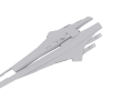
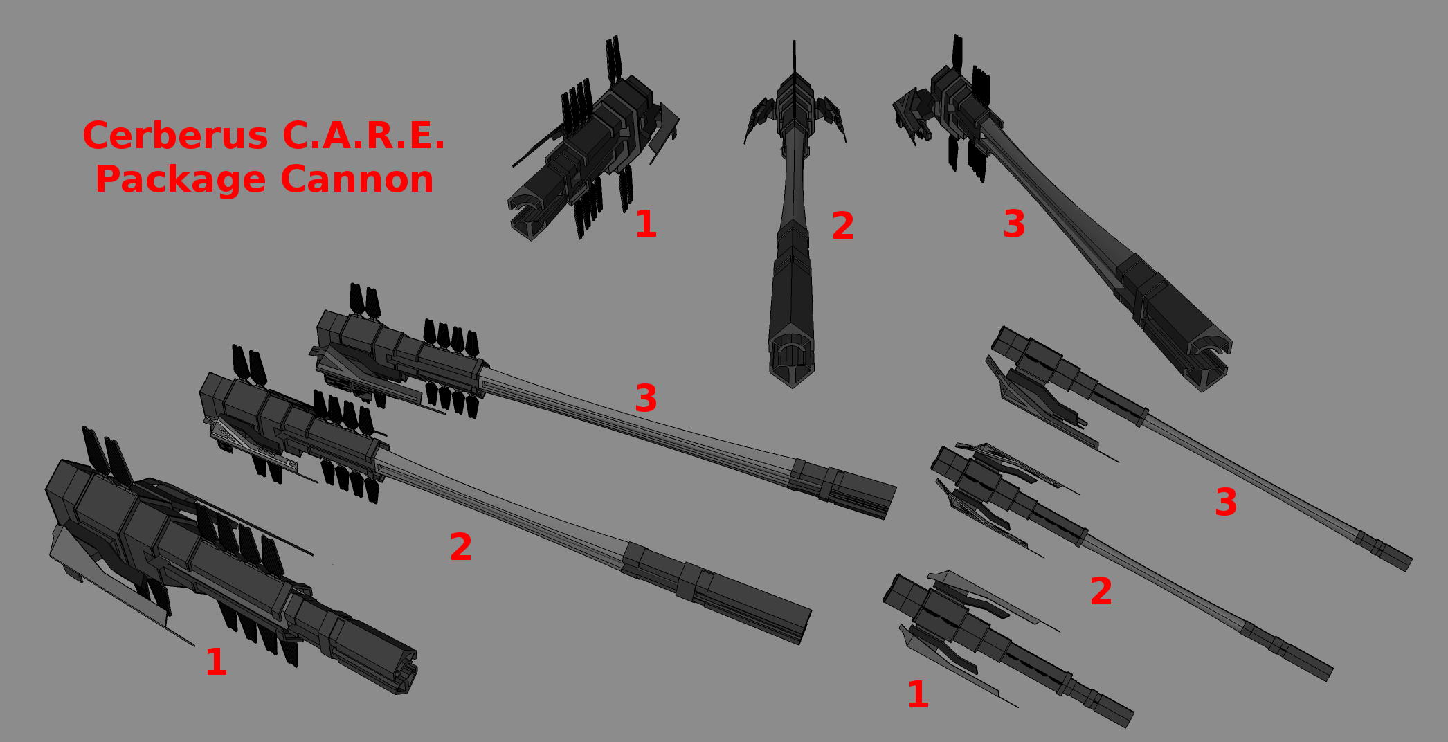
These are the three final designs of the C.A.R.E. Package cannon. Go ahead and state which design is your favourite, and if you wish also state why you prefer that design. As you may notice, Concept 1 has a shortened barrel, Concept 2 is the standard concept and Concept 3 is the asymmetrical version of the concept. Please don't state your favourite concept more than once, as I'll be checking which concept gets the most support. I've set up an actual poll on the forums if you'd prefer to vote there (or both).
#2 is my favorite. I like symmetry and #1 seems a bit to short for a weapon of mass destruction. That's just my opinion.
Well the longer barrel would not be needed in space. So would be more cost effective. Though one could argue that you have multiple C.A.R.E. Packages stacked up ready to go, or something else along some other line. Honestly do not really care what one he picks; they all have something I like about them.
Yeah, I wouldn't complain whichever one he chooses.
3 and 2 look like hammers!
It would be cool if it was animated, so when it's readying up to fire the barrel could extend.
This comment is currently awaiting admin approval, join now to view.
#3 for me.
i would say number 3, the way that the ''wings?'' are only on 1 side really touches me, makes it look like theres actually a bridge or something.
I think 2 is good
Well number 1 is the scariest looking but I vote 2. I like the telescopic look.
Number 1. It's not about size, it's about how you use it.
Exactly. And besides, I think it looks like a massive inter-system shotgun.
Must suck to be the crew stationed inside this thing though.
same, i say 1, the size is just right, and the two wings don't look awkwardly placed, 3 now looks unbalanced, same with the barrel of 2 and 3, they just are too long in my opinion and would be more like a prop for a slap stick comedy in space.
loftysgttaylor votes 1
forgot to add and asymmetrical like 3
I gotta agree with ya, number one got my eye. Size ain't everything. (Don't tell your girlfriend that)
I know I wasn't the only one who had a dirty thought about this.
I like #2
Number 2#
I can't decide between 1 and 2. 2 looks great because it's some kind of a monumental superweapon but 1 looks more like a badass and compact space station. The asymmetrical concept 3 doesn't fit in my opinion. Hard to answer without texture... Well, because 2 looks way more sleek and similar to the mass relays I say 2.
In the past I had an idea for a superweapon of the Synthesis splinter group of Cerberus which I called the "Lakunae-project". Lacuna means gap which does really fit to Synthesis, the gap which techno-reaper-organics or a new humanity fills up. This project is some kind of a super-mass-accelerator with at least 4 mass relay rings, built in an asteroid laboratory near the Charon portal were even the Alliance didn't notice Cerberus. It's a mixture between Reaper tech and the very best of human resources and research. Designwise a mixture between the Crucible (but Cerberus-like), some mass relays and probably some asteroid parts with antennae. It is able to accelerate ships, projectiles and itself which makes it a mobile superweapon. Maybe overpowered but it could even just be a mobile mass relay... Just wanted to share the idea with you guys being some suggestive thoughts on that side.
The concepts shown here are much better as the beginning concept. Great work and keep it up!
Personally, I like number three. It makes sense that a massive super weapon of that size would need to have a command and control center, hence the little section jutting out on the side. And quite frankly, never been a huge fan of perfect symmetry with military constructions. There are always small bits that 'stick out', and I like it.
honestly,maybe somewhere between 1 and 2. The barrel looks far too long in number 2 (and 3), but far too short in number 1. I think a combination of them all - a command control center on one side and a barrel not a long as 2 but longer than 1
Yeah, I agree with that. Just take the best parts of the three concepts and merge it into an uber-concept. No but seriously, I just thought the same. The command tower of 3 looks awesome as does the overall structure of 1. In 2 and 3 the barrel is just a little bit to long or should be added with some details (some plates as in the short barrel of 1 for example). In 1 the barrel looks awesome but, yeah, it's to short to look like a superweapon.
Number 1
It's not about size, you need firepower too.
it is a mass accelerator!
So size matters ;)
Definitely #2
#1 is too short
#2 is unbalanced (so what I don't like ^^)
3.
1
2
2
I think number 3 for super weapon, but I do think a combination of 1's hull and 3's side module would be very cool. I also think that 1 could looks cool as a smaller defense gun, it just lacks the same sense of scale as the other concepts.
#2 for me, but it is also good 3
I like #3.
The barrels on two and three are just too long, I much prefer number one because its compact and flows with the design aesthetic. With the other two, all the detail is in the back and theres nothing on the barrel to contrast the design so its just freely hanging out there. On number one, however, its still out there but the barrel isn't subtracting anything from the design and allows the concept to flow from high contrast at the back to a funneled low contrast point on the front.
When Skylin5gtr models and textures the CARE package cannon ,If either design 2 or 3 is chosen, he'll probably add detail to the barrel, like power conduits, heat disposal panels and the like. Also I didn't do any texturing because texturing on Sketchup is a pain in the *** (and unnecessary for a simple concept), especially on irregular surfaces like the barrel. I personally would prefer either concept 1 or 3.
maybe a 1-2 mix it looks like
3
#2 is the best for me
#1 with #3's wings, and a bit longer.
I like #3 more
#1 looks cool but it could be a bit longer.
#1 Or a mix betweed 1 and 2. The barrels on 2 and 3 are way too long.
3
1
2
2
1
1
1 looks best in my opinion
Okay, I'm making my vote then: 1 mixed with 3, but mainly 1.
Total so far:
Concept 1: 13
Concept 2: 14
Concept 3: 12
(Mod members have two votes, except for me).
Ooh so tight. tell me if I miscounted.