A Halo mod for the critically acclaimed Sins of a Solar Empire, that aims to capture the fast paced intensity of the Halo series.


UI Updates
(view original)

Post a comment
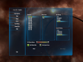
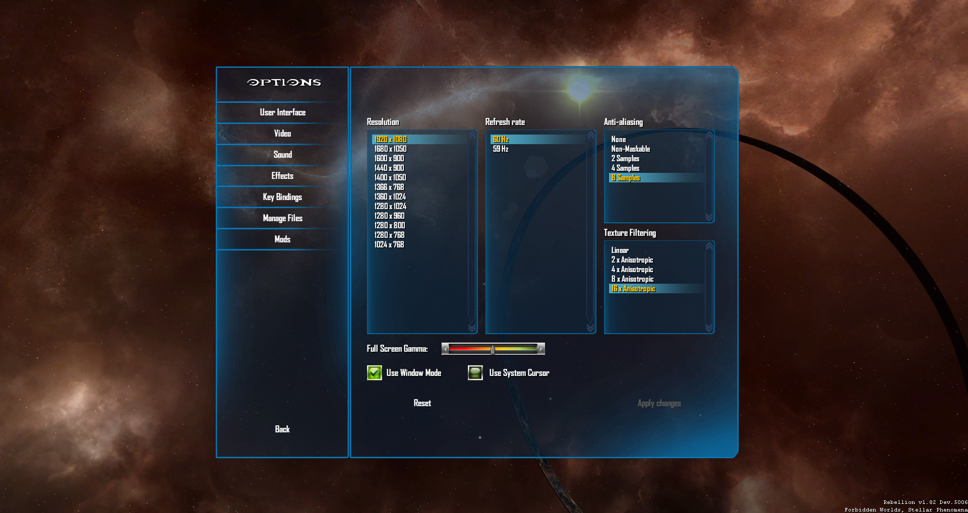
Description
Lord_Set continues to experiment and improve our outdated UI, here are shots with a more Halo 4 feel.
AWWWWHHHHH YEAAAAAAH!
Looking good!
I would lose the Halo font personally and rather go for a font similar to the menu fonts in Halo 4.
^^ Datto, the Halo font from 2001 doesnt fit anymore with any halo related UI if there is some one that can create the Halo font from 2012 it would look better. Or just like Zero said use a more regular font like from in the Halo 4 menu or Halo SA.
Agree.
Generally, I'd agree, however I felt that the use of the font was sparingly enough that it wasn't jarring or distasteful. I'll talk to Set about it tonight, see if we can find something closer to Halo 4.
I think your font is just fine.
Taste vary one cant cater to everyone.
I prefer older style halo font halo 4 font just didnt feel like halo any more lol
Agreed I prefer the halo 1 font, it also brings back a bit of nostalgia.