Facing impossible odds, a team of survivors are cornered against the unstoppable poltergeist horde! Defend yourself as they spawn terrifying monsters, possess players, and wreak havoc in their quest to destroy every survivor! Spot out the demon's shadow to uncover where they're hiding, but make sure you find a flash light, or you'll be trapped in the dark! Team work is essential if you want to survive. Stick together, share ammo, and destroy the poltergeist horde in Demons Vs Humans!

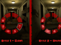
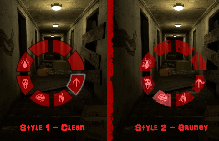
I have been studying a few awesome games and mods of the similar theme to DvH and a lot of these games seem to adopt a more grungy style. I just wanted to see if you prefer this new grungy style, or the old sleek style. Place your votes!
Btw, I haven't done the HUD in the grungy style yet. I will do that if you guys think that I should continue with this style.
Style 2
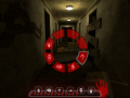
But you might need to ticker a bit with the settings because of the grunge the symbols are a bit harder to recognize
Yeah, this is only a WIP and I agree the symbols are a bit hard to recognise. But I will fiddle about with these things after I've come to an agreement on what style I should use. Thanks. :)
Style 2
Style 2
Style 2
Looks like Style 2 is on for a winner. :)
A combination of both - Stlye 2 base with a bit darker red and broght borders around your selection.
I do like the darker red idea. I'll get a full mock of up Style 2 done soon to show you all. :)
i also tried this in photoshop, i duplicated the radial and game it a 50% multiply setting, the red becomes a bit darker and the icons stay about the same/get a tiny bit brighter.
It also has the effect of giving a slight bright red border around the buttons.
Didnt look to bad imo ^^
i would choose style 2
samezies
Style 2 is way better. :p
Style 2
2
Style 2, BUT.
I dig the idea of a more visual style, but it could be something else as well than just grunge, since thats as generic and flat as electric guitars. How´bout decorations? Gothic? Or, metallic? Shamanistic/black magic/whatever? Or an octogram in the middle / going over the design table?
2
I would like a sort of balance between the two styles.
style 2
I prefer style 2 but style 1 is much more readable. I'd say make the borders of the power selection look grungy but keep the icons easy to read.
How about a combo of both,
The grungy look with a thin clean border
it seems everyones voting for 2 maybe i should too
Style 1 ''trollface''
nah just kidding style 2 ftw
BOTH
and add an option in game that make us choose between the two!
but if you cant i will go for style 2 :[
That would be great but it's a bit too much hassle to add in. If Votes were very spilt we might consider it, but it seems very much a one way vote.
style 2 ! :)
Why not have both?
Grungy for your demon, if you have a similar UI for the humans, make it cleaner - different color - etc.
Grungy, of course!
I'd also like some drips of blood on it :)
Style 2.
Style Q.
Yay! Commmunity votes :) Anyway, 2 totally dominates 1.
style 2. but icons only would be good to
like clive barkers undying
2
2.. :D
Make an option where you can edit the hud. Though most people would select style 2 then.
Grungy!
Style 2 is so cool!
Which Ever one doesn't give me brain damage.
I'm not drain bamaged. =(
I like style 2 but the icons could be a bit easier to read.
style 2
Style 1 :-)