Creatures came out of what seemed to be thin air. Animated and alive. They came without a warning and swept the world ...
1187 - Day one - teaser 1
Post a comment
Description
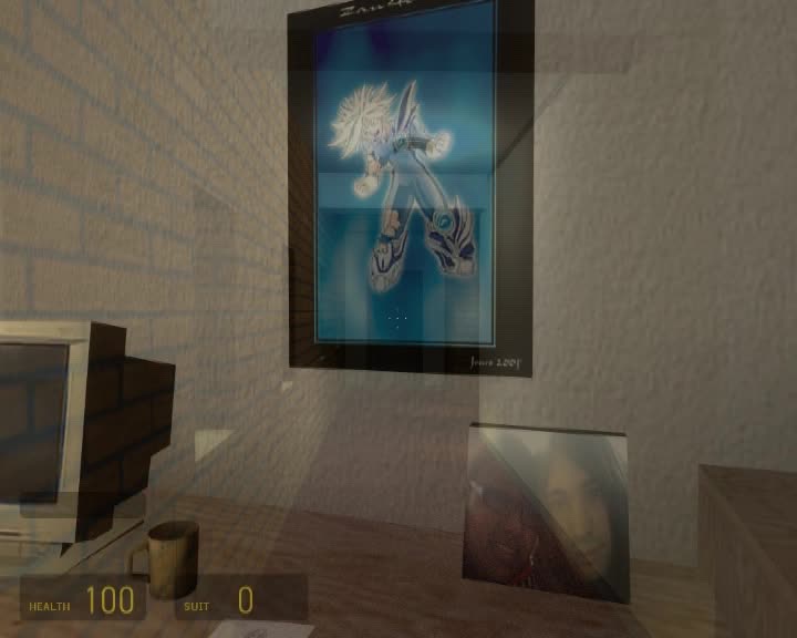
Small clip showing some of the appartment complex.
Looks a tad blocky in some areas, love the rooms and how you added in light switches and almost all the textures and models are custom. Love ho you added in the small cut scene with the rebel and zombie. Looking forward to this :)
Well Done
thanks, and yeah I am trying to get rid of my blockyness.
There's more stuff going on in the map, but allot is still being tested. Very glad people seem to notice and like the custom textures and the paintings my gf made. There's even custom ambient sounds and door sounds etc.
Simply amazing~
i think the skybox is a bit empty. the rest was awsome great job
PS: wow it seems i clicked "reply to comment" :P
nice
good map
but i didnt like those barnacles, i mean...
there is no way for them beign there =p
hmm, thats funny i know, well, I have no idea how a barnacle gets up a ceiling in the first place, looking at its anatomy. But then well i havent had a chance to study them hehe. well, I think when you'll play the map, their pressence wont seem so strange, but you'll have to see it. right now I'm fine with them. but thanks for the feedback.
Look's good.
Very nice level design!!
lol september 2nd.Thats my birthday
that's my birthday aswell hehe
just a thought there should be more blood on the walls and a cliche flickering light in the part with the barnicle. looks good a little bare in some places but good. love the light switch!! hope this is a recurring thing
Interactive enviroments are gonna play a big part in this mod ;)
I think gagging the zombies until spotted will raise the awesomeness by ninethousand. That continuous crying and moaning already alerts you to the presence of a zombie.
Watch your door widths, i noticed your brown hallway entrance doors were not to scall with the white room doors. Other then that, you (or your mapper) are/is very good with Hammer.
lol the stairwell looks like my sisters collage!
hmm...good
aa barnacles I fear I fear I hate barnacles and I'm not love this mod
i know this is WIP and has probably been fixed by now but the neighborhood is dead no people not enough lights unless thats the desired effect
not bad
Looks very nice for a WIP... but those damn barcacles... dont make any sence !
And I just noticed theres a "e" missing at the end of the mod history... on the word alone its typed ( crappy english FTW ) alon whit no "e"
to me this mod looks good and i love the texture and feeling
I like it. And I like the Custom Textures and I like the Mapping, but I think it's way too blocky. I really hope this will be improved. At the moment it looks like a high quality HL1 mod. And I really want it to look like a HL2 mod. And on the balcony the chairs need to be cleaner. If you don't want to make a model then here: Gaming-models.de There's a few other models on that site that are free to use and would really improve some parts. :P
PLEASE HAVE MORE BUMP MAPPING TEXTURES, like the bricks, and the doors, the sky box should also be filled a bit more.
Trust me, this is WAY OUTDATED. This is over a year old. Everything has improved tremendously.
Why did this show up again?
knob shouldnt be just part of texture, it should be modeled, also table texture is low res and you should use bump mapping on the brick wall :D... mapping is really awesome and i like the clean look