When I first started prototyping the framework that is the foundation of Fractured State I had no idea what kind of RTS game it was going to be. My main goal was of a purely technical nature - I wanted to make a game that ran on XML data so modders could create content for it after it was released.
My first "experience" with game design/development was hacking around in the INI files of old Command and Conquer games. This was before the days of officially sanctioned tools or Community Summit Weekends or ModDB so we were forced to figure things out for ourselves and cobble together our own tools and processes. (Shout out to Olaf van der Speck - wherever you are!) I wanted to make a game that allowed for as much change and customization as possible and I wanted to document all of those possibilities and be available to answer questions when people got stuck.
Now that Todd has come along we've been able to start imagining what this world and the characters that inhabit it look like. We have close to 35 years of history written up to serve as a backbone to the central conflict that is also helping to flesh out the mechanics of the game. I'm so excited to share some of these things with all of you over the coming weeks and months and I genuinely hope that you find this world and this game as interesting and compelling as we do.
Since Todd did such a good job of cleansing the palette last week with some awesome architectural concept art I figured I would muck it up again with some programmer art that looks like it's straight out of a PowerPoint presentation from 1994. So, onward and upward!
After spending so much time working on the Editor I wanted to finally start building some systems that will make their way into the final game. As I said, we've got some mechanics laid out on paper and I am really anxious to start implementing them and iterating on their designs - but a few housekeeping things needed to happen first. The one I decided to tackle initially was a framework for building 2-dimensional UI elements in the game. I started this with 2 main requirements: 1) it had to be moddable via the same XML patterns we've been using for everything else and 2) it had to perform as fast as possible. (Really this second requirement is cheating - performance is a requirement for almost everything, but I digress.)
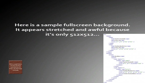
What I've come up with so far is a system that dynamically builds screen space mesh objects and skins them with textures based on the data in an XML file. Here's an image of what it looks like along with a snippet of XML in the corner:
See? I told you - PowerPoint. Moving on...
I implemented this with a second camera that renders on top of the world camera in Orthographic mode. The mesh objects are placed in screen space according to the coordinates in the XML file. A single texture is used so that every element can be drawn in a single draw call (performance!) and any element that is declared as a button is hooked up to receive left click events. The action node in the button data determines what type of thing that button does when it's clicked. In this example, the button moves the game to a screen called SkirmishMenu (not shown in the data file). The images block at the top declares all of the images that a screen can use. A unique material is created for each unique map entry and the system cuts the texture up and skins it onto the mesh objects appropriately based on that data. You can see the image I used to create these screens here.
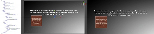
Here's a more "workflowy" shot showing the full XML dataset.
Lastly - here's a shot of SkirmishMenu as it's implemented in the data you see above.
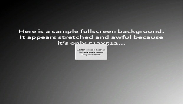
You'll notice the rounded corners on that particular (awesomely rendered) button. The system supports full and partial transparency so layering things on top of each other is no issue at all.
There is still a lot of work to be done on this, but I'm pleased with the result thus far. (Minus the art - I know! Get off my back will ya!) The text on the buttons is currently part of the actual image. In the future this will be expanded to allow for text to be displayed as bitmap fonts that can be overlaid onto UI elements. I'd also like to code up state-specific styles so that things like buttons and other interactive elements can give visual feedback that a mouse is hovering on them. However, this will allow me to at least mock in some basic menus to navigate around the game.
My next step is to work out a process for publishing map files and loading them into the game. Hopefully at that point we can start to iterate on some design ideas and actually show you guys a game instead of pictures of terrain meshes and categorized prop lists!
Thanks for reading! Don't forget to join our forum and follow me on Twitter @ThisIsKelso.