Solitude (Working Title) is a PSP and PC game using a heavily modified Quake engine, expanding upon the story of Halo: Combat Evolved. Expect a great, brand new single player story and all of the most popular multiplayer modes from Halo: CE! Our team is working hard to bring the game to you as fast as possible so be sure to stay tuned for any new updates. More information can be found on our site at www.halosolitude.com. Note: We are NOT ripping anything from any of Halos! All our models and textures are our own, made by using the original Halo art only as reference.
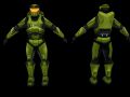
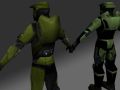
Another look at the new Spartan
(view original)

Post a comment
Description
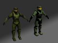
Well, with mixed reviews.
BEA-utiful.
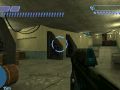
This is closer to how it will look ingame.
You're the one who make this Spartan model and textures right? Did you edit it? I mean, this one seems a little bit different from the others uploaded before...
Just a LITTLE.
And by that I mean something as simple as changing the brightness and contrast in photoshop.
Yea, and it makes all the difference. Textures stands out more on the back too, it looks good.
xalener whats the poly count on your model?
Mid 500
nice! :D
I can say now it looks better, the colours look much more "alive" instead of being too dark... Now i can say this is better than the old one.
Can you guys please upload the 2 spartans again (in 1 pic) but now using this one that looks much better?
this looks waay better than the earlier pictures of this model, no offense to the older version no the older older but the older version of this version, get my drift?
lol
awesome!
it looks much better now.
You know they didn`t do much. Just the little changes make a big difference on peoples opinions.
Cant agree more actually... This seems to be better than the others. My opinion just changed... O.o
thats amazing
Ok, It's looking a lot better. Still would like to see some shot of it in game.
ALSO:
No offense to Dandi8 on all this old texture basing. We're just trying to "make a sale" Also, you're great at map textures. You just need to keep making these great map textures.
This does look much better.
now that right there is some amazing work! keep it up
I'm convinced this is better than the old one now.
The shoulders look pretty bad, I wouldn't mind if you placed a few more verts in just so the shoulders could be fixed.
Also, the shade of green you're using, while better than the last one, seems.. off. And the black sections could be a bit lighter, so you can actually make out the details.
I'm sure you already know this, but the texture is grey. The colors are completely customizable. I also agree with you about the shoulders.
Actually, a few minutes after this pic was posed, xalener fixed the shoulders.
better
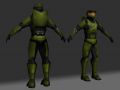
I like the old one much more, it didn't look so uber-low-poly like this one
God damn it.
Lol... Yep, this looks better than the darker one but it does look a bit low poly. I'm just gonna say what I think.... It looks a bit fat, (my opinion only). The glass of the helmet looks a bit strange too (my opinion).
Yea in this picture alone he looks fatter, but in the older pictures of this model he looks much skinnier. It's weird.
I FOUND THE SOURCE OF THE FATNESS!!!
It's just an illusion, you see. The hi-lights of the under-armor are in a circular shape. I shaded the sides of the torso to cover up any bad transition in the UVs. You see, with the black background the stomach looks fat, but it's really just the rest of the body blending in with the BG.
You can't please everyone ;)
Very true! I like it.
Is it just me, or does this picture make the model look a little cartoonish? Don't get me wrong, i really like it! But do people see where I'm coming from?
Yeah agreed, but people like this one because of that i think...
I think I love the texture except for the face mask. When he brightened the colors the face mask became to bright.
I really cant disagree on that one. The mask seems to have a very "alive" yellow colour in there. A little bit darker wouldnt kill anyone...
Everything HAS to look cartoonish, you see you can't convey realism at all with the constrictions that we're at... In order to create relatable characters (or just interesting looking ones) we NEED to exaggerate EVERYTHING.
But yeah, you're right about the mask. I feel so stupid for not noticing it.
Yea, that makes a lot of sense. I really like the texture though, did you make it too?
yeah.
THIS (that) IS SPARTA(n)
wait this is the new one right? this darker green one? and that lighter green one was the old one right? this one looks much better, I don't know why people are complaining about it... well I suppose there IS always room for improvement. I guess it does look A LITTLE cartoony, but it is still better than that other one.
wait... nvfm...
brain diarriah.
lol - what?!
does look better now - for some reason..
Still prefer the old one but this does the job fine aswell :)
If you played with the old one in game, you wouldn't prefer it. Trust me.
Well, none of us know that because we haven't played it ingame.
That's a good thing.
alright, second look again, it looks awesome, way better than the last skinny one. I would keep it!
hmm. Backpack needs original shape. thats all, really :)
Oh, also the back of his head should stand out more. costs 6 polys or smthng ;)
Well, since we've got md3's in now, the polycount for this is about to skyrocket :P So adding a few extra faces to the back of the head may just push it over the edge.
Isn't that a bad thing that the polycount will skyrocket?! Will that mean less on screen?
Well since it's an MD3 the model has to be cut up into peices, and needs more polys to round off stubbs and fill in holes. I can't really afford to add any polys for asthetic changes, as they will only add to the strain.