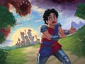
Guard Duty: A Development Retrospective - Dev Diary #4
The Art of Guard Duty - Pixel Practices
Howdy. Today I would like to take some time to talk to you about my process when creating art for Guard Duty. I’m going to be focussing on pixel art and practices you need to be mindful of when creating your art. Hopefully this will give you a bit of an insight into my process for creating the many pixel packed locations in Guard Duty.
Let’s start with a few basic things you’ll need to keep in mind when working with pixels. My advice here is geared around creating pixel art in Photoshop, but most of the rules will apply to other art packages.
First thing’s first - Decide upon a resolution and stick to it.
The problem I see a lot of people run into when starting in pixel art is in consistency of resolution, that is they often mix different resolutions within the image (or game). Mostly called ‘mixed resolution’, it is a where pixels in the image are not all of a consistent size, often leading to an undesirable look. Traditional pixel art is based on the foundation of a grid, where each pixel acts like a grid square. The pixels are unable to be placed outside of these grid squares, therefore keeping a consistency throughout the image. The hardware used to render pixel art in it’s heyday was unable to handle high resolutions, meaning that each pixel had to be carefully placed to make up the intended image.
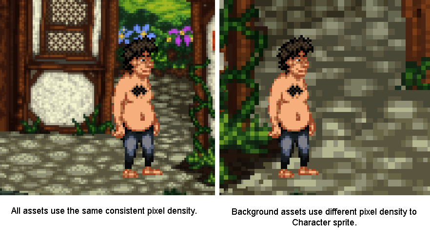
See this graphic for example, the image on the left is using a consistent pixel density whereas the one on the right is using a different density between the character sprite and the background (mixed resolution).
You see the difference? The larger pixels on the right-hand image look messy compared to it’s counterpart, this not only looks a bit strange but does not keep with the traditions of creating pixel art. You want to stick to the resolution you started with. There are some examples of modern games which used mixed resolution pixel art successfully, but these are normally used sparingly and are scaled in-engine, mostly to benefit gameplay.
Platformers often use sub-pixel movement to make gameplay smoother, which can lead to character sprites not lining up correctly with background assets. Sprites however are very rarely scaled in engine as this is far more jarring to look at.
Either way, you will save yourself a lot of hassle if you decide on your game’s resolution at the start and stick to this resolution throughout. Guard Duty uses a similar resolution to many of the early LucasArts and Sierra titles using a 4:3 ratio of 320 x 240px. It might not sound like much but that’s 76,800 pixels you’re going to have to wrangle. More than enough for me!
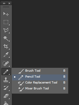
Moving on - Do not use anti aliased tools
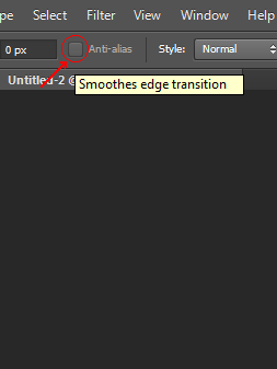
Another problem I see that newcomers often run into is the temptation to use tools designed for high resolution artwork, things like the brush tool, smudge, burn/dodge and gradient fill are all inherently anti-aliased and will give you a heap of extra clean-up work. These tools create way too many pixels, with a massive array of shades and colours. You’ll find that tweaking your artwork becomes increasingly harder when using these tools. So just forget them, resist temptation to smudge your wall texture, or use your neat grass brush, It’s really not worth it if you want to create pixel art. The easiest way to keep track of anti-aliasing is to use (almost exclusively) the pencil tool, the pencil tool can be found by click-holding the brush in the toolbar and selecting the pencil from the drop-down menu.
I also recommend turning off the anti-alias setting on the marquee selection tool, transform tool, paint bucket tool and magic wand tool. All of these can be used in pixel art, but with the anti-alias checkbox active you will find that they create a lot of different coloured pixels around the edge of your selection, again causing issues when flood filling areas, or otherwise editing the image.
So as a general rule, make sure each pixel that is going onto your canvas is intentional. Photoshop isn’t really geared towards creating pixel art and you want to make sure it doesn’t do anything without your permission. Bad Photoshop! Behave!
Try to avoid scaling your pixel art
This is similar to my first point, but can often catch you off guard. Once you’ve drawn something on the pixel grid you may find that it doesn’t fit in a scene you’ve created previously, despite both images having the same resolution. You’ve drawn the sprite too small and although the pixels are consistently sized, it just looks tiny in the scene. Well, you’re probably going to have to redraw it, somewhat.
When you scale pixel art Photoshop will try to scale the pixels to match the resolution’s pixel grid, anything under a 200% scale will result in only some of the pixels being larger than others (some will become rectangular) and at 200% the pixels will be twice as big, but still fit into the grid. This is because Photoshop has to keep to the bounds of the canvas resolution and doesn’t know what to do with the new space between pixels.
You can see from the image that some of Tondbert’s upscaled pixels have stayed 1px wide/tall whilst others are now 2px wide or tall. His eyes, nose and left shoulder have suffered the most. Poor Tondbert. This is because Photoshop doesn’t know what to do with the pixels, at the chosen scaling it only has ‘small’ (1px) or ‘big’ (2px).
Anyway, to combat these issues you should always draw your pixel art with other assets in mind. When working on a game you don’t want to have to be scaling the character sprites differently between locations, so you should paste your character sprite into the blank canvas for the new location, so you’ve got something to reference the size. If you stick to a consistent resolution with all your art and be mindful of other assets you’re intending to use together you shouldn’t run into any of these problems.
When scaling pixel art, always use Nearest Neighbour interpolation and scale in multiples
Pixel art is kinda small and most modern computers are displaying a 1920x1080 resolution or higher. This means when showing off your pixel art on a website, it can often look reeeeeally tiny. So, you want to be aware of your image resize settings. You need to make sure the image is scaled in exact multiples of itself, 2x bigger 3x bigger etc. So if your canvas is 320 pixels wide and 240 pixels tall, the upscaled image would need to be 640 pixels wide and 480 pixels tall. To keep it simple scale the image to either 200%, 300% or 400% depending on how big you want it, but never 250% or 225%.
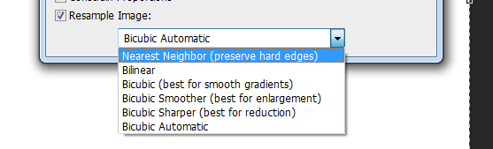
There is also a setting at the bottom of the ‘Image size’ box in Photoshop that has a drop down list of interpolation types, next to the ‘Resample Image’ checkbox. Set this to drop down to Nearest Neighbour(preserve hard edges). It will make sure that your pixels always stay crisp when resizing.
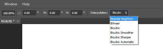
There is a similar drop down box when using the transform controls which you will also need to change, if you do not your sprites will become blurred.
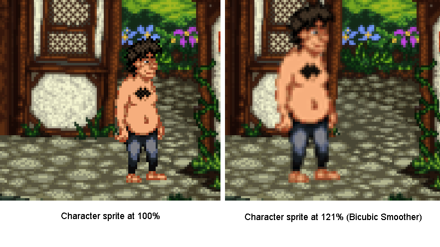
Note the amount of pixels Photoshop has added when trying to smooth out the sprite to 121%, this would make the sprite near impossible to modify beyond this point. Using the Nearest Neighbour interpolation solves this issue.
Stick to a limited palette
When starting out with an image I try to keep the colour count to a minimum, this way you won’t get bogged down with tweaking the finer details and can focus on the bigger picture. It also makes tolerance selecting bits of the image a lot easier. Try to keep to three or four colours per texture, dark, mid and highlight colours. You can add extra colours later if needed but removing colours is a bit of a pain.
Now we’ve gone over the basics, let’s get started on a creating a scene.
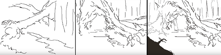
Start with a basic thumbnail sketch
This technique applies to both sprite and background creation, but for the purpose of this post we’re going to work with a background.
I like to sketch out a few different compositions for the scene before committing to one. I usually find I get something decent by the third sketch but it may take longer, just stick with it. Each sketch shouldn’t take more than a minute or two, we’re just establishing where the shapes in the scene are going to sit. I use a black 1px brush for this stage but the colour is mostly irrelevant (we will be changing that later). I liked the composition in the second sketch and decided to make the opening more central, adding a fallen tree to the left similar to the first sketch.
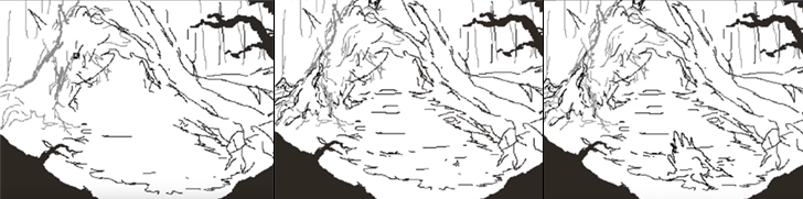
Develop the thumbnail sketch
I was pretty happy with this so decided to roll with it. The next image shows how I developed the detail in the image, sticking to the sketchy black lines for now. I occasionally use a dark grey colour to show objects that are further back in the frame.
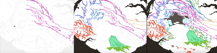
Establish clean 1px outlines
In the next step I set my sketch layer to semi-transparent (20-40%), lock it and create a new layer then begin to outline each of the individual elements. Remember to use a 1px brush and the pencil tool. About 80% of the time I’m holding shift whilst click two points on the canvas to draw a 1px line between the two points. This saves a lot of time and really helps when drawing straight lines, or long curved ones. At this point in the process you want to keep your pixels as clean as possible, avoiding ‘double pixels’ where the line becomes more than 1 pixel wide.
For the time being I’m using a different colour for each of the elements in the scene, this will make it easier to colour them in the next step and helps to cut down on having lots of layers at this early stage. It’s not necessary, but if you’re drawing everything on the same layer I would recommend it. Plus this is probably the only time you’ll get to use bright pink, vomit green and orange in the same scene!
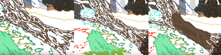
Separate the outlines and block in the colours
Once I’ve outlined the each of the elements in the scene I pick one and start detailing! I don’t worry about the finer details, I just aim to block out the main shapes and colours. What I have done below is use the magic wand tool (anti-alias turned off) with the tolerance set to 0 and contiguous turned off. This way it will select just that colour from the scene. I cut out the element and paste it into a new layer.
I decide upon a highlight colour and start blocking out the parts of the trunk that are raised, drawing these on the same layer as the trunk outline. Underneath on a new layer I am able to fill in the darker base colour of the trunk, as seen in the third image. This leaves the outline and highlights intact and allows me to use a larger brush size to block in the colour underneath.
You can see where I’ve added some trees and foliage from another background in the top right of the image, this is to get a feel for the colours used in those backgrounds, to help consistency between scenes and because I’m too lazy to draw new trees.
Apologies for the slightly blurry images, they were pulled from the timelapse video.
Add definition with shadows and fine highlights
This is the fun part, giving the object volume. First you want to add another layer above both of your previous layers. Then by carefully placing your shadow colour you can add heaps of definition to the shape. Here I’ve used it to bring out the cracks in the wood, as well as help the branches stand out against whatever will be behind them.
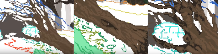
Thanks to having the colours on separate layers I am then able to tweak the balance between the three colours, ready for adding an extra fourth colour for fine highlights.
After adding the fourth colour we’re about done, the object has a nice shape to it with a decent amount of detail. You could work on it further from this point, maybe adding a second dark colour for shadows but I tend to leave it here. Remember, every step of this process was done with the pencil tool and a 1px brush, the only exception was the use of a 10 pixel brush for blocking in the colour. You can use this technique for everything in your scene, I like to merge the layers once I’m finished on each object but that’s personal preference. If you do decide to merge them you have the option of using a Brightness/Contrast or Hue/Saturation adjustment layer to tweak the contrast between the highlights and midtones etc, this won’t affect the pixels or add any anti-aliasing.
Okay! That’s about it. There’s nothing particularly fancy going on once you’ve setup Photoshop to handle pixels appropriately, you just need to follow the process I’ve laid out above and you’ll be creating rad pixel art in no time. If you’ve got any questions feel free to drop me a line on one of our social links or email me on the contact form @ www.sickchicken.com.
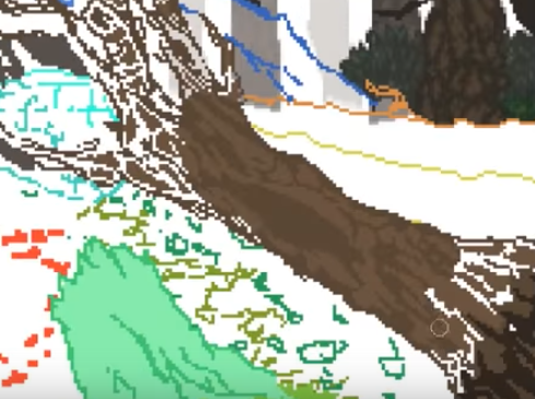
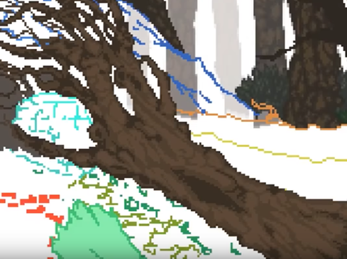
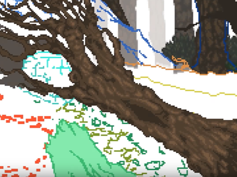
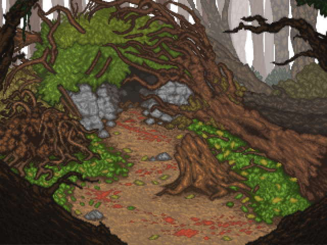
Here’s the finished image:
You can watch a timelapse of the process on Youtube here:
For a bit of additional learning, I highly recommend watching the ‘8bit & 8bit-ish’ Graphics GDC talk by Mark Ferrari:
Cheers!
-Nath