Hey everyone I'm Josh, the lead designer on Desura. After Scott's "2011 Musing's" I would like to start off the year with a series of posts revolving around the design of the Desura website and application by sharing some of the designs I'm working on and also gathering as much feedback as possible from the community.
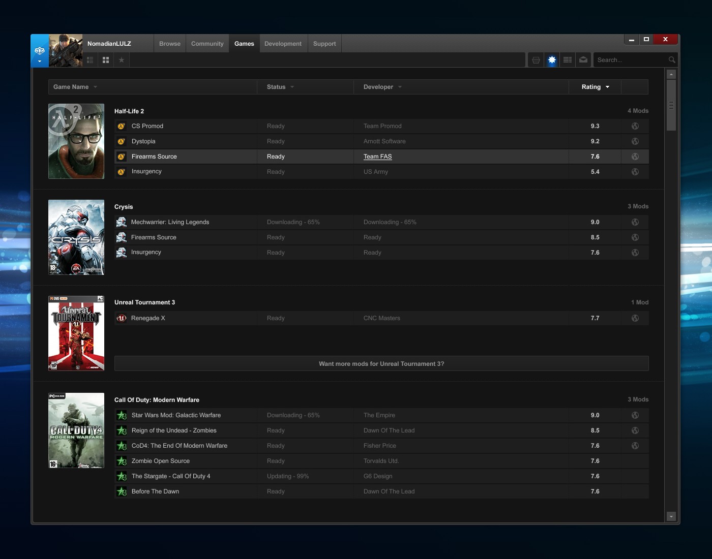
The first of three things I would like to show you all is the play list of the Desura application. The play list features all the games and mods that you currently own, in a single library view. All your games will be sortable and filterable by name, rating etc. An idea that is currently on the burner is the ability to sort your games by the current number of your friends playing, so it's easy to see what game or mod you have a higher chance of playing with a friend at the current time.
The image below shows the art list view, where one can easily find their mods listed under the game they're based on. The art that to the left of the list would be optional, therefore if you wished to have a simplified list where only the basic information you needed was displayed, this is also possible.
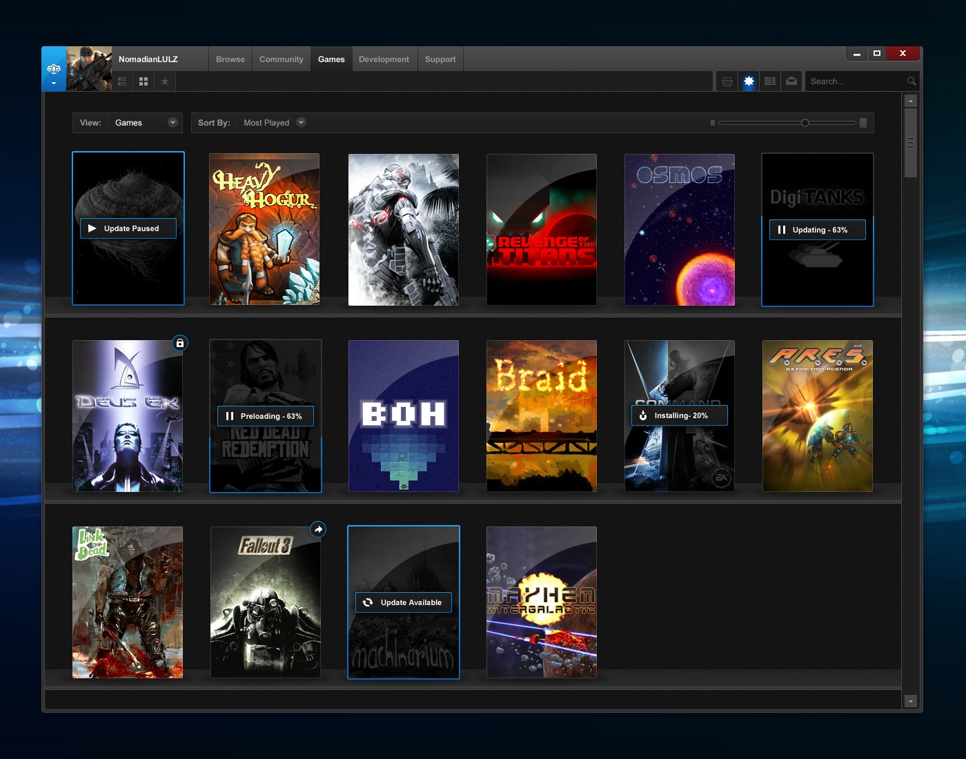
The second view is of the box art grid where those of you who love the eye-candy get to take a new look at your mods and games, hopefully making you feel like you own physical goods when downloading your mods and games. If you want to change the box art to your own custom image then just drag the image you want into the box.
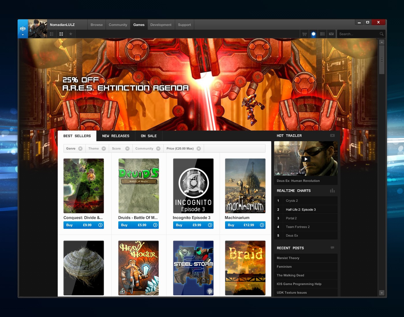
Last but not least is the website. This is the current state of what we think the way you browse games will end up looking like in the new overhaul. Let us know, is this how you really want to browse your games? Does it look like an improvement on the current website or other digital distribution services? Should we focus more on news and rotating through fresh content? The design below features the revamped games page where one can browse the games on offer as well as see real-time data from the community on the right. The top banner, where there is currently the A.R.E.S image, would rotate between a variety of games determined by the editors based on current popularity, new releases etc.
A few key questions we'd love your responses to:
- What content & features do you want to see on a game's profile/selling page?
- What content & features do you want to see on your own and others profile page?
- What application features would you like to see in the future?
Be as creative as you wish when requesting features. Hopefully this has given you all a brief insight into some of the work I've been doing and do let me know if you would like the next post to be longer, feature more images or anything else you can suggest. Any feedback that you could send us is very much appreciated and we will work hard to make a really awesome application that you all want to use every day. I hope that you all enjoy Desura and even if you find things you dislike, please tell us and we’ll work hard to improve it. Thank you for taking to time to read this post. If you would like to keep up to date on future design posts, feel free to follow my blog at www.joshcollie.com/notebook

I love all of the ideas. Go ahead, go, GO NOW! This is awesome. Also, I've always liked having digital items on shelf, like on the second picture. It does add a physical presence to it.
THIS looks so much sexier than Steam. Just saying.
Agreed. The aesthetic appeal alone is fantastic and draws your attention immediately ( as compared to an...all too familiar " cobaltish " grey ). Excellent.
You're doing some great work.
My recommendation would be to remove the blue buy icons under the game covers on the selling page. I've seen that design before and it looks a bit old to me. I think it would be better if the price would fade in whenever you hover over a cover. You could provide a price search filter for those who want to find those that are cheaper.
Secondly, I think showing activity levels of multiplayer mods is a great idea. What if you expanded this concept to activity of every user and provide a meter to show how many users are loading the game up. You could call it the rage meter and alert users when a mod reaches high levels so that we all get an opportunity to get in on the action when its most popular.
Of course due to the scattered nature of moddb international userbase its kind of difficult to be relevant to American users if somethin is popular in Europe. I'm in Asia at the mo so all multiplayer mods are irrelevant to me.
Thanks for all the feedback OisinFX. With regards to the price, I'm not sure how everyone else feels about this but I'd assume that after you have sorted by price, people would like to instantly be able to see how cheap the games are as opposed to hovering over each one.
Good idea for the 'rage' meter too. We'll definitely take into consideration the regionalisation of the current activity levels too. Thanks!
Red Dead Redemption in the second image. What does that mean?
Nothing, we just picked random boxart. In time our aim is to list all great games.
great stuff. also, Firearms Source on Crysis... would be a fun project.
hey guys. i love the ideas.
i agree that you should be able to search by price though. and also wish that under the game you could change a setting so that you could view all the possible mods that can be installed, just for quicker installation.
cheers
If you take a look at the last screenshot, there is a bar above all the box art where you can filter by price range such as $0.00-$20.00. Is that the kind of thing you were meaning?
Steam, be scared. Desura is coming. =3
Your point? AS much as I love Desura now for mod installations, it will probably stay in the backyard like most of the other digital distribution platforms. After all Steam have something like 75% of online purchases for PC... Nothing will stop Steam now...
BUT, I gotta admit, Desura is a community driven platform, and the presentation that is shown here is so damn sexy!
O.o
Going on nicely indeed.
1. Regarding the large header image of A.R.E.S.
Could a particular game profile (A.R.E.S.'s in this example) feature such a layout (with a large header in the background instead of a box) instead of the main page?
2. Could commercial games already paid for on Desura be transferred to your friends (removed from the system and given to others as a gift)? (Borrowing/lending of sort.)
I could only comment on the first point which is that this is an item which has been designed already (if I'm understanding you correctly) but we are just waiting for the redesign to deploy it properly.
Perhaps you misunderstood. I meant whether the design-to-be could be applied to a single game/mod profile (the large banner in the background) instead of the main Desura page.
So instead of having it as a spotlighted mod/game feature on the main page, like here:
Media.moddb.com
The background picture (the so called large header) could be applied to a game profile instead:
Moddb.com
Hmm, or e.g. two large headers - one to put as a top background picture, the other one as the picture contained in the info box (the box with "platforms", "engine", "developer", "official page", "contact" and "genre" info).
Here's a quickly edited screenshot to show what I've meant:
Sagefans.net
Sorry I didn't explain myself well there. I mean it has been designed although not shown here :) It will be something shown in the next series of images. So there will be the ability for a single mod profile page to have a large background banner. At the moment it's just a case of making sure no matter what image is there, the profile still looks professional and aesthetically pleasing to the visitors.
I don’t like the new games page.
The current system has in-game shots and description which gives a lot more information about the actual game/mod than a PR-cover can give.
Maybe an item should be displayed in 3 parts?
[cover][descriptive-Image]
[cover][short desc text]
Where the 2 covers is the PR-cover (it's vertically wider)
Also, about the general design, please don’t restrict-fix the width like that. What do I have a Full-HD monitor for when moddb, indiedb and desura have webpages optimized for, and only for, 1280x1024 or what?
Make it relative, make it adapt to wide-ness.
* What content & features do you want to see on a game's profile/selling page?
Community/Review Rating.
Which friends already own it?
Gameplay Video(s). Maybe even allow community to add videos and rating them, then sorting them by rating.
* What content & features do you want to see on your own and others profile page?
On my friends profile, which games does he have / which games do we both have?
Thank you for all that feedback. Something we will definitely need to do is consider a semi liquid layout for all the users with higher resolutions. It does make sense that you can see more items on a larger screen. It was originally like this as it can be a lot less usable to see more games as it can cause blindness to some of the items on the page and perhaps make you miss games/mods. Great feedback, thanks!
lol this looks just like GOG.com now heh.
A mac version would be nice!
Deus Ex on image? win. :3
First of all, let me say: I really love how Desura progressed and the interface is great! It's lightweight, fast and even beats Steam when it comes to community and mod integration. As for your questions:
What content & features do you want to see on a game's profile/selling page?
- I'm very convinced with what I'm seeing at the moment. User comments, community ratings and reviews, videos, screenshots. Concerning community, it would be interesting to see on that page, which of my friends have the game. Other than that, I'd like to see the release date on the profile and a notice about DRM systems utilized. Those are often a reason for me not to buy a game and I've made bad experiences on Steam because they're not always writing that down in the profile. Should be made a policy for developers that they _must_ give information about DRMs. Concerning DLCs: A separate tab would for DLCs would be nice, in order not to bloat the "release" list. Would also allow for some space so that users could separately rate and review the DLCs.
What content & features do you want to see on your own and others profile page?
- Love it, no ideas right now.
What application features would you like to see in the future?
- I'd like to see an age verification system. I'm living in Germany and we get a lot of stuff censored here, even as adults. What's been happening on Steam lately is that adults bought uncensored games from the UK for instance, but then they were afterwards censored through Steam because the publisher (Activision) was afraid of sanctions in Germany, because Steam has no age verification. If Desura could provide me with 18+ games that are uncensored, it would yet be another USP compared to Steam.
I really like the idea of the DRM information being more prominent. It's an ever increasing worry with gamers nowadays. Good idea.
I'll think about how best to filter the DLC too. Would you be happy with it being under the games section but then you could filter whether to see DLC?
Age verification is a definite gripe of mine on a lot of websites so we can definitely discuss this.
Thanks a lot for all your feedback.
DLCs: I think that could work with a filter. But in terms of accessibility and flow, I think a separate tab on the base game's page could be very useful. If I'm searching for a DLC, the first thing I'm searching for is the actual base game. Sometimes, I'm also not aware what DLCs are out there for a specific game, so it's nice to see DLCs associated with the game (just like you associated mods with the game).
Now, a DLC tab could contain the DLC titles, prices and perhaps the average user rating. But they'd only be links, so the DLC itself could have a separate product page - which would then enable the same kind of social communication for the DLC that games have.
I'd personally rather browse that way than to search for DLCs directly in the games section.
No constructive feedback here, I'm afraid. Just wanted to say that it is looking great so far!
Haha, afraid of what? All feedback is good feedback. Thanks for the comment though :)
Looks like its heading towards the right direction, keep it up ;)
Love the designs, i like the boxart on games pages were you buy it's really good. Can't wait to see this :D.
I'd like to be able to see what my friends are playing and join their games if it's multiplayer. Also, it would be nice if you could see statistics for how many people are playing a multiplayer mod. I think these features would probably prevent most multiplayer mods from dying out 2 weeks after release.
If anything, I'd say that you should take a look at adding more of the social features that steam has. What your friends are playing. What they've recently purchased/installed. How much of that game they've played and who is currently online and what they are playing right now.
I love it.
Bravo
The design is very good! Great work.
Here is a (maybe not so much design specific) idea: why not also support user Maps (which are not part of mods)? Map authors could have a personal site for all their Levels or there could be a place for complete Mappacks? I bet a lot of map authors would be glad to have a place like this to share their projects. Also of course the install process would be simplyfied, and no long searching on the web, which is already great for mods.
good luck on that way :)
I love it.
But now I'm sad at the lack of a PC port of Red Dead.
First of all, I love to sea the progress you makes with Desura :)
But because I currently don't have so much time I just answer your three questions you have asked:
What content & features do you want to see on a game's profile/selling page?
I want to see which one of my friends own this game or currently have installed this mod and also, what their opinion bout this game/mod is if they have reviewed it already.
What content & features do you want to see on your own and others profile page?
A list of "favorite mods" would be awesome or "recent activities" for writing a comment, reviewing a game/mod or installing it.
What application features would you like to see in the future?
Linux Suport and a kind of "In game indicator" or a simpe chat-system like steam owns one (not to "copy" it, just to increase the feeling f the friend-system). Also some kind of binding to the steam-id system to synchronise the ingame status or make use of a kind of "friend-searching" or protocol the playtimes of a mod (i load mods through desura, but still lunch them through steam because so my friends see in which mod I am and not just the "Source SDK") would be really awesome but I think this would be a to big workplace for to small usage for the most people using Desura.
But, what ever you do, as long as I can sea you keep up working I am happy for every change. Perhaps most because I have the big hope of a linux-version xD
Looks very sexy! :O
I love your UI concept. :)
I Like much the design of the first image.
The second is very good if when you click on the game, you can see statics like: hours played, mods installed, friends have this game too, manual of the game, soundtrack, trailers downloaded, if the game is single player game, multiplayer game, coop game, awards unlocked and so on.
Maybe the second, will be the most beautiful if you give this features I listed you, but it is better is the player choose what style want, the first, or the second.
Finally, the third concept have a great catalogue style, much and much more better then the actually style of menu. Is a good idea for me, to insert a tab called "media" and catologue in this tab, all soundtracks and trailer of the game you want to search. Filters for genre, price, platform, community report, score are all good things. I like the covers of the game and the price of bottom. Ye ye, very good!
I've been looking forward to the day these concepts are implemented into desura for 9 months.