In the year 1923, war erupts across Calradia and Balion once more, bringing life to a new age of mechanization, revolution and nationalism, and a fourth era of technology that will forever shape the face of warfare.
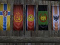

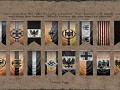


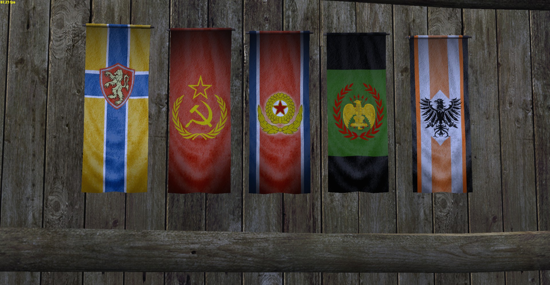
Faction Banners Re-Done
(view original)

Post a comment
Description
Yay or Nay?
"I've been waiting all week and I get some stinkin' banners, well WHOOPTY-DOO!!"
I'll say...yay! But why the black lines in the rhodok flag? why it's not all green instead? I like the Khergit one, but reminds me the national flag from Costa Rica haha
Whoops, didn't remember that Costa Rica had that kind of flag... haha
no swastikas? I think the main swadian flag should have a swastika on it, but the sub flags maybe not.
Maybe a small Swastika under the Swadian eagle? About the Khergit flag, it could be Costa Rica, OR North Korea. And like Thorvaldo said, the black lines in the Rhodok flag does not look very good.
Agreed; if you're going to include a swastika, it should just be a smaller one under the eagle, like the actual 3rd Reich coat of arms. Just having a big-arse swastika on a flag is simply gaudy and tacky.
This comment is currently awaiting admin approval, join now to view.
I like them all as is.
I actually prefer the Swadian flag without Swastikas. :P
I agree with TheIronCHancellor1, the new banners are great and Swadia sans swastika looks just fine.
When are there going to be new banners for players, especially ones for balion players?
In the next update will be Balion flags, and if I'm good lil' worker I can get all of them redone
This comment is currently awaiting admin approval, join now to view.
dat nordic flag b dank.
Without the black the Rhodok flag would look like it's from the middle ages. Overall I find all those flags to be of very high quality. I'm still kinda in the middle wether or not the Swadian flag should have a swa(d)stika or not, thought I think it should appear in their aestethics in some way at least. Anyhoo, all flags are brilliant!
Looks good :D
As for the swastica, I'd say choose a different style, not the usual Nazi one. The Swadian Reich isnt the same as the Third Reich :P
why? That would mean they would have to change the Vaegir-Russians hammer and sickle to something else too.
Only thing I'd change is making the falcon on the Swadian one more prominent. Right now it looks kind of, I don't know, small and wimpy-ish.
Everything looks great in my opinion but I think you should still change the vaegri flag from that generic hammer and sickle into something more. Just look at some soviet republic flags for inspiration or something
1st look so bad ;(.... ei pahal :/
Kai siihe sit tulee kunno suomen, ruoti, norja... lippui?
Siis oikeita valtion lippuja? Ei todennäköisesti, mutta laitan ainakin Suomen, Ruotsin ja Norjan kuntien lippuja.
Omasta mielestä ensimmäinen lippu on erinomainen, ja tuo mieleen Kalmarin unionin ja on tunnelmaltaan ehdottomasti pohjoismainen (ja nimenomaan ei liian pröystäilevä tai suomalainen), vaikkei olekaan oikea lippu. En itse muuttaisi.
Mitä mitä tääällä puhutaan, kultaista Suomea oikein isolla S:llä? =) Mahtavaa!
All the flags look fantastic. They are all of fine quality. The Rhodok flag looks off for some reason. I think its the green field and black stripes. Otherwise it looks very nice.
ps. The Khergit and Nord flags just look so damn good. I wonder what The Confederates states flag will look like...
This comment is currently awaiting admin approval, join now to view.