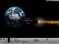
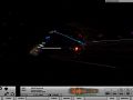
“What would happen if we applied Earth 2150 to Homeworld?” -- Slipstream: The Price of Freedom is just that. Or, at least, was supposed to be just that. What started as a multiplayer combat simulator, ended as the first entry into the Slipstream universe.
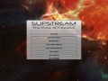
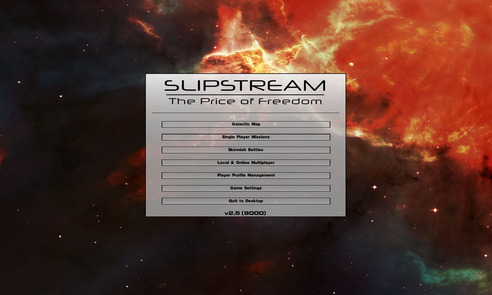
Tweaking the Menu
(view original)

Post a comment
Description
I removed the animated Background, But I'll make up for it. Promise.
Why do you tweak the menu so much? I don't really care about the menu. As long as the game/mod is good I give a *chocolate cookie* about the menu.
It's his mod, and he wants it to be the best it can be.
Yeah, but it's certain that this won't stay for long, you'll sure change it at least five more times.
To be honest, when I've saw the video of Slipstream evolution, there was one background and a menu somewhere about the half of it, which I really like, but then it was keep changing and changing. How could you ever find the one you need, when you're still remaking it over and over again?
Everytime I find the right one, I'll bitch about it 4 or 5 weeks later because I screwed something up, or it doesn't catch the right tone I want to communicate, or it's too gloomy, it's too "happy", etc, etc.
I want people to go "woah" the second they start the game. Not just think of it as a "Menu".
Ok, I understand you. But I've had those "woah" moments already several times.
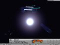
I've played the video again to be specific: 1.0 wasn't bad, I really like the 1.3/1.4. 2.1 looks nice (although I don't think that galaxy map was fitting, but the shadow from the planet on the right side was very nice). 2.4 isn't bad, but I guess it wasn't catching you're idea, when I look back at the others. All 2.5b/c are very good.
Anyway, this one is also very good looking (one of the best), but I can imagine, that it will be gone in the moment you'll start to feel it's all in retro colors or something similar.
Nah this one is staying this time, simply because I've almost finished tying up the loose ends.
Great.
Damn, that's the best one yet!
why dont we figur a way to have the menu like a slideshow / motion like in FX mod or sumtin like that then u can use ALL of ur backgrounds :P
Eh, Maybe. If I find time to do it in the polishing, I'll try it. But this one stays for now.