This is a work in progress!! A conversion mod for Sins of a Solar Empire! Eve online content is owned by CCP, with their permission we are creating a new mod for sins! EVE online content is protected by Copyright © CCP 1997-2015 www.eveonline.com for more on CCP's awesome product!

WIP
(view original)

Post a comment
Description
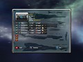
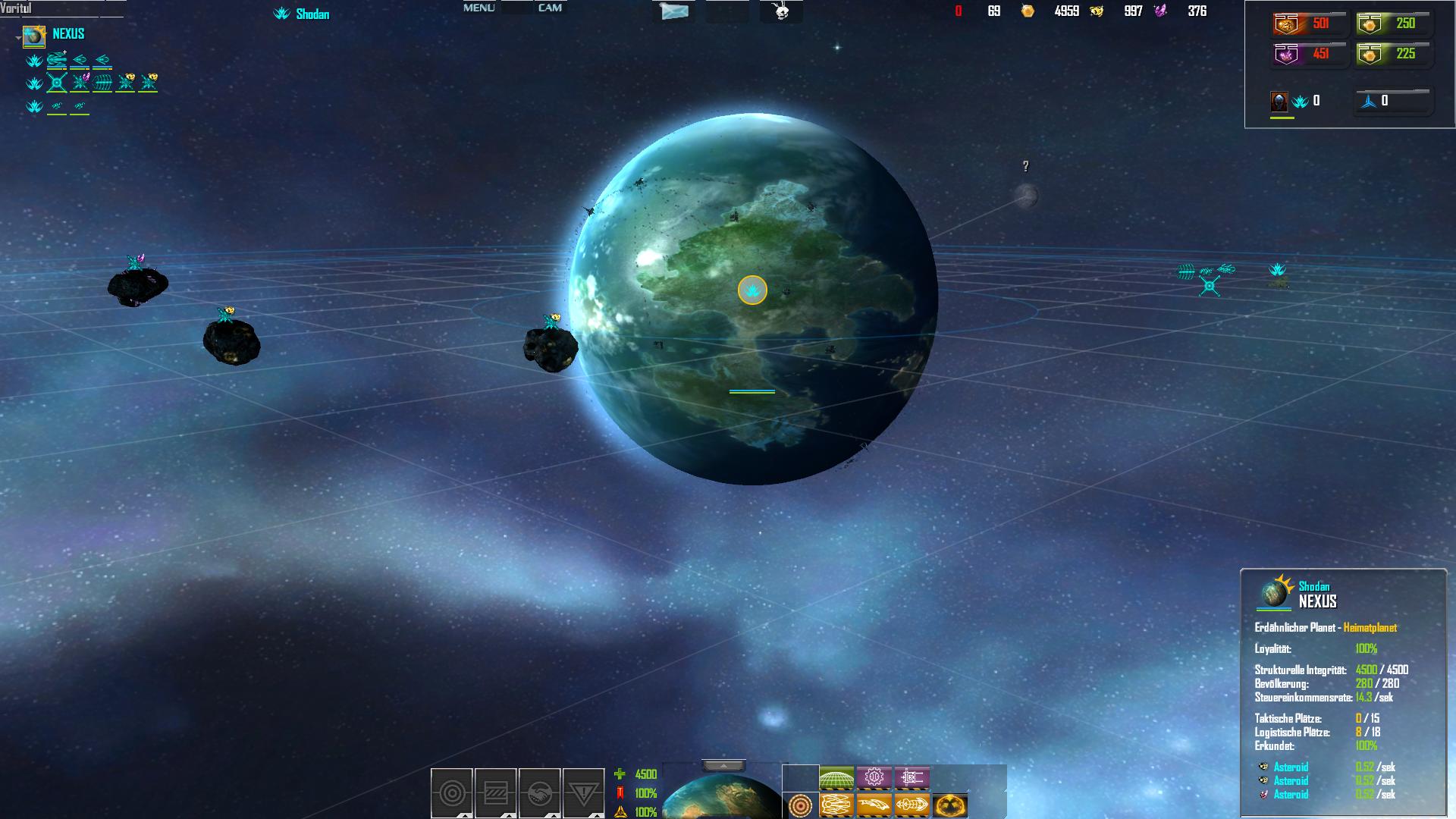
New Ui - build 0.1
...to minimalistic?
nice UI
im liking what im seeing mate!! Is the buy metal and crystal box easy to fix? its the only thing that caught my eye, rest looks great dude, keep it coming!
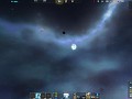
How should it look !?
Any suggestions??
by the way I hate all those icons at the left (the list icons)we should change them...all;)
I think you should still have a slight bar at the top. Just make it mostly transparent. Looks nice though, especially how you changed the bottom =)
I kinda agree with Deth, if we made the effect of a bar at the top would still be cool. Need an icon for the science tree button too! The box for buying and selling stuff, well im not sure, thats your dept. :P
My idea for the oh so annoying pin bar with all the ships and planets is to make a drop down arrow so you can close or open it all with the click of a button.
Nope I meant the symbols...they should be signs - simple so that you have a good overview and can act faster.
I like the little icons on the left, lets you know what is i each fleet and such, as for the UI itself, it looks fine to me.
fixed you can now - close or open it all with the click of a button ;))