Long ago, when the word 'Hiigara' rang only as a hollow dream, the kiith of Kharak never imagined they would walk the Path to Victory. But, when they reclaimed their Homeworld and proclaimed themselves 'Hiigaran', they believed they had reached their goal. How wrong they were. 150 years after Hiigaran landfall, conflict rages across the Galaxy... Path to Victory is a multiplayer and skirmish mod for Homeworld 2 that adds new units to both Vaygr and Hiigaran Races as well as enabling the Keepers, Raiders and Kadeshi as playable races.

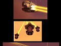
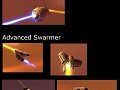
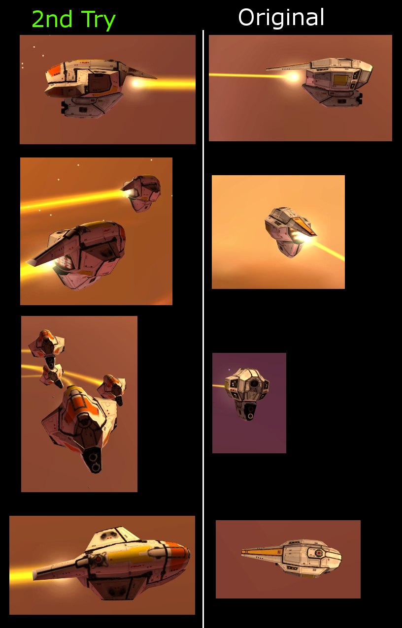
Presenting a new reimage of the original compared with the original.
I'd be interested to hear which one of these two variants you prefer and which one you'd like to see used ingame. If you want the new remake I'll also redo the rest of the swarmers to fit the syle.
The second version, the newest one.
I personally would love to see the remakes of the rest.
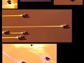
Under way at the moment. Obviously they won't remain identical to the original HW1 ships but the style should be more consistent.
In this case it's not better because it's closer to the original. It is closer, but that's not the reason why it's better.
Haha.. Someones gone cryptic.
I personally like the new ones (/2nd try), definite improvement :)
I did change it in the 5min time, because it went just way too complicated and after a while I also realized that it was very off topic. But if you want, the original text (feel free to delete it) was:
"In this case it's not better because it's closer to the original. It is closer, but that's not the reason why it's better.
Maybe I'm contradicting myself, because you could say that the original Kadeshi "faces" were better designed and this why I cannot simply say that the similarity with the original doesn't mean anything, But I would definitely vote for it even if I didn't know what "Kadeshi" means.
Ok, I should find the easier way to say what I have on mind:
You don't necessary have to keep it close to original just because it happened to look nicer when you did. Only thing you should do is to make them the angrier faces, make them sleek and round and keep some key design elements and then it could look anyhow.
(in moments like this I don't really think I'm making any sense to other people)"
Haha its okay chap.. I edited mine as well in the end.
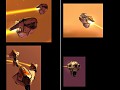
I like the new one also, however, I prefered the 'tail' of the old one, that flat yellow panel I think looks better than the 2nd more angular tail.
I'm not talking about the colour either, the geometry looks better, but only in my humble opinion.
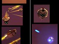
Mololu, I must second a comment someone else has made about the textures; is it possible to have the black lines that separate the white panels be a lot thinner? The black lines seem far too thick or not scaled right, I don't know.
Aside from that, bloody golden.
agreed
They can be made thinner but they're actually about the same width as they were on the original kadesh models (though I may use the lines more than relic did).
I understand what you mean Pouk, the 2nd version is simply a superior model to the first in many ways.
the tail... yes... something I wasn't really sure about. I may change it again in future but it's the least of my problems ATM ;)
Ahh, never mind then, I've learnt that there is a big difference between looking at detail in these pics and seeing stuff in-game yourself.
Hey, all the best with RL too ;)
That is true though I think I could cut back on the black a liitle.
Thanks about the RL, so far everything's running great.
I can't really agree with the black lines.
You see on all the ships in HW2 they are just a tiny lines, yes. But I always saw Kadeshi like they have a shell and they are covered with those plates like a turtle. Like it was inverted and I didn't see the single hull but a structure of an individual armor plates.
Sorry if this sounds stupid but does this mean you think the lines are ok or should be made thinner? I agree on your assesment of the kadesh designs though.
I think they're just fine but it looks like I'm the only one.
Seems so.
Not everyone will ever be happy so there's a point where you just have to say that is the way it is.
Yeah, if you're short on time for this kinda thing don't worry about it. :)
I like the 2nd version with the lines and the thicker tail.
Time for my input:
-like the tail of the first better, as well as the location of the yellow team color, and the "gas cap" (that's what it looks like to me...). Although I like the second versions x shaped "gas cap" appearence more.
-like the overall body style in the second better with the only suggestion being to compress the new sides a little closer to the main body. They just looks a little too prominent to me
-I like the second ones texturing better (in the first one, you put black lines on nearly every intersection of polygons, which I didn't like)
-black line thickness on the second one is fine in my opinion. my only suggestion would be (to add a ****-ton more work for you)... make recesses for the black lines
-there is a slight black line size difference between the body of the model, and the gun
-like the engine textures of the second one better
-I like the face of the first one better. However, I like the 3D modeling for the face of the second better. So, may I suggest moving the eye down a little, and making it slightly larger?
I'd love to recess the black lines but practically it's not feasible with the poly count or the ammount of details on the textures (plus the time issue).
Agreed, the tail and face will need minor adjustments. That can be done fairly quickly but I got a few other things to finish first.