wellcome commanders at the vortex of war which is a mod for generals aiming to combine all factions from ra2,ra3,c&c3;,c&c4; and about 3 tottaly new factions and adding new units for the original factions for the sake of ultimate war.
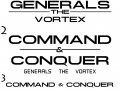


C&C the vortex logo revamped..... .
(view original)

Post a comment
Description
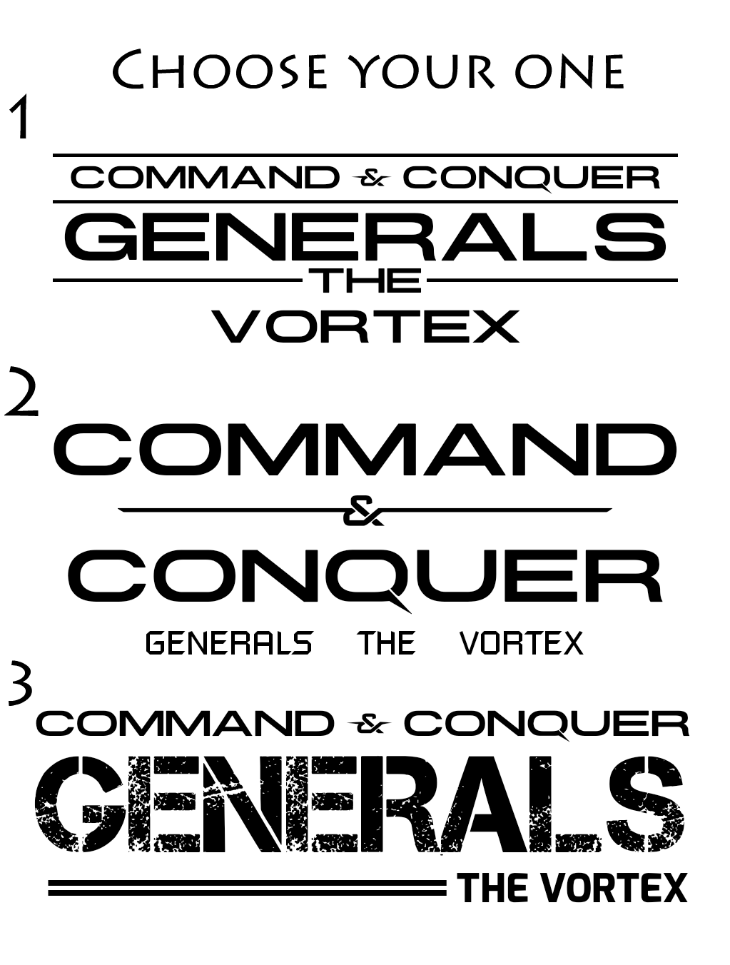
Currently I'm looking at revamping the sides of the mod that looks to me now out dated or low quality for the current standards of the mod as my skills get better over time, at this point I'm revamping the logo itself It was good but fits more to average quality mod, it was directed towards generals theme and the blue skin doesn't suit the nature of the mod that holds every faction in C&C and more, so I made this to be more generic, however I would like to know which would you guys prefer :)
i like 1 and 3
3th is the best :)
1 or 3
1 is best :)
The 3rd suits better!
First one.
I like one or three too. I like one a bit more though.
I like 1 and 3, but if I had to choose, I would say 1.
1 or 3, probably 1
the first one
1 or 3
3
Hilariously, I like the first best, as do most people. That one's pretty much your current logo layout though, now that I look at it.
Actually I changed it with the choosen one which is the 1st about an hour ago xD
3
3 and then 1
Original logo + The vortex please!
Media.moddb.com
2
Really love the first one! :)
1
Second is pretty bad because it conflates "Generals" and "The Vortex", which is kinda awkward when one is part of title and another is the mod name, plus spacing is all wrong.
Third one abandons the more close to iconic font in favour of more stencil-ey font, which is weird when you have a pretty close to original font in the first picture, and the approach to putting The Vortex in bottom right means it captures the person's attention last, which is kinda questionable.
First one, on other hand, is perfectly fine and I suggest sticking with it.
Merge the heading title from 1 with the subtitle from 3, you make the best logo yet for this mod.
1 and 3
i think #1 is much better...