The reapers have returned from dark space. With Earth under attack and the mass relays in a state of chaos from refugees and the councils fleet engaging reaper forces the galaxy is a mess. The outcome is unknown, the warfare is devastating. The galaxy will never be the same.
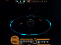
Cerberus UI Remake Final
(view original)

Post a comment
Description
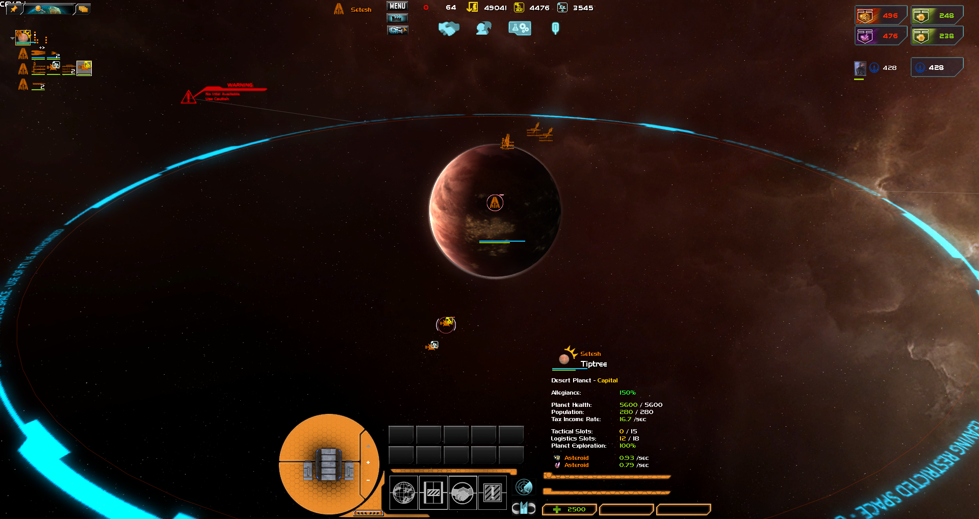
Wasn't happy with the first remake, so I went with a omni tool design for Cerberus, a similar one will follow for Council.
Top Bar layout is complete, but still trying to figure out what to put up there. More Tomorrow.
its impossible to have an ui which is great for everyone especially in a mod where the players allready learnd the vanilla ui. its your mod (i know you are not only making it for yourself) but what i am trying to say is, you guys did a fantastic job, just keep working and if something feels odd later on you can still change it. i have more trust in you as into all big companys like ea or activision.
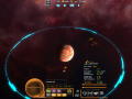
Why the change? This layout feels far too busy and cramped compared to the other one. The bottom just feels too squished and condensed to be useful, rather than the simple and effective look you had before.
The one i had before was so spread out it ruined lower resolutions, you simply couldnt use them. This is based of an omni tool design which is in keeping with the universe. It may look condensed but it works rather well.
i like it
Hey, I'm no modder but the bottom design you have looks good. I personally though would put it in the bottom left corner. In the middle it looks cluttered and distracts from the view. Put it on the left and it would be like you are looking down at since most people seem to wear a omni-tool on their left arms. Just some feedback.
I like this idea. The remake is good, and putting it off to the left (although I don't know how this would interfere with the fleet list) would be less distracting, imo.
I like it!
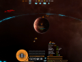
The basic sins UI set up has always felt lack luster to me or too sorta plain.