Half-Life: Absolute Zero is a fan-made modification that re-creates the original ideas and plans from the award-winning classic: Half-Life.
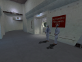
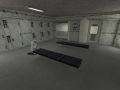
C2A1 - Footfall (Out of Date)
(view original)
")
Post a comment
Half-Life: Absolute Zero is a fan-made modification that re-creates the original ideas and plans from the award-winning classic: Half-Life.
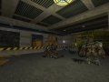
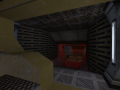
The maps are okay for recreations, but the lighting in every single picture is just blah. Bland. Try using some spice. This one right here is the only one with an actual solid colour. And there still isn't any real appealing thing to it. Get some diversity in there. Just **** **** up. **** it all up. Make it a ******* fireworks show. That will grab some attention. **** yeah. People love colours. **** yes they do.
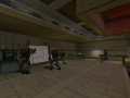
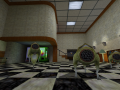
The problem with colorful lighting is that it takes away the visual cues of each episode, either it takes away the player's attention on the areas I need the player to focus on, or quite the opposite, making them pay attention on areas they aren't suppose to be. I can do colorful lighting in most of the areas, but said styling doesn't work really well on the kind of gameplay that Half-Life offers/offered during it's development.
As some sort of "experiment", I gave several people the chance to playtest one of the episodes im currently working on, trying to make the game as pleasant to the eye as possible, using lighting on different areas to tell apart from, using scripted sequences to hint the player about future situations, or just telling the player how is the mapping going to roll out in terms of layout.
While the later worked and had good results, except of the testers being able to break apart the scripted stuff (goldsource isn't the best at making scripted cinematics like other games do), the big problem was on the lighting, it was either they got stuck on some place due to the lighting being different (they tought it had a meaning from the colour, when it was just that I tought it looked cool) or just pointing out too much an area that does nothing but offer the player a fight or just a resupply, or they weren't able to tell blocked paths from an intended path.
Sure, making maps look colorful makes them look nice and attract more attention, even more from a screenshot, but trying to deal with it while playing the map, it really does harm the experience from a casual player, or a first-timer on the map. It also takes away the visual cues from the npcs (telling apart a panthereye because of being red, from a stukabat that is purple) since everything is filled with a colour.
As for visual cues, I was experimenting for making a2a1 stand out more, but the issue was that it didn't have much to highlight, both on retail and alpha, c2a1 was mediocre at it's best, and on paper, the original idea is just bland, you just have to do the same key-hunting like you had to do on c1a4, and the pre-redesign c2a2 was the same, until they remade the layout so it was just a linear layout with trains on the middle.
Ah, yes. I feel quite silly for forgetting that these are based around valve's geometry and style. I reckon proper lighting and colours wouldn't fit these after all. Good recreations either way. Thank you for clarifying that up as well as the input.
*Stimson will remember that.