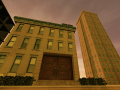
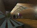
Seven years have passed, and the time has come to descend the mountain once again
More trains
(view original)

Post a comment
Seven years have passed, and the time has come to descend the mountain once again
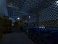
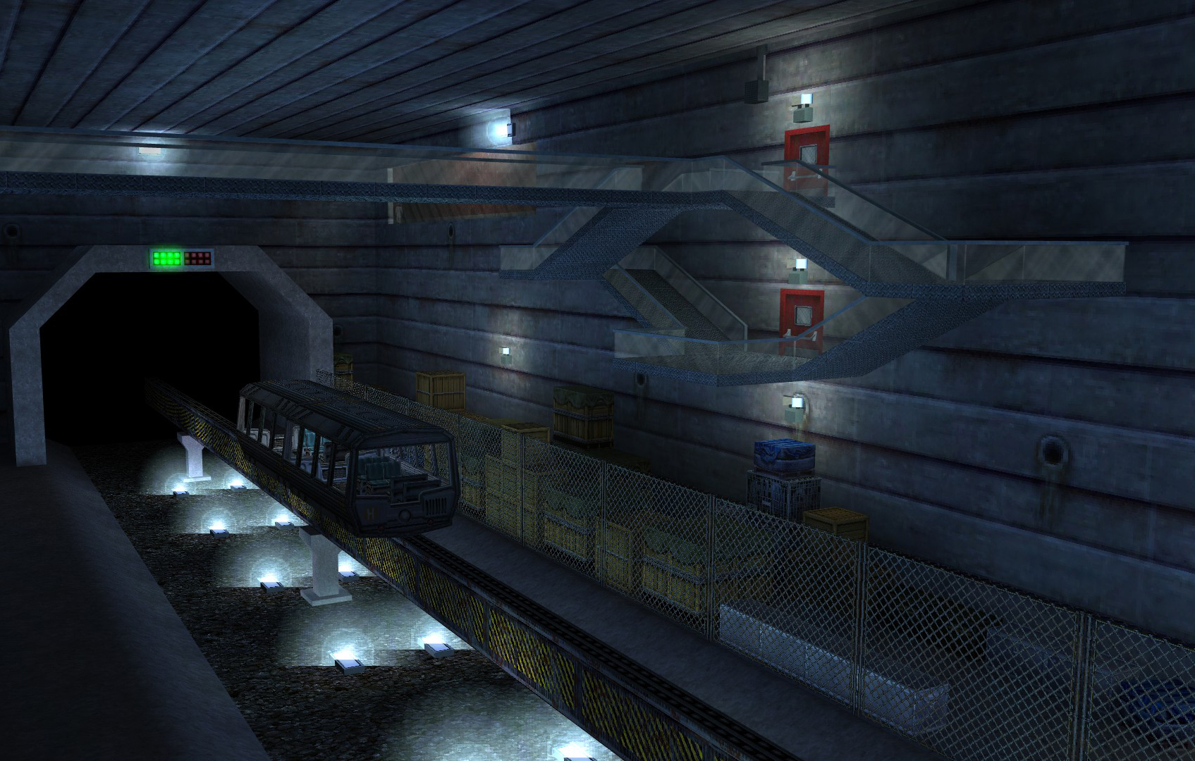
That rail looks a bit too massive...
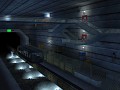
Truly impressive. I really like this one. You could test to see whether it's better or not by actually carving the textures segments and turn them inwards/outwards to see whether that is better or not. That combined with some rounded edges might fantastic. If it's just for an intro sequence thought it's not worth the effort.
Personally I believe some other light colors possibly yellow could be great somewhere. Right now the environment looks very cold somehow.
I agree on the rail size. 25% less might look better.
I’ll try decreasing the rail size and seeing how that looks, thanks for the suggestion. I was going for a frigid look with the blue lights and concrete since this level follows the mountain level I showed earlier. Though some yellowish lights on the floor and ceiling might look nice and brighten up the crate area some since it’s pretty dark right now. Would also compliment the primary blue color.
I used the Washington DC Metro as an inspiration and I might make the wall design like the ones in those stations since it’s pretty basic in this pic. It would be great if I could pull that off.