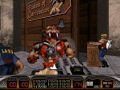
So I decided to redo the font in a more readable face, its readable now and you can make out what letters are what. I thought the first font was okay, but it was rather chunky and 3's looked like 8s among other things.
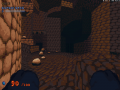
Also replaced the crappy water fall graphics with less crappy ones. Alternative form of water has its own graphic now.
Mapping status.
Map 1 = 90% done
Map 2 = 75% done
Map 3 = 5% done
Map 4 = 5% done
5-12 pending.
Not shown in the video, since I just recently did it, is new waterfall effect. Also the sprinkles of water that popped out are now behaving like GUTS instead of DEBRIS, they fly out less and arc more.