Base Defense is a single/cooperative modification based on horde-style and RPG systems. It's awesome, you should try it ;)
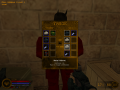
New Weapon Selection Menu
(view original)

Post a comment
Description
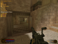
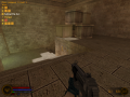
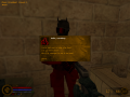
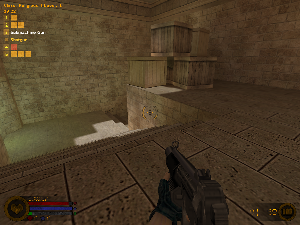
It was a long story for me with changing weapon selection menu, but now it's final version. Looks cool.
Looks nice but, I don't really know if it's better
The old one was blurry (it's goldsrc sprite issue, nothing I could do) and wrong placed (it was over class, level and time info). Blaster pic looked really bad in this menu. I started to add new weapons and saw a new problem, weapon pictures are covering whole screen on 640x480 resolution, it can be up to 6 guns in 3rd slot for now. There was a time without any weapon HUD, just slots and mouse wheel to change weapons (needed to press a slot button several times to get a gun you want), but it was bad: no graphical scheme to remember guns positions. It wasn't problem for me (I remember where all the guns are anyway), it could be bad decision for new players.
Thanks for the comment!
I do see why you need it for your mod, and honestly I like it on the side better.
I like it, looks more neat and original.
Thank you!
I also really like it :)
It makes more sense to use it with the mouse wheel than the horizontal one.
Never thought of it, but you're right! Nice remark!