Base Defense is a single/cooperative modification based on horde-style and RPG systems. It's awesome, you should try it ;)


HUD Concepts
(view original)

Post a comment
Description
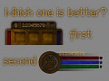
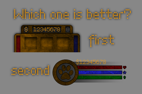
Got two new HUD designs, so which is better?
P.S. These are not final variants, I just wanna know which type looks better.
Второй прикольнее.
Damn, hard choice.
I think I'll go with the second.
I agree, I prefer the second.
But they don't show the same information. The second one has the green bar that the first one doesn't have, and the first one has a '0' near the money and 3 slots for something.
How would you relay the information that the one you choose doesn't have?
Yeah, you're right, but that "0" is just for symmetry. Green bar means experience, which I just forgot to add to the first one.
Anyway it's a concept, not final variant.
For now I got remade second HUD and it looks so nice.
I'll use second one in game, so you will see a screenshot of new fully working HUD soon.
3 slots are for healthkits, manakits and skill indication. In the second one skill is shown in the circle and has no healthkits/manakits indication. But I got the new design which has all necessary information including healthkits and manakits.
Personally I like the first one better, but they are both good. I'm so happy to see more and more updates!
I agree, they are both good, but I like the first one better.
According to the comments: the answer is both.
i dont know, but i think the second one looks best
The second one looks better!
I'd say I'm on-board with the second one, seems to be the popular choice as well.
2