Back into crunch for more polishing before our Future Publishing (PC Gamer, Edge, PC Format, Gamesmaster) preview on Tuesday.
We were very happy to learn that PC Format have extended our coverage to four pages, which is a really fantastic thing to get from a mainstream mag - very gratifying.
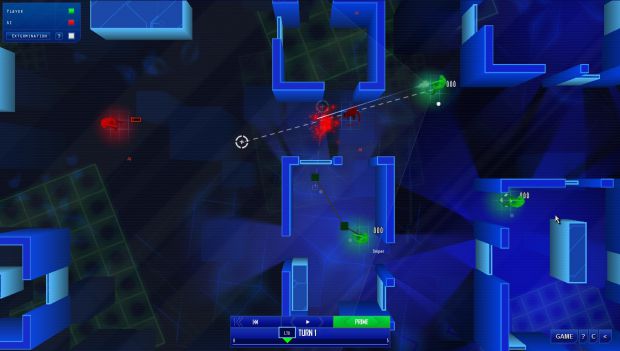
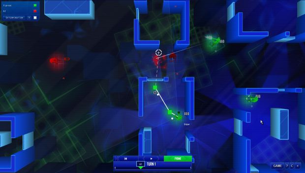
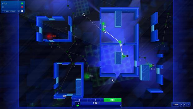
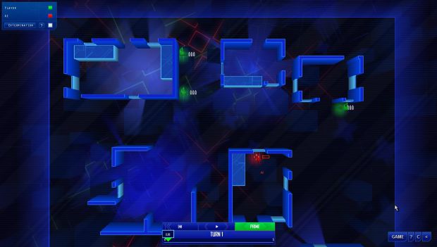
Added a bunch of stuff to the game to make things clearer when a large number of people are playing - one bit of feedback we've had is that it's hard to tell when you're watching a previous turn, or planning the next one, so we've got some big huge glowy text that appears saying PLANNING PHASE! Can't get clearer than that.
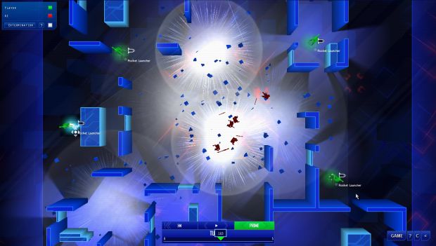
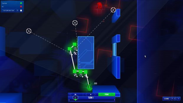
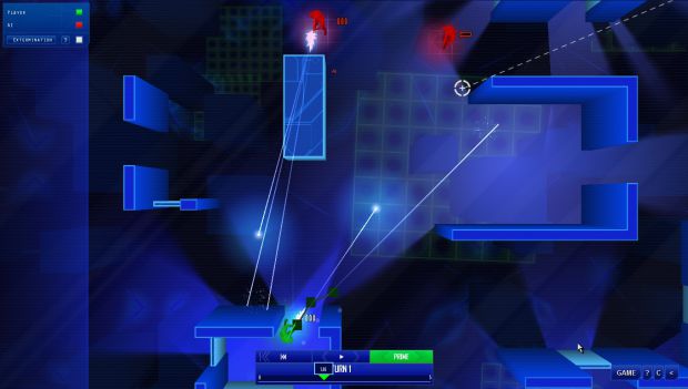
I thought I'd share our screenshot pack with you - you'll be seeing some of these in magazines in the near future...
We're still working on a lot of this stuff, but it's going well.
More soon!


wow it allot like that game on armorgames
hers the site Armorgames.com it funny that u did not make this unless u did but not shere
tell me
xgard, have oyu ever played any of the Rainbow Six games? This is quite clearly a lot more along the lines of those games than Steambirds. I am looking forward a real lot to this. And I can almost assure you it is not a ripoff of some flash-aeroplane-thing.
Ian played Rainbow 6 many moons ago - I have never played it. I'd say our game is much closer to something like Laser Squad Nemesis, but I know people loved the planning stages in R6, so it's nice to have that as a positive association.
i was not saying that jest that the idea is the same with the holl trun sicle thing
We're nothing to do with Armor Games - sorry!
Lots of progress !
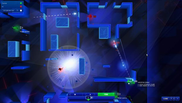
more clear ground and better effects
Good work you all !
Hope i'll get to play this game soon.
Thanks guys. We had a lot of comment on these backgrounds being to bright and garish - I think a lot of people want the uber-pared-down dark and menacing look, so that's what we're going for now. I'll keep you posted!
Dark and menacing? Really? Aww, and here I was looking forward to trippy.
Although the posted screenshots still look sweet!
Ha! I think the right place for some of the more trippy stuff might be for a specific purpose in the single player game; or perhaps with an option for MP. I know that pretty much everyone wants the "basic" blue setup to be nice and simple, there's space for experimentation after that.
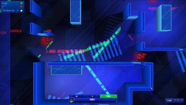
What we worked on today was something based on lights under the level, rather than crazy big neon things; we'll post some shots and vid tomorrow, but I have a strong feeling people will like it. It's...MUCH more subtle, but still kind of trippy. I like it much better as a general direction...
Mate, you're totally wrong when you say we want more menacing stuff, sadly I can only speak for myself when I say this, but take it with a grain of salt then ..
It's about having a *clean* look, it's about having it seem more .. Professional =/ Cleaner look is a better look in my eyes and I'd rather not play games that hurt my eyes from the amount of effects that's going on behind my game
So no, not a menacing look, a *clean* one.
No, I understand that. I just find sparser things more menacing!