Deus Ex: Revision is a large-scale re-imagining of the world of Deus Ex, bringing a tightly integrated aesthetic-oriented approach to the original gameplay.
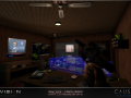

Hell's Kitchen
(view original)

Post a comment
Deus Ex: Revision is a large-scale re-imagining of the world of Deus Ex, bringing a tightly integrated aesthetic-oriented approach to the original gameplay.
NICE
I like the Panama sign. With such The Fall references along with the Human Revolution throwbacks, it really feels like the Deus Ex Saga is coming full circle with this mod. I can't wait for this to come out in (May?) so I can finally finish my first playthrough of Deus Ex.
You have never finished Deus Ex yet? I am gobsmacked!
I only started playing when the Revision Demo was already out. It ends at the cemetery, then points to a map that they haven't released yet, so I've been waiting for this mod to come out to finish the game. I mean, when you start playing with Revision maps, can you really settle for the base maps anymore?
Ah fair enough. You are true. After playing with this mod, the default maps did seem rather bland compared to what they have changed. It definitely looks much better.
Really glad to hear it, that's exactly the impression it was supposed to make (;
Imo the buildings themselves are kinda bland, could use more funky designs and such. Just a thought. :)
Cooking.
Looks awesome!
Love the Page Industries! There should be a Sarif building as well. Maybe a Limb clinic? :p
The ads are full of easter eggs and references, we had to stop at a certain point xD
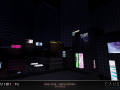
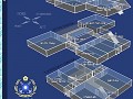
Probably the only screen i don't like. Visible skyscraper wall makes level look like a toybox. I generally like neon in video games, but this is a bit too much, i think it destroys the dark NYC streets atmosphere (or was it intended?). I would tone those signs down a bit, make textures more dirty/worn (like Hell's Kitchen bar logo), may be drop the unlit surface property for some of the billboards and use generic light sources to highlight them. Those two sky windows have flat gray texture that feels "default" and look more like a glowing lamp rather than a window.
In terms of atmosphere we think the overall effect works, especially from street level. The original map was about half the size of our edition, and it worked well atmospherically. When we expanded it, what we ended up with was a much larger environment which, because we're limited in what we can do to add voiced NPCs, ended up feeling sparser and emptier than the original, something we didn't want. The added layer of decoration brings back some of that liveliness to the space; there's something metaphorically appropriate about a moody, empty city street with a neon "Pizza" sign at one end and a bright, well-maintained billboard far above. Basically, the ads aren't quite in line with the original game's presentation, but in terms of the "feel" of the place, they let us have our cake and eat it too. As for the skylight windows, that's an error, and they ought to be appropriately lit. Well spotted!
La cage aux folles lol !
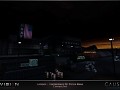
The only thing this is missing is a few windows being illuminated. Like if the lights in those flats/offices would still be turned on. Other, than this I love it.
suggest lower the skyscrapers outer around to get rid of a box feelling.
suggest make some windows of these skyscrapers glow.
Looks very busy.