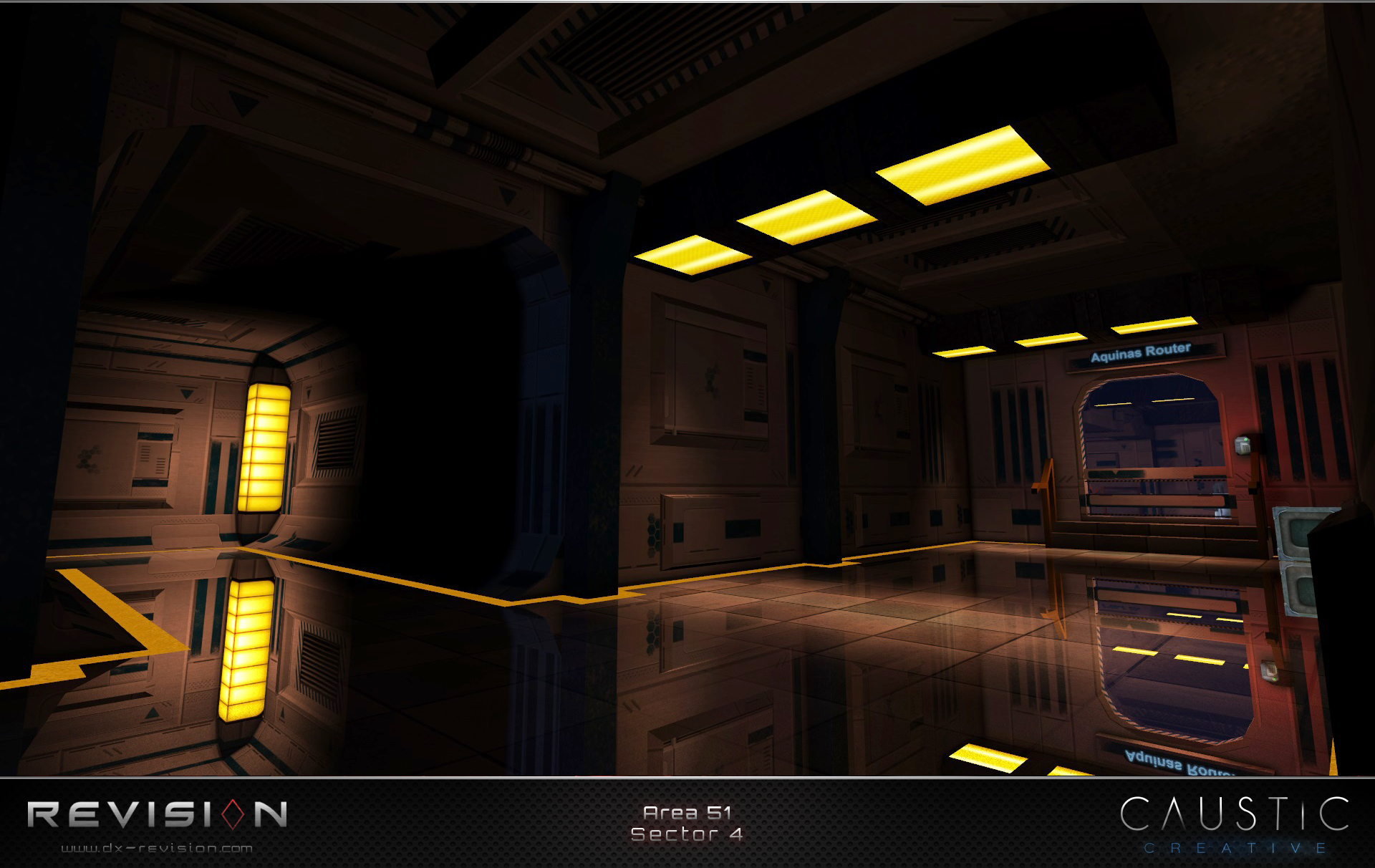
Deus Ex: Revision is a large-scale re-imagining of the world of Deus Ex, bringing a tightly integrated aesthetic-oriented approach to the original gameplay.
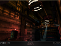

Sector 4 Aquinas Router
(view original)

Post a comment
I hope these aren't the promotional material that was talked about. Just kidding! :P
It looks really nice, and also a lot more sophisticated and polished than the original area. Only 2027 has managed to make Deus Ex levels look this good. Now to see if this or 2027 will look better.
It looks gorgeous but the original level had a better ambience IMHO
Could you tell me why you think so? Was it because the rough grey and white walls made it feel more like a simple military bunker, as opposed to a clean, high tech office like space?
^This
I think that new kind of materials doesn't suit to a (very) old underground шелтер. I mean during the events of Deus Ex, the Area 51 is at least one hundred years-old.
Lol, there's a russian word instead of "Bunker", sorry about that. ^^
That's how I feel, yeah. Also much more use of blue.
I was expecting to get an angry comment, especially since I was whiny yesterday. I was pretty pleasantly surprised.
By the by, are you interested in Dishonored 2?
I thought it looked pretty bland in the original. It's a matter of opinion though. :)
Original: Pasteboard.co
Exactly. :)
Simple is sometimes beautiful. ;) Don't worry, I'm sure your redesign will be appreciated by some fans atleast, and they are technically competent from what I've seen.
Dude, ignore these guys. Your redesign is ******* awesome.
really REALLY shiny floor
Wow, those reflections are gorgeous! How are those even possible on the UE1?
Well, those are the only kind of reflections that UE1 has. :P
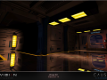
I really like the redesign of Area 51 in Revision - perhaps in large part because the archi reminds me of System Shock 1 and 2 (and by extension, TODOA Moddb.com ). :]
I wonder who their janitor is.
It's 2052. Cleaner bots. ;)
lol... with all the security bots-- we dont get to see the other technology like those cleaning bots .. but i ts hard to put to many things all at once im sure - matthew
This comment is currently awaiting admin approval, join now to view.
Scruffy.
Looks cool :)
I like it a lot it looks really smart.
Looks beautiful. I wonder, is it possible to add this game VR support?
good work, it looks like you beat down ue2 engine with ue1.
2052: mirrors instead of floors.
2053: skirts banned in public.
Shiny.
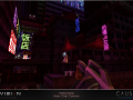
Awesome! For some reason I really fancy that light in the left corner. Sweet architecture.
Time for Denton to dust off the old tap dancing shoes.
lol
The reflections should be slightly toned down IMO.
Yellow is not one of the colors that should be dominant in DX. Bland, gray concrete, metal and brick are dominant. IMHO, game levels should always push to create immersion feel instead being visually cute. Ofcourse there are various opinions, and that;s fine. In DX:HR the room of Adam's girlfriend at game end is one unrealistic room, it is more storytelling than realistic, no one could live in such whiteness... i think... JC Denton's original Unatco office is perfect in it's simplicity to me. Anyway, congrats on making contribution to DX universe.