Designing the UI for an Egyptian adventurer
Any adventurers out there? Mark Arandjus here, lead UI guy for the upcoming Call of Osiris. I’ll give you some insight into the production process of the game’s graphic design.
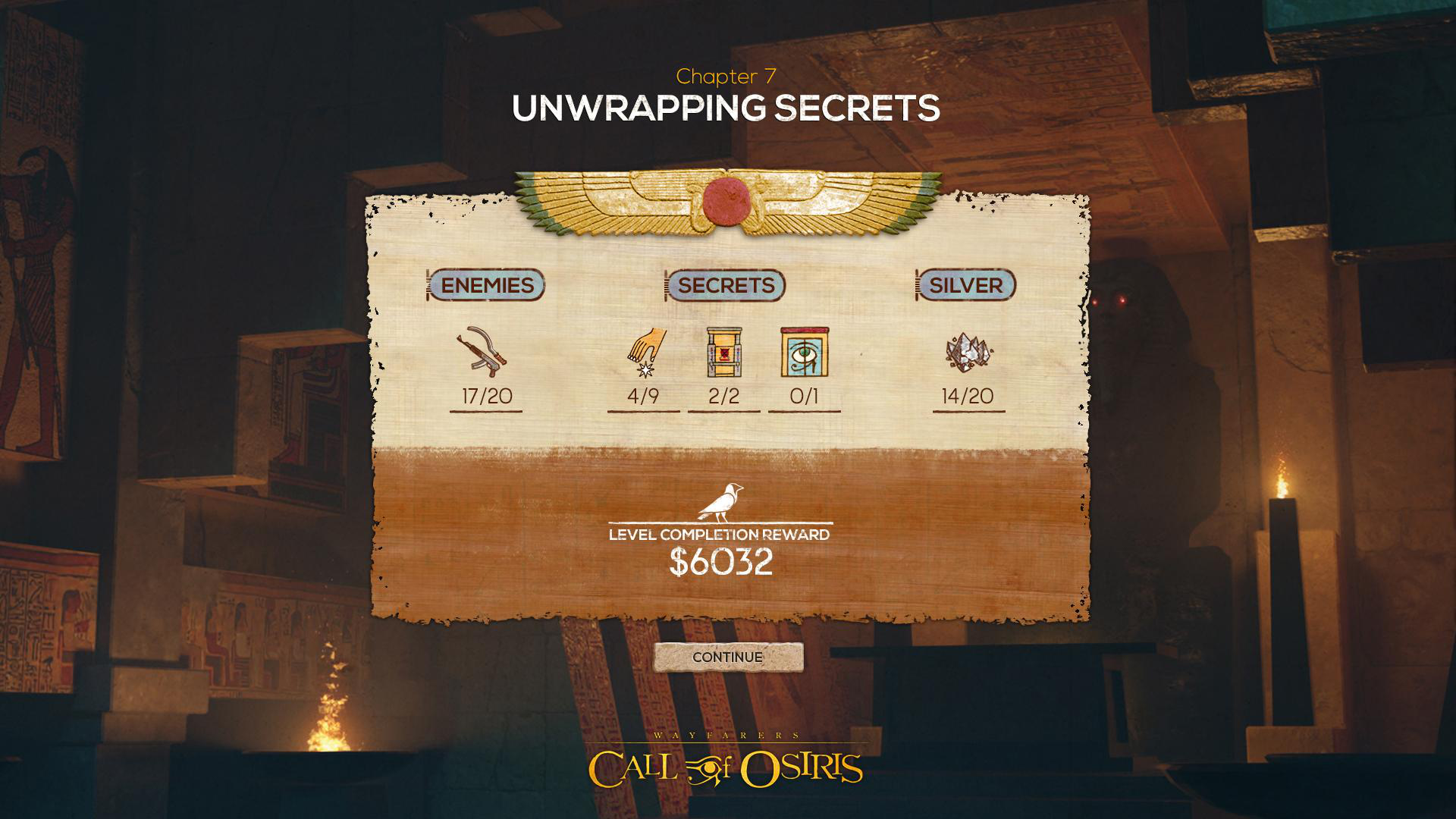
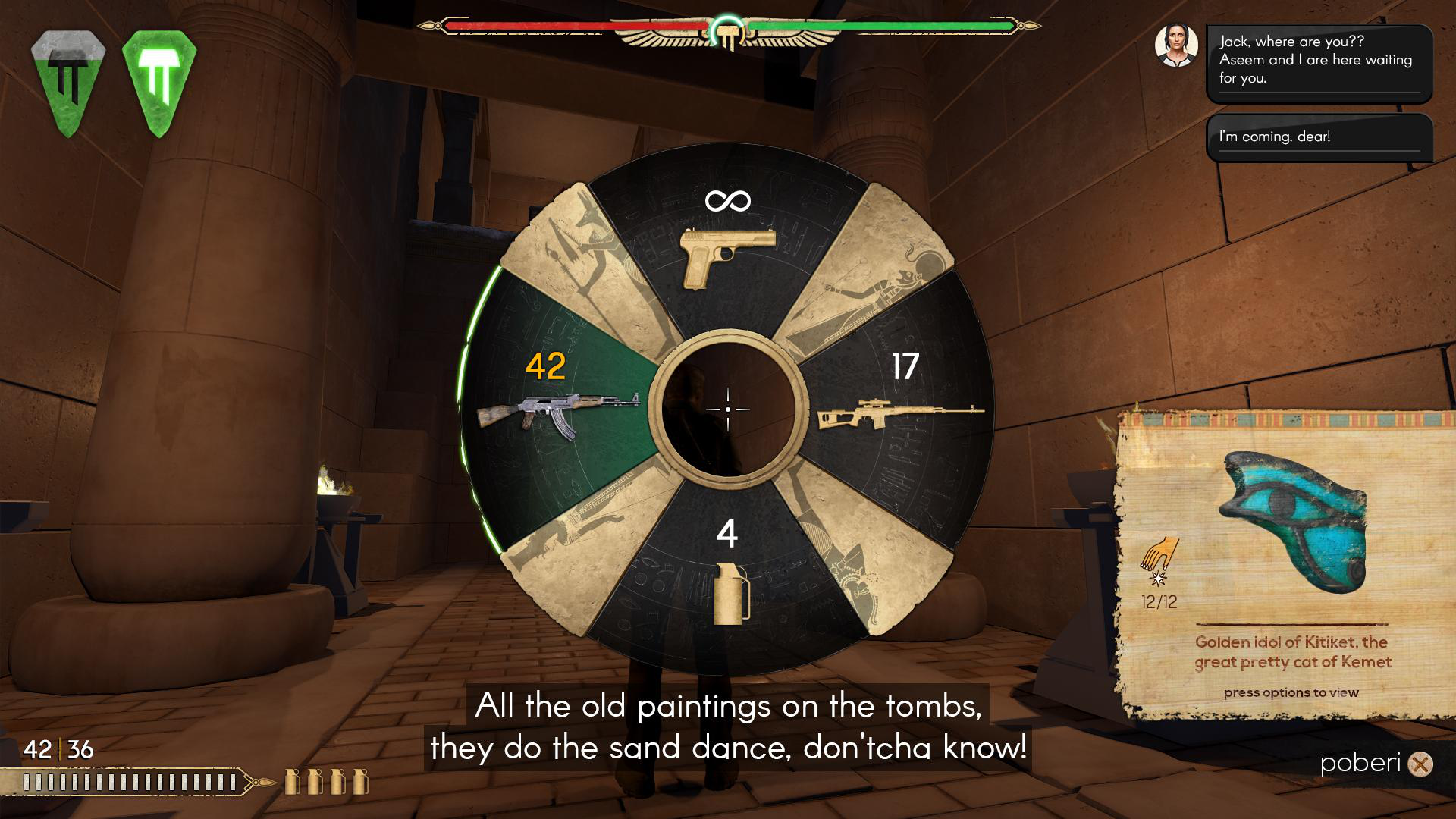
Finding the right design was a constant balancing act between established adventure game norms and creating a unique visual identity. One thing was clear: the design had to have recognizable Egyptian features, so right from the start we aimed to use stereotypical Egyptian graphic design elements. Fortunately, the Egyptians had a penchant for iconography and straight lines. Long chequer borders, columns with hieroglyphics, winged sun disks, unmistakable cartouches… All of this found its way into the HUD’s ammo counters, health indicators and loading bars. The ancient Egyptians solved many of our design decisions in advance by having a distinct graphic identity that lasted for millennia. The dilemma we faced was how to render them.
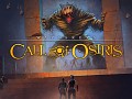
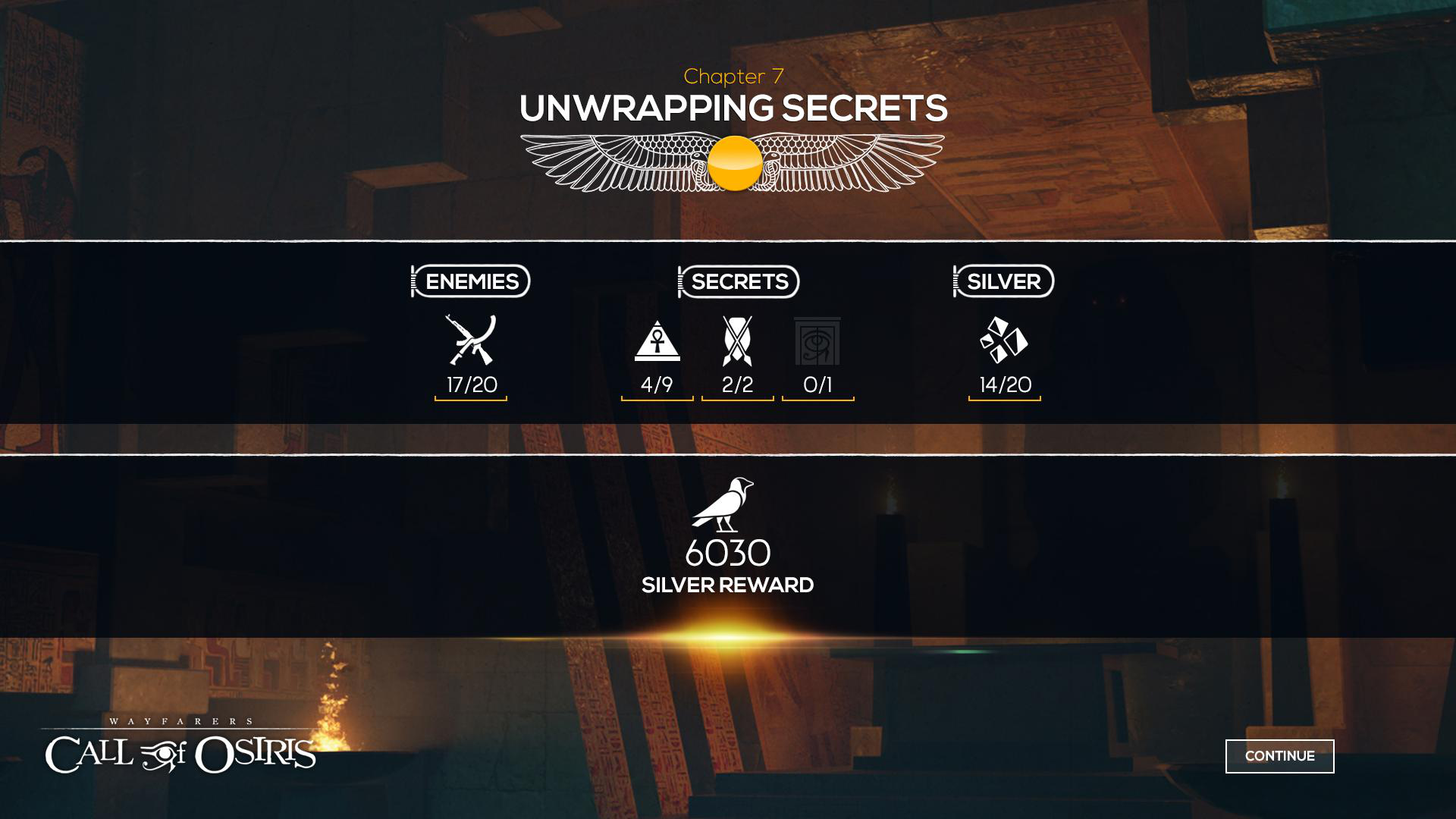
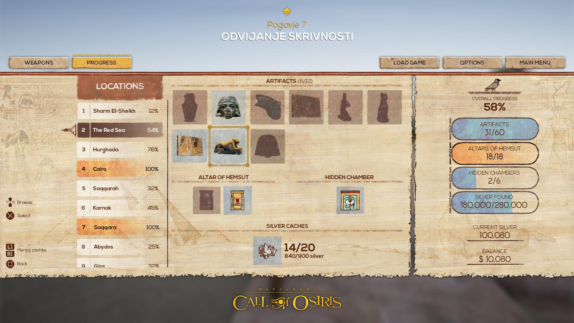
Many modern adventure games opt for straightforward, flat white shapes and silhouettes for maximum separation of the UI from the game and for better readability. This was our initial approach. It was functional and looked nice, but seemed more militaristic than adventurist. And not so Egyptian, with all the clean menus and crisp icons. The ancients were many things, but simple and minimalist was not one of them. We redesigned the UI to reflect the setting: decayed limestone, papyrus, gold, granite – the materials we now associate with ancient Egypt were implemented one way or another in the UI.
[Before...]
[...and after.]
[Before...]
[...and after.]
Much of the game takes place in underground tombs, so beige materials were still light enough to be visible in the dark, while the texture and color (and a bit of black exterior glow) still made them pop in the bright Egyptian sun. The only thing we kept modern was the font, which is white and doesn’t look completely antique. By ‘coloring’ the papyrus behind the letters, we were able to make it more legible, and by adding a noisy texture to the actual font characters, we gave it a patina so that it gives the impression of being part of the papyrus menus.
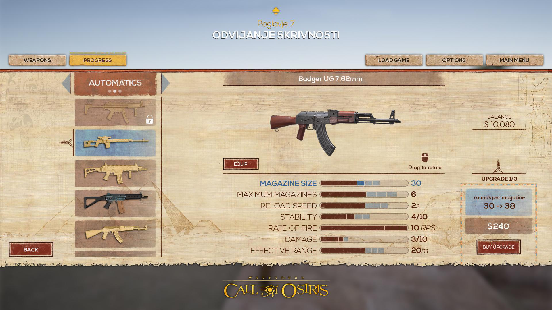
We now had much more room for ornamentation, personality, and detail. Every aspect of the UI became worn and torn, without a single geometrically correct straight line. In a way, this was liberating because we didn’t have to be pixel perfect anymore, and since everything had a texture, it could be exported as one piece instead of doing everything in layers as usual. From a technical point of view, however, we could no longer stretch textures as usual. Before, if you wanted an 800x800 window, you could just take a small 16x16 graphic element and stretch it because it was just a solid color. Now everything had a texture so most window backgrounds had to be exported at the size you see them on screen. Fortunately, some elements could still be stretched. It turns out that a jagged line still looks nice and jagged when you widen it.
We’re quite happy with the redesign. It’s not easy scrapping hours of work, but the new UI is, we think, one that feels much more warm and rich with detail, which mirrors the game’s setting.
Mark Arandjus, UI/2D Artist, ActaLogic
Please consider backing us on