One of the big criticisms levelled at Dissolution was its use of colour (or, more accurately, its overuse of grey). A lot of people felt the mod was far too visually bland.
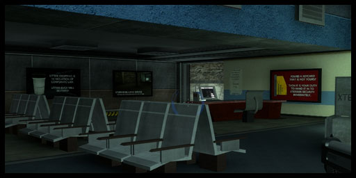
From the screenshot above, it's fair to say that Dissolution had a fairly washed out, murky colour scheme.
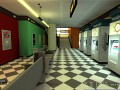
With Lunar Descent, I wanted to make more use of bright, bold colour combinations. Less metal, industrial corridors and more bright, modern interior design. Here are some work in progress screenshots which show this design approach quite nicely:
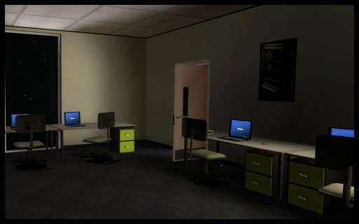
Both screenshots are, of course, not representative of final release quality, but they show what I mean. The rooms are much smaller than Dissolution's, yet the use of white/cream-coloured walls makes them look spacious. Bright colours are used here and there to draw the player's eye and keep the interiors varied.
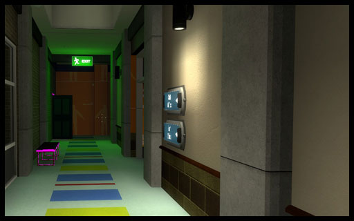
With LD, I've also shifted to preferring warmer colours. So, for instance:
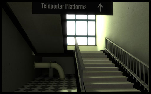
This staircase seemed far too cold for a safe area of the game. It's not at all inviting to players. So I "painted" the walls bright orange and made the walls reflect orange light.
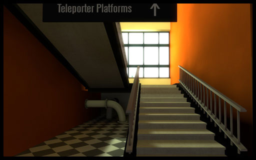
Only the walls have changed between the two shots. Of course, it's all about balance. I want LD to be colourful, bright and striking but I also don't to go overboard and make the environments look cartoonish.
Lunar Descent is currently aiming for a Q4 2015 release. You can follow its development here on ModDB, on Twitter and on our development blog. Both ModDB and the development blog have RSS feeds if you'd like to keep track of development conveniently.
Thanks for reading and please do leave us your thoughts!
Those screenshots look really nice. Also Q4? I didn't expect it that soon.
Hmmm why not making a new moddb page then ? :)
Cool color schemes. Though, I kinda feel that the stair room is too bright. Maybe swap the solid orange with a white wall w/ a thick orange stripe or something?
I think you may have a point. Hopefully, whenever something goes on the wall (pipes, advertising, a wall painting or whatever) it'll look better.