Two months without update? Does that mean we did something great? Yes, that’s what it means. I had some fun deleting all those source-files I don’t like, then I rewrote them. Here is a little chart I made:
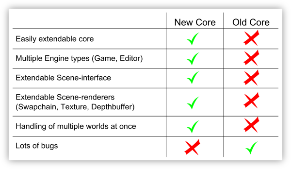
Looks pretty funny, but it is true. The new core beats the old one in almost all cathegories. We can even create little “sub-cores” which run independent from the main-core.
The editor-core is one of those, the game-core will be another one. And there will be more, a profiling-core maybe
There is also a new design of the rendering process. We now have multiple rendering interfaces which can all render different scenes to different targets. With this, we can render multiple viewports pretty easy. Also reflections and shadow mapping will be easier to implement.
The headline says something about GUI. Can we see it?
Sure, here you go (work in progress):
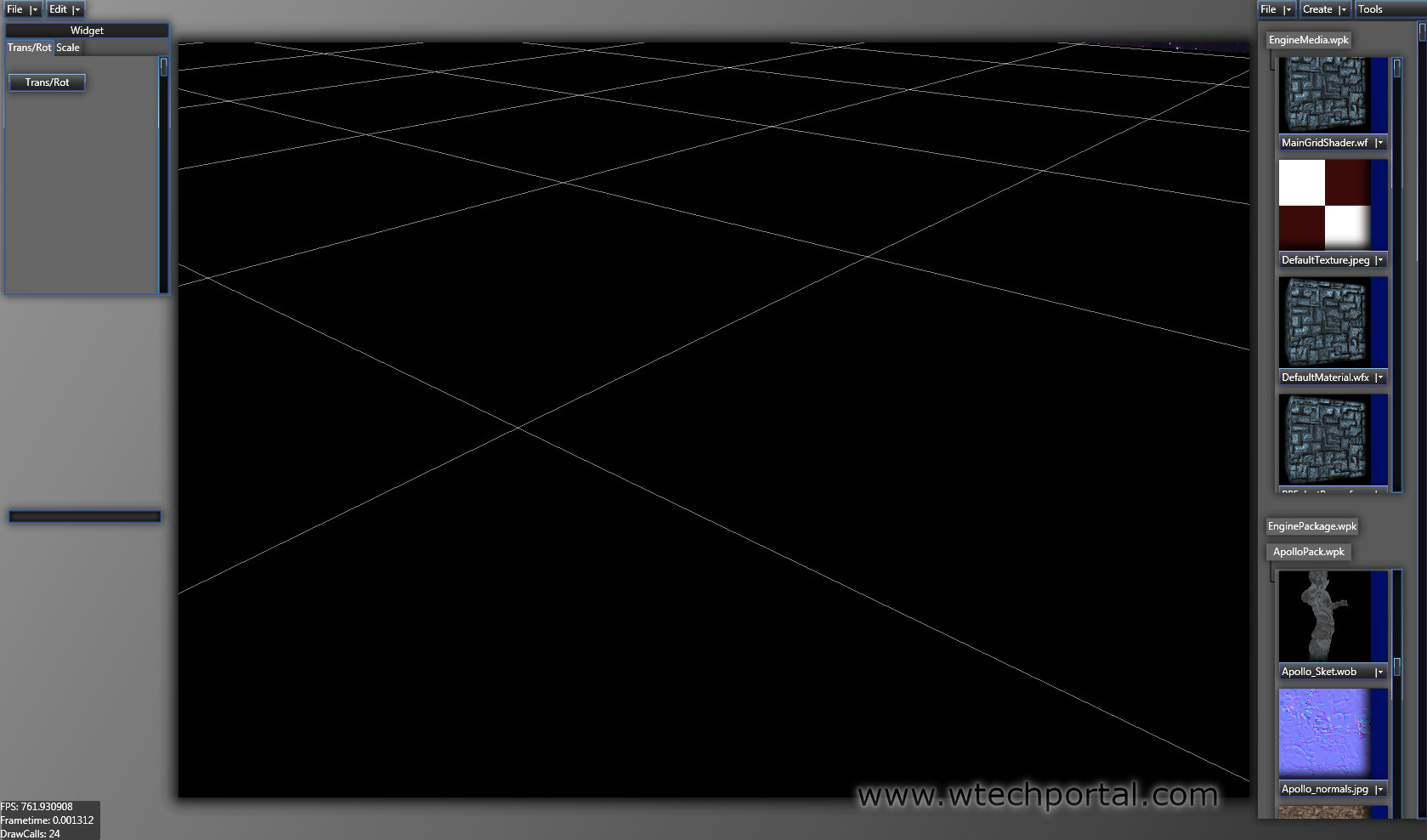
Much better, isn’t it? We now have real preview pictures in the browser! Even meshes get rendering into this little thumbnail!
If you want you may collapse your packages by pressing on their names, this will give you more overview and will maintain a fast workflow.
We’ve also planned to make the browser extendable to the left, so you can have two, or three, or even more rows of thumbnails on your screen. Will work best with a widescreen monitor I guess.
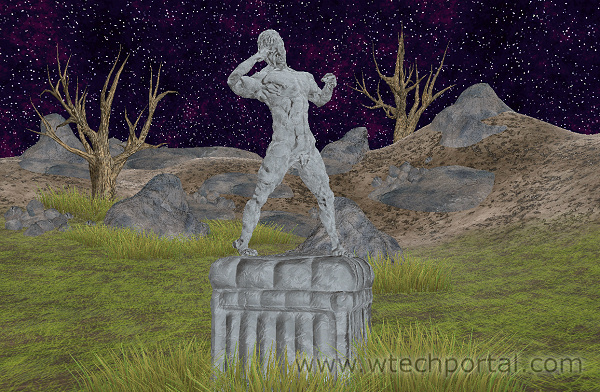
What’s about Rendering? Better Graphics?
Oh yes, better Graphics, indeed. I did not only rewrite the core, I also changed a “few” things here and there. Hell, I even switched the whole lighting model!
And this is why you only get this unlit screenshot without much to see:
I said above that there will be 3 more news postings about the core-update. We will extend this map with each news posting.
For more information, more updates, or questions to the team, visit [w]techportal:
![[w]tech](https://media.moddb.com/cache/images/engines/1/1/146/crop_120x90/Preview_moddb.jpg)
![[w]tech team](https://media.moddb.com/cache/images/groups/1/1/997/crop_120x90/wtechteam_preview.jpg)
Great update.
Yah i agree aswell it does look abit to over the top with the drop shadows etc. It would be better to go for a cleaner look and less effects used :P.
I am away of that there are always people who dislike some style. I personally like it, so I won't change it now. But I have to say, I also like to have the option to customize things in a program, so there will be definitively support for user themes or some kind of settings dialog where everyone can set up his own style.
That would be a nice side point for my Todo-list to work on when I have some part of the code which seems to hate me ;-)
I agree, as a UI designer and future tools developer it makes me cringe. As a tools developer, your number one focus should be usability.
Ehm, I think there is a big missunderstanding: We are focused on usability! But the whole GUI isnt finished yet, even the browser on the right hand side has not reached final status. On the left handside is only a placeholder for further boxes.
[WuTz]! has written the whole Framework by himself so we are glad that it is working properly and we have decided to give it a more modern and dark look, but we will not waste any space for effects or make it more complicated because of style-elements. Things like shadows and the whole color scheme will be adjustable;) And as already said: most elements arent integrated by now. But we wanted to present you our own framework and to give you an idea how it will look like. Don't worry about usability;)
I dont see any thing wrong with this editor, its a work in progress right? slap in a few more view points and some more tools and it looks ready to go to me. I mean we aint talkin about the next maya or 3d studio max here(engine looks really good though).