Greetings all,
This month I managed to get a lasso around Conner, one of our jack-of-all-trades devs who bounces between making models, producing 2D art and helping out with other aspects of the mod. Conner is the artist responsible for those wonderful renders you will have seen, and he is responsible for a great deal of the mod's presentation. For the re-release of AOTF, he has been placed in charge of the overall design of the TOS Federation, which has certainly been a challenge. Obviously with the budget The Original Series had on hand, we didn't see much of Starfleet beyond the Enterprise herself, so Conner has had to draw from various sources including books, fan groups and his own imagination to put together an aesthetically consistent faction design. And, personally, I think he's succeeded.
I'll let him describe what he's been up to.
__________
Hi I’m Conner, one of the artists on the Stellar Parallax team and this article is going to cover how we've gone about designing the look of the TOS Federation faction for Ages of the Federation. This is going to be an in-depth piece covering not just the ships but stations, UI and other little bits that give the TOS era that distinctive look.
Matt Jefferies has a lot to answer for
The two most influential designers during the TOS production were Matt Jefferies and Wah Chang. Between them they designed the ships, props and sets of the original series but it wasn’t created in a vacuum. Jefferies worked closely with NASA designers to understand and extrapolate what future space travel would look like. All whilst keeping it grounded in reality (for its time). This was combined with Jefferies' World War II career as an airman to further sell that this was a functioning place. For example, all the personal quarters on the Enterprise had a computer terminal in a time when everything was written down and documented on paper.
The aesthetic may be dated but the look is iconic, so as mod developers how do you make something that looks so out of place work nearly 60 years later. Then to further complicate matters, reconcile that with Enterprise, The Motion Picture and Discovery (Discovery is a different matter but we’ll get to that). That’s no easy task but thankfully it’s not a total vacuum, licensed works, fan designs and period art work means we have something to draw on. Luckily they all have very similar design features to work off too like:
● Round Bussard Collectors
● Two nacelles
● A deflector dish (Usually round)
● Cylindrical shapes
● A clean and uncluttered texture
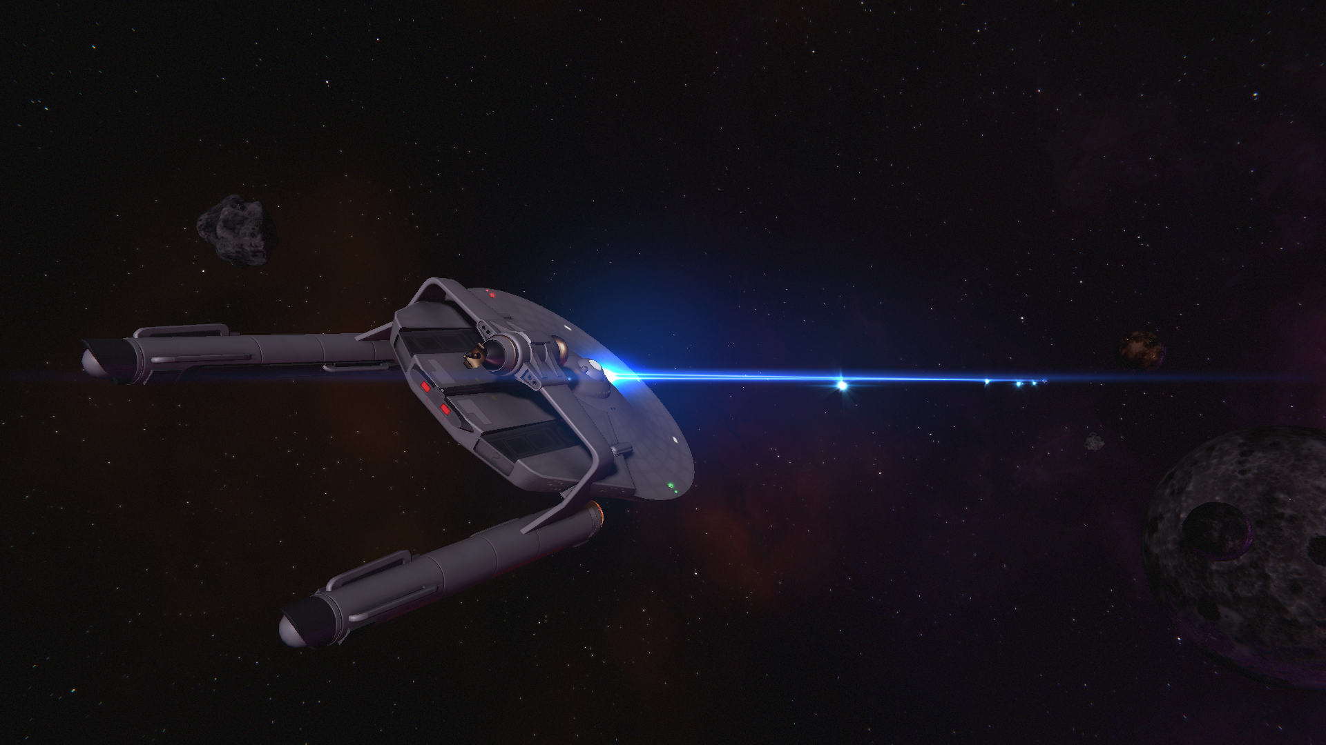
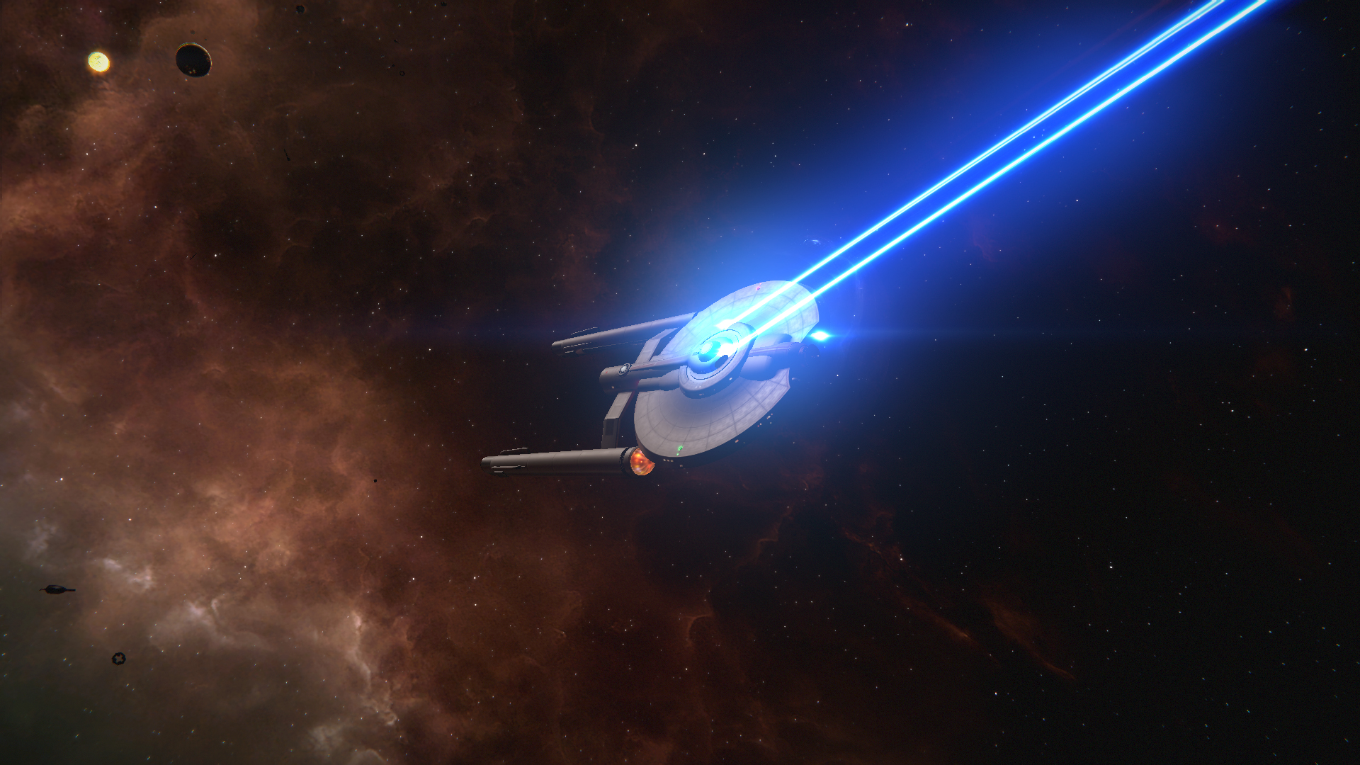
That’s a pretty set and general gist but not limiting, in fact because we only ever saw ‘one’ TOS starfleet ship it gives some good range to have some freedom but keeping to the rules. So let's look at a ship that received ‘TOS-ification’ by Max, the Miranda-class. The Miranda has been around since 1982 and as a result is firmly implanted in the Star Trek zeitgeist.

The terraced saucer, roll bar and underslung nacelles are the defining features of the class, so how does that translate? Seamlessly, arguably. The shape is mostly the same but it’s the little/medium things that make it stand apart. A deflector dish in the style of the Connie is where the torpedo launcher is, the bridge dome, saucer and nacelles are also taken from the Connie but the notches are redesigned to be more prominent. The TOS “Miranda” has a long history, with designs like the Surya and Anton being around for almost as long. However we wanted to tie into the TMP era so a “Vanilla” was selected.
Fundamentally however the design is still recognisable without being derivative, which has been a key aim when we choose and build what ships we want in the mod. When we looked at the Agents of Yesterday for STO for TOS designs there were definitely ones which stood out as unique but also ones that felt like filler. The Perseus-class from STO: AOY has made it into the mod as it strikes a great balance between TOS features and unique aspects like the huge phaser balls on the front.

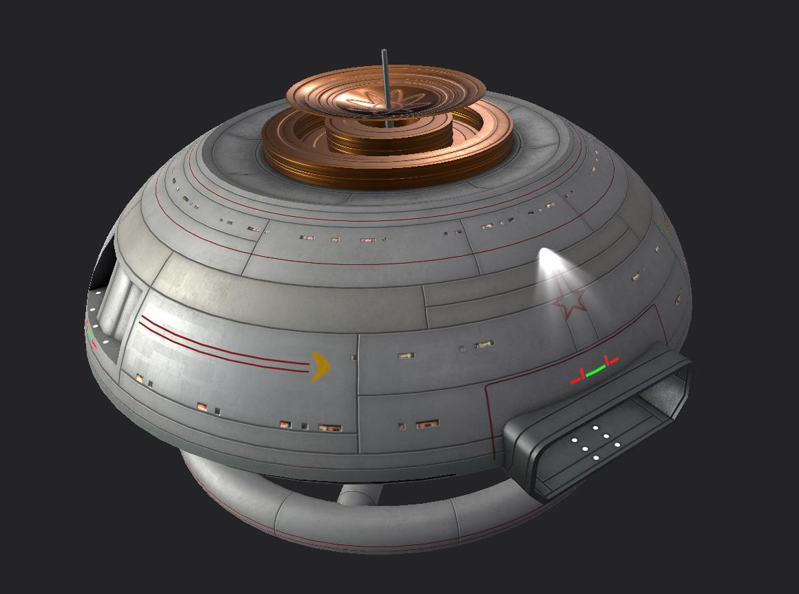
This has also extended to the stations. With K7 the only original station seen in TOS we’ve had to look around for what might be suitable. Vanguard has been implemented as it's a great predecessor to Spacedock seen in ST3. However we’ve also created a slew of original designs to beef up the roster. Again, following the basic ground rules we’ve got a good selection of stations already done with the rest on the way. Heavily inspired by NASA concepts of the 60’s and 70’s to maintain the design language of the era. Plenty of tubes, curves and simple shapes combined with that clean look really completes the overall feel of a true TOS faction.

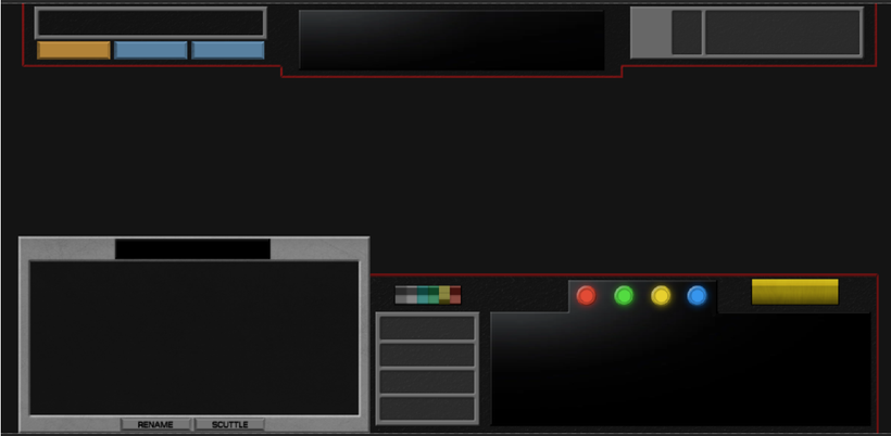
The next bit I want to discuss is also the UI, Hobbs has worked incredibly hard on having it look functional without being tacky. Incorporating many of the defining features of the Enterprises computer consoles. Like Jelly bean buttons, acrylic black surfaces and various switches. There is a preview below which shows the progress being made towards it. We’ll cover the UI in greater detail in a separate article.

To conclude we’ve embraced what TOS was for it’s time and by drawing from the influences and aesthetic of the 60’s we’ve hopefully created a faithful but still visually appealing faction to play with. In regards to Discovery, that will be a separate article, going through the various thought processes for the direction of the ships we’ve chosen to implement. As well as how we’ve reconciled it onto our own mod.
Thanks for reading and see you in the next one.
__________
Thanks, Conner.
Personally, I feel that the TOS aesthetic has a certain timeless quality. Look up records of the early aerospace experiments, the space race and mid-Cold War aircraft, and many of the designs used still look pretty cool today. The Bell X-1, Sputnik, Vostok-1, Apollo 11, the F-86 Sabre, the Lockheed A-12... the futurist aesthetic of the mid-20th Century produced a great number of beautiful real-world designs. Honestly, TOS could have drawn inspiration from worse ideas.
We'll be back soon with another update.
Till next time, stay classy. Or don't.
- Orion


Small correction, the STO expansion is 'Agents of Yesterday' not 'Yesteryear'.
Excited that you added the Perseus design, and the Vanguard/Watchtower class.
WOW! Great update. I came to see if maybe there would be a 'Christmas in July' type of thing waiting.... but close enough! I love all the new models and the UI looks like it going to be super cool to have in game!
And this is what's missing from alot of new Treks like Disco and Picard, passion. Passion not only for the project, but for the property, as well as paying homage to what came before. This is some fantastic work.
Also, personally speaking, I just laugh when I think of Discovery. Just another parallel timeline as a result of the numerous incursions from the TCW, I'm sure Daniels will eventually clean that mess up.
There's lots of passion in the Discovery and Picard. It's very clear watching any of the BTS materials.
Nah I don't see it. Whatever happens behind the scenes is all well and good but the finished products I found to be incredibly lackluster, and as far as I'm concerned best left forgotten or relegated to a parallel timeline, especially in the case of Picard.
I'd rather it not, I really enjoy both shows.
Totally agree with the timeless quality of the TOS aesthetic. I actually prefer the original Enterprise to several post TNG designs like the Enterprise E, though the D will always be my favourite.