Half Life 2: Raising the Bar REDUX: June 2019 Update
Hi, everyone. RTBR has ticked along just fine since our last serious update, and though it took time to revert the changes made by the April Fools update – not really, but still – we got back into the swing of things very quickly. We’ve got big things to show today and some nice map progress as we continue to refine chapter one in preparation for a release. In light of complaints about having to scroll through too content-rich an update, we’ve made sure to make the renders and images in this article a little easier to digest. Welcome to the June 2019 update. Let’s get started.
New Team Members
Firstly, I’d like to announce that the RTBR team, as usual, has increased in size since the last update: Green_Alexander, our new hard-surface modeller; Skorly, our new mapper, who will be working on the Wasteland of chapter two; Robert Zagyi, who is our character concept artist and whose work you’ll be seeing later in the update; and Peeps4321, who is working on animating some of the custom creatures we’ve got in the mod. Someone who has joined after the video was put together but before the update was put out - or rather, rejoined - is Cosme. We're all incredibly excited to see him back to work - he worked on the teleporter, sniper rifle, and tau cannon before he required some time off. All of them have already done great work on the team and whilst it’s not ready for public showing yet, we think they’ll have great stuff to show by the next quarterly update.
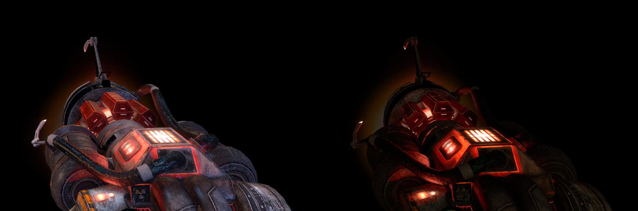
Recon Scanner
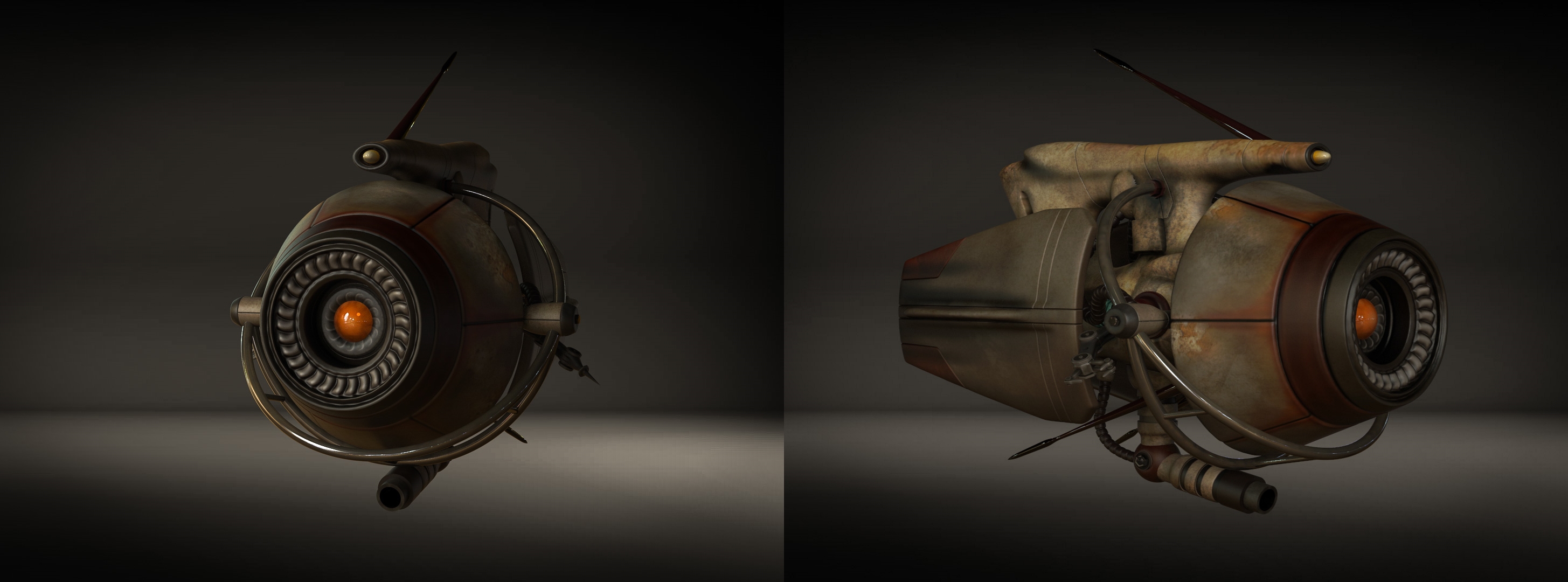
Recon Scanner Renders
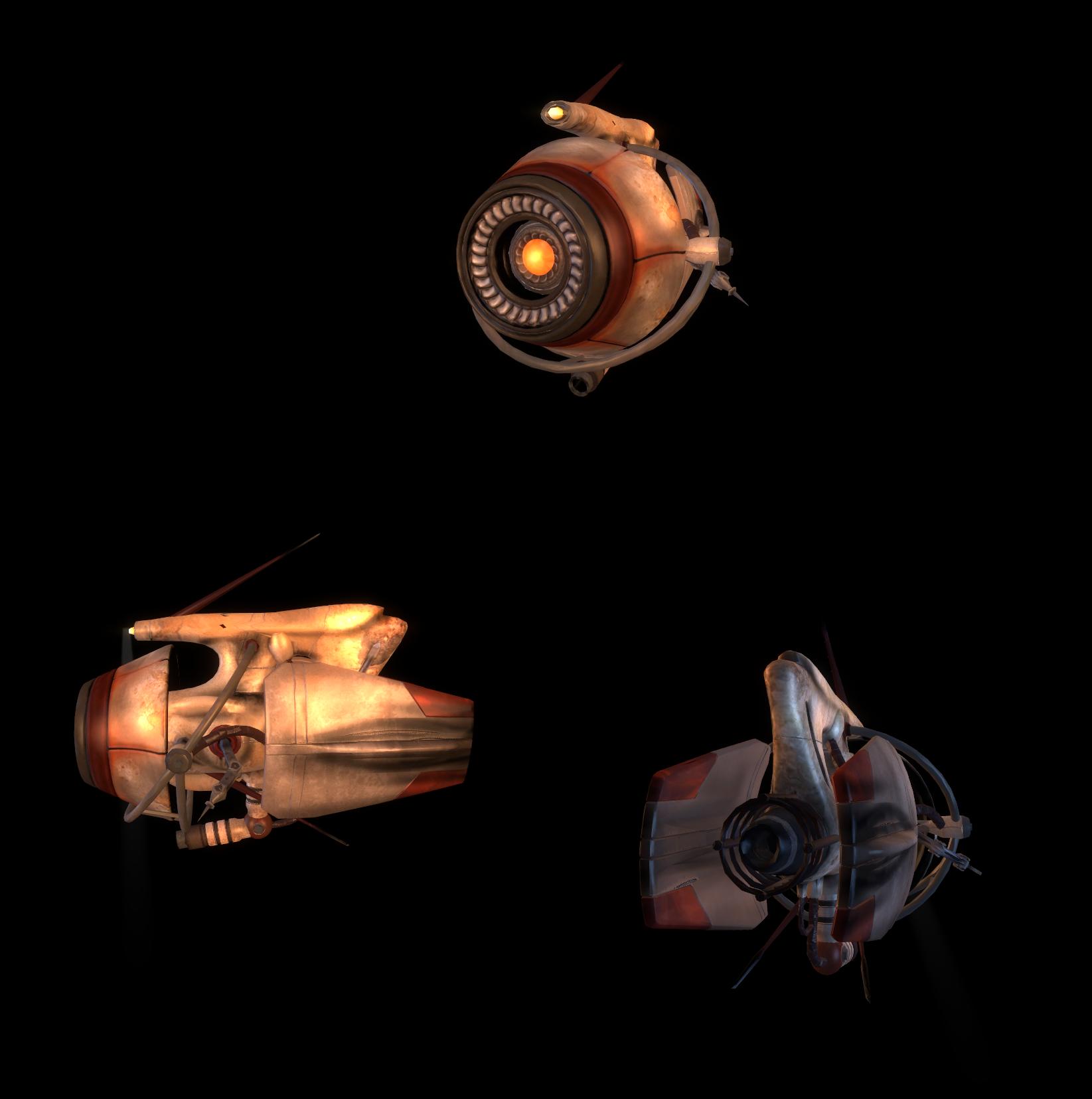
Recon Scanner In-Game
We teased some front-shots of our new recon scanner in late April, and, as promised, we’ve got more shots to show here. Our recon scanner was based off of a number of cut designs for the city scanner, including the well-known combot, but also being based off of more obscure scanner designs. We like how the melding of a variety of inspirations has resulted in a replacement for the city scanner that matches the tonal style of the mod whilst also being a familiar call-back to iconic designs of the past.
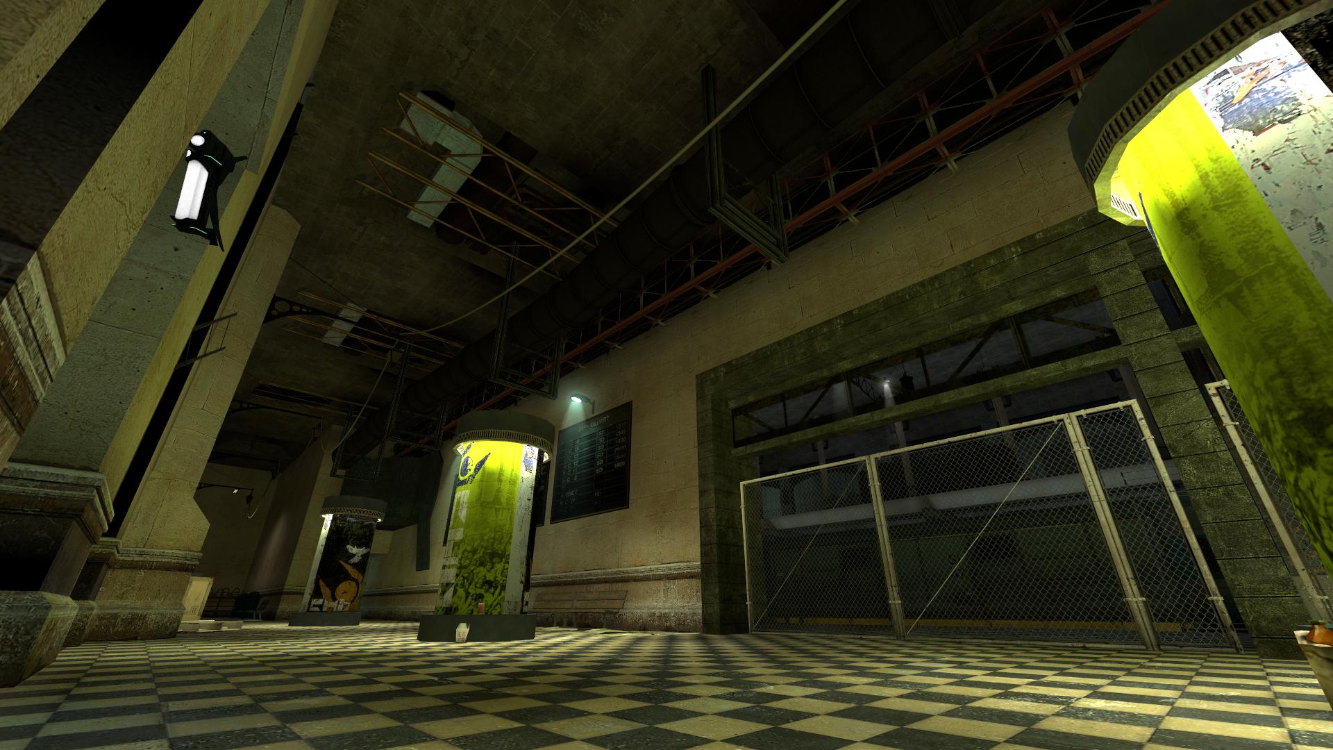
Arcade Progress
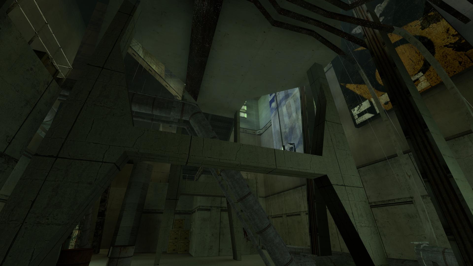
With most major areas in most maps already well-detailed, lots of effort has been going into refinements into smaller but nonetheless important areas elsewhere. The underbelly of the manhack arcade was desperately in need of attention, and this shot demonstrates the greatest of these improvements. We’ve never even shown this part of the arcade due to it being in so dire a state, but with recent improvements by our team, we think this and other areas have begun to shape up nicely.
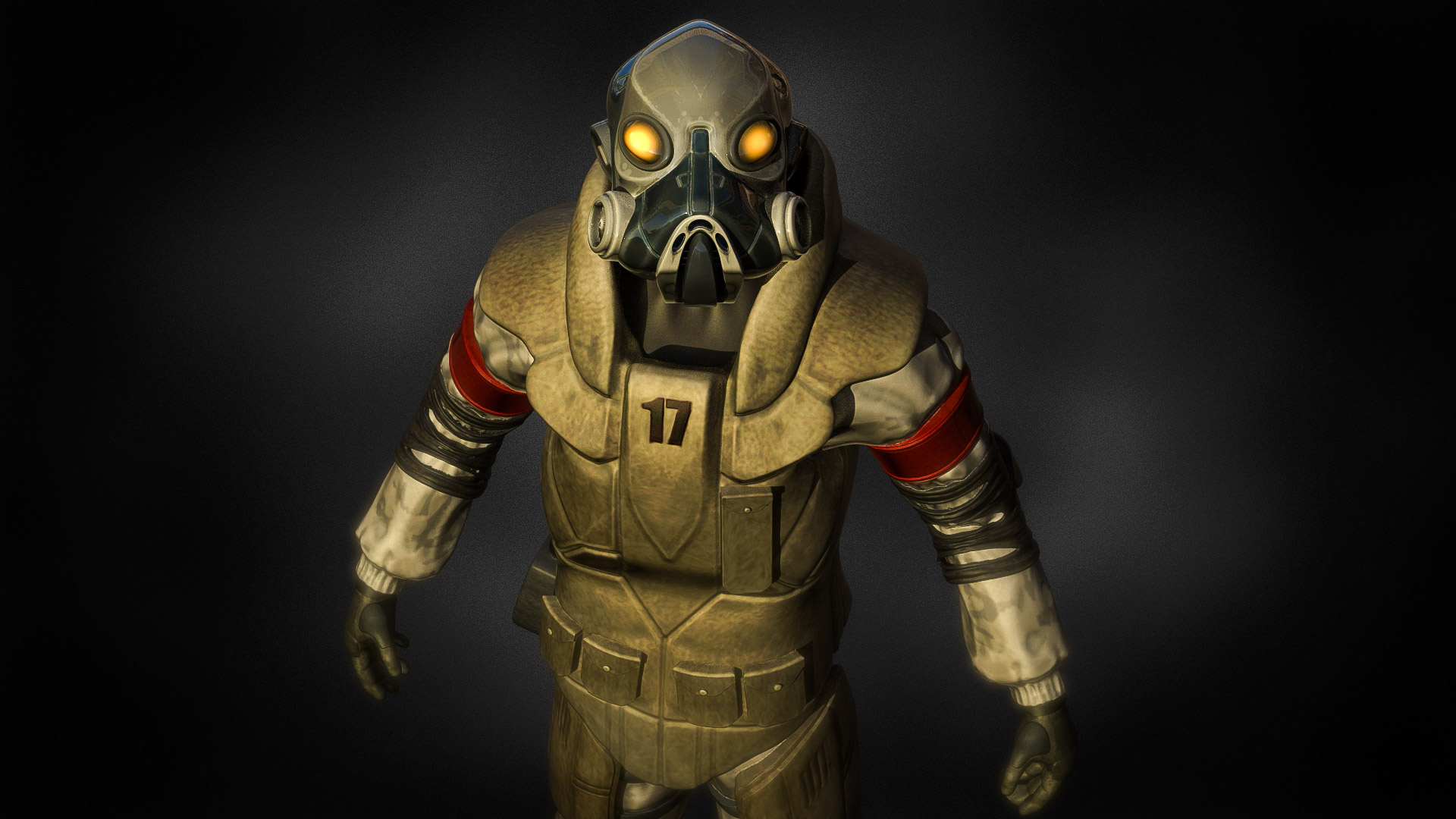
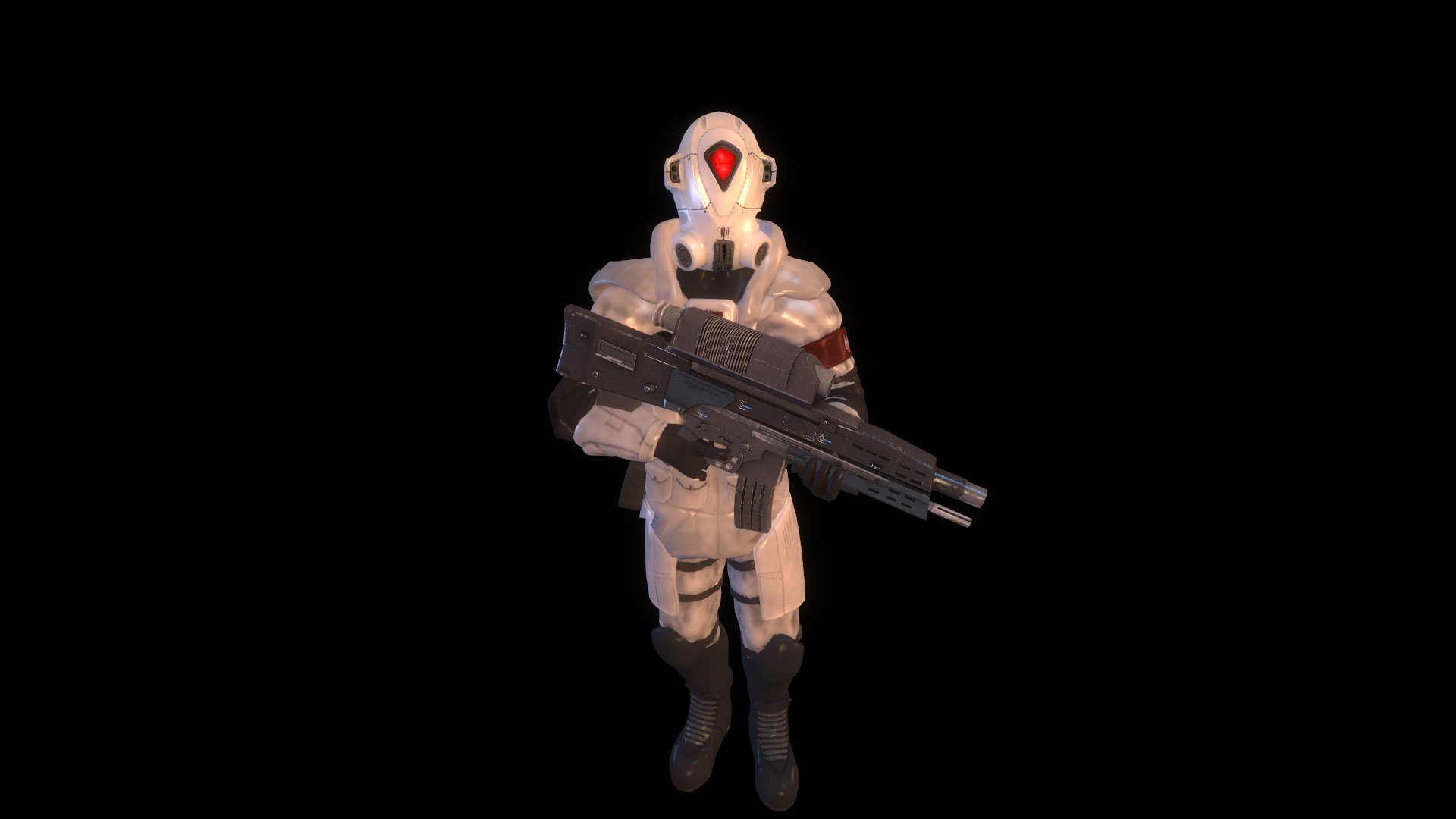
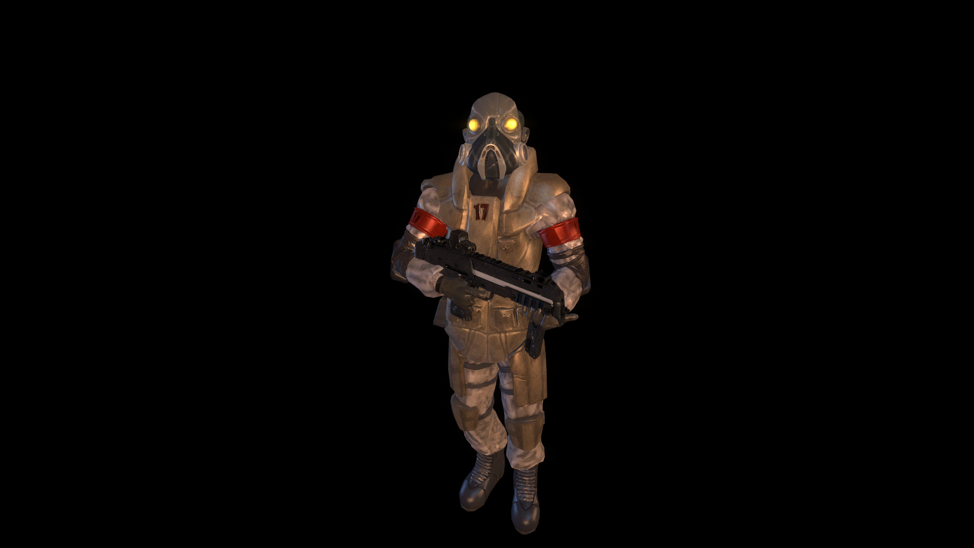
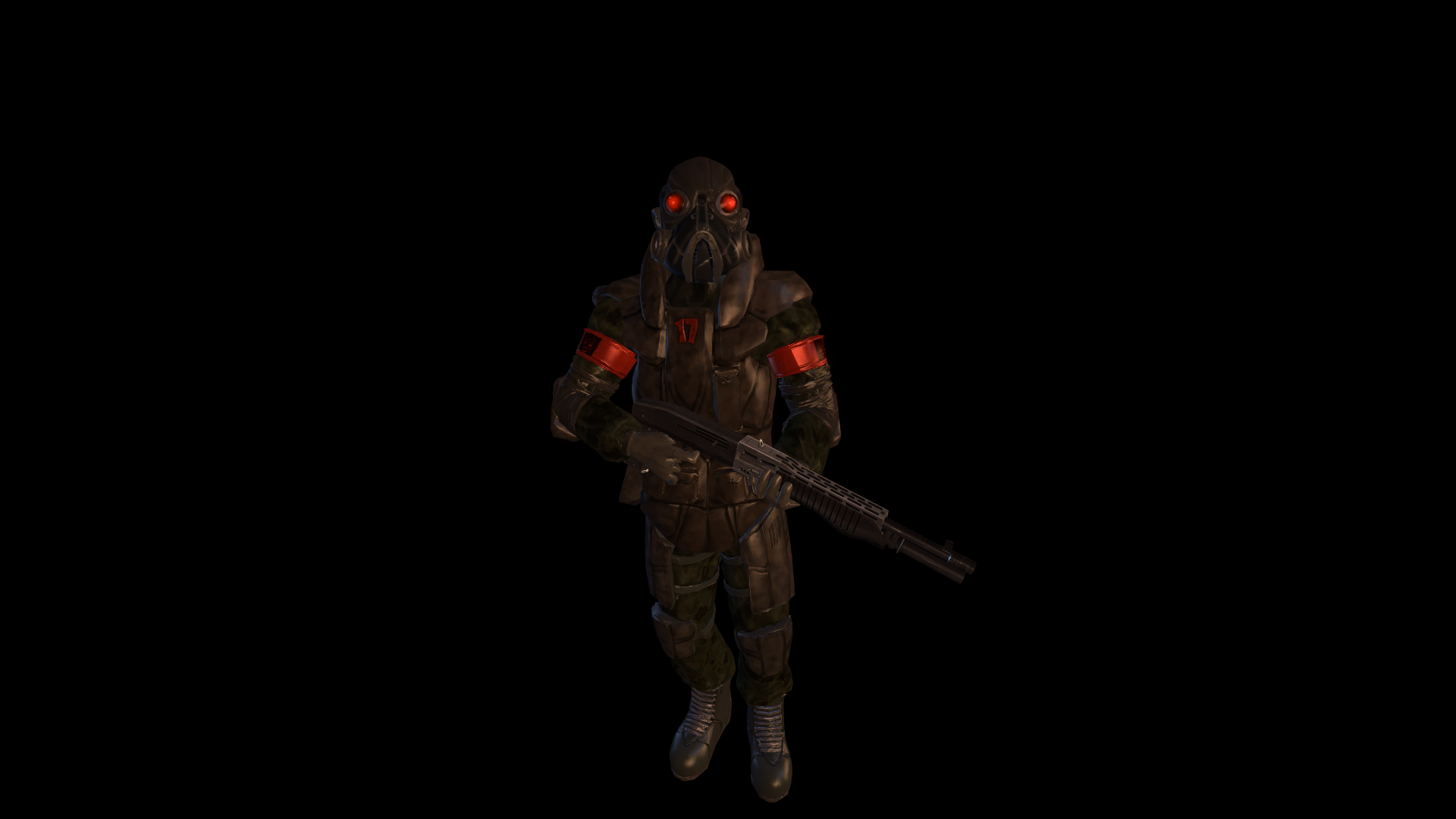
Combine Soldier Models

Combine Elite
Combine Soldier

Combine Shotgunner
Combine Elite In-Game
Combine Soldier In-Game
Combine Shotgunner In-Game
One of the biggest developments on the creature and character side of things has been the modelling of our own interpretations of the combine soldiers. Extensively referring to cut concepts for the soldiers, Andy has created an imaginative and unique meshing together of numerous concepts into one cohesive whole. Our ordinary soldiers follow both the “bug-eye” design for them and the more grounded flak-jacket design, whilst our Combine elites are suitably more armoured, their helmet taking after both the retail model’s “cyclops” design and the Hayao Miyazaki-inspired concept. We have plans for other combine units like the sniper, combine guard, and metrocops, but the soldiers allowed us to establish a good baseline for the visual style of the remaining enemy types. They go in a very different direction to retail’s soldiers but, then, so do most cut concepts, and we believe the unique take shown in these models will help them stand out from other recreations. We had planned further inspiration from other cut concepts, like blue shotgunners as seen in Episode One pre-release material, but we were unable to find a way to make the look work with our soldiers, and decided to stick with the darker colour palette of retail’s shotgun soldiers.
Trainstation Progress
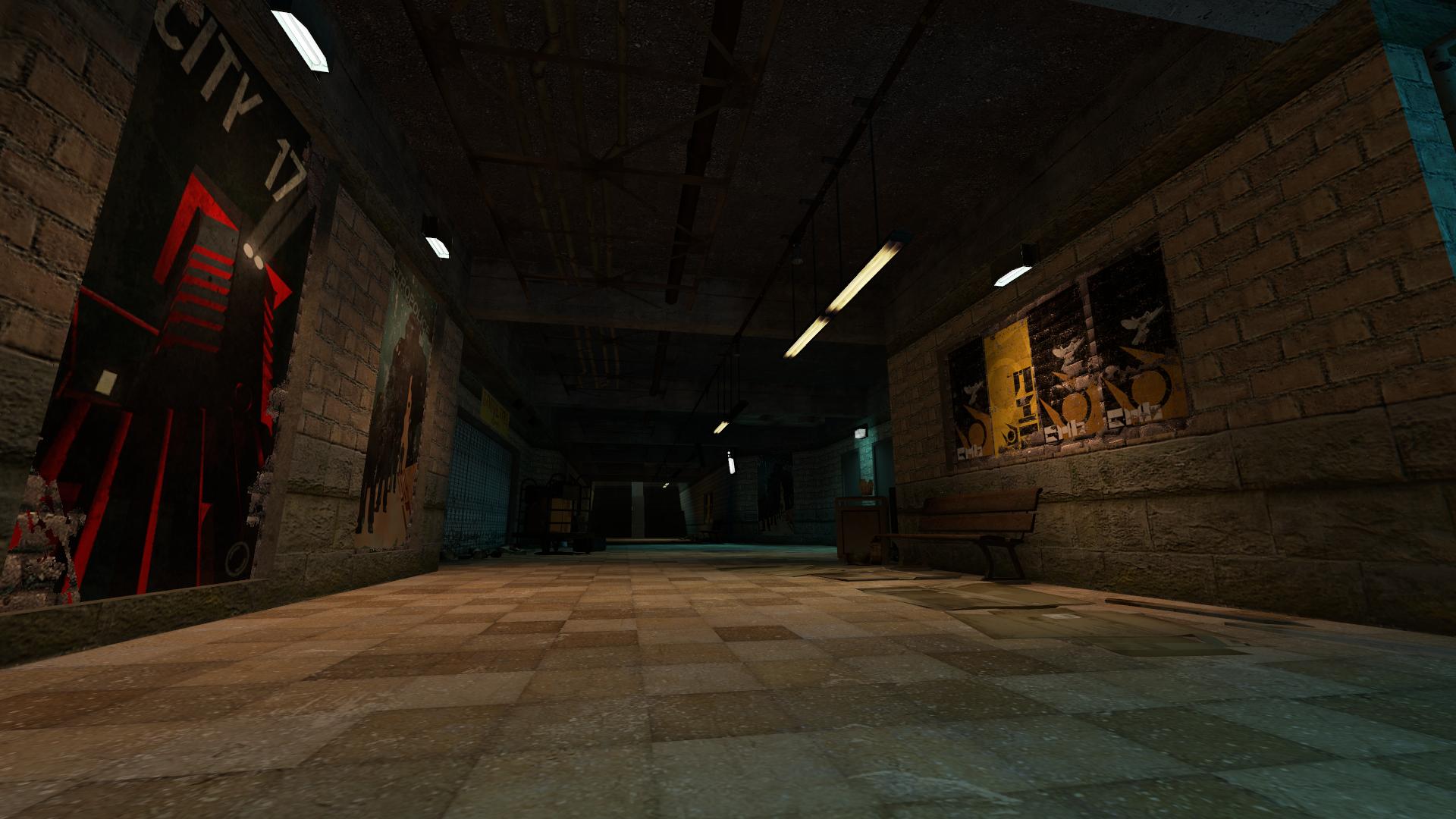
The trainstation continues to receive regular attention, the detail within it being of paramount importance as the introductory map to the mod. Lots of work has been done to refine the relatively moody and uninteresting lighting around the map, as well as improve the interior brush details on walls and ceilings. More work is still being done to bring it closer to iconic concepts of the map, but, as with all maps in the mod, great improvements are regularly taking place.
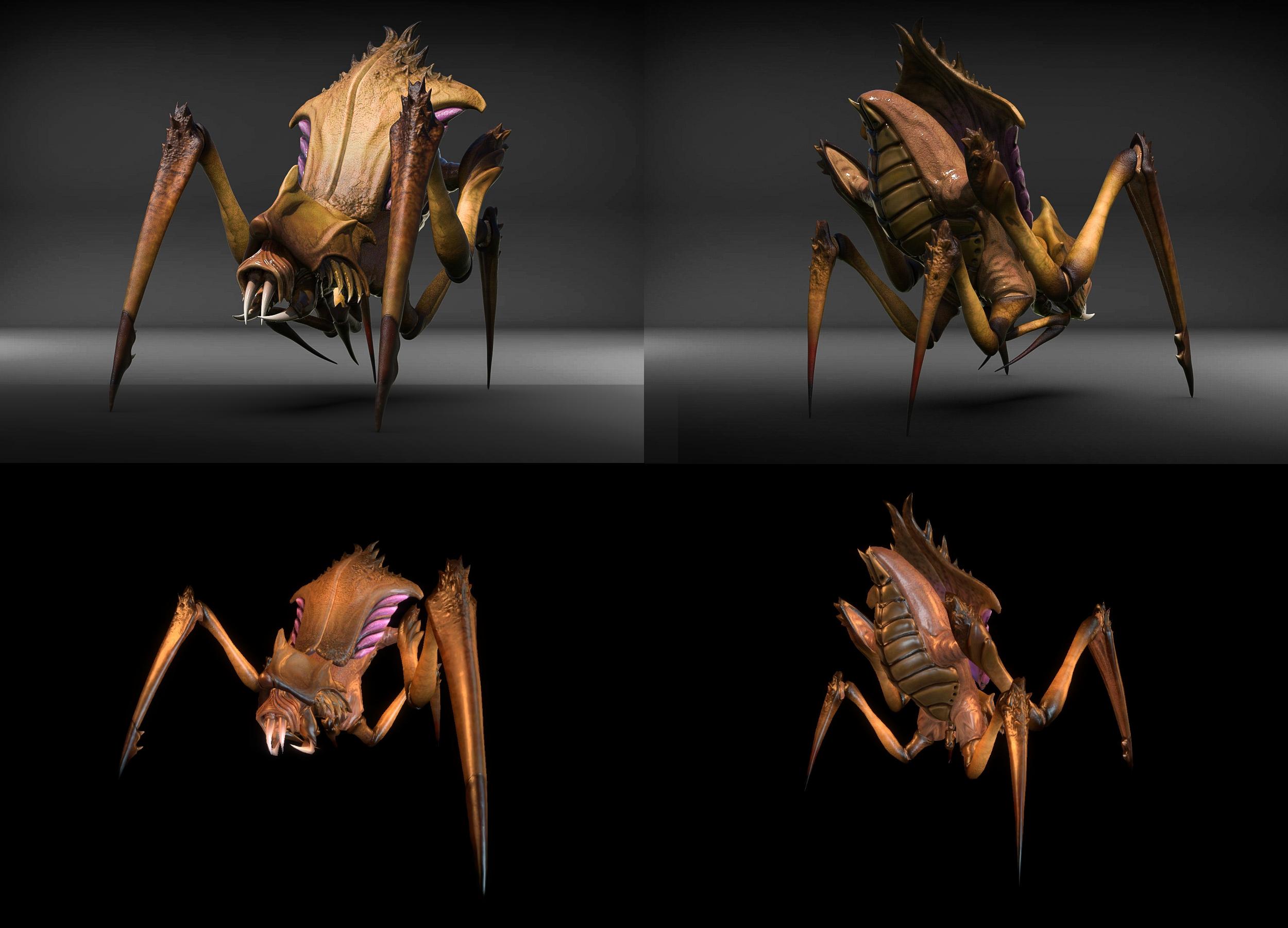
Antlion Models
Yellow Variant 1 - Render Top, In-Game Bottom
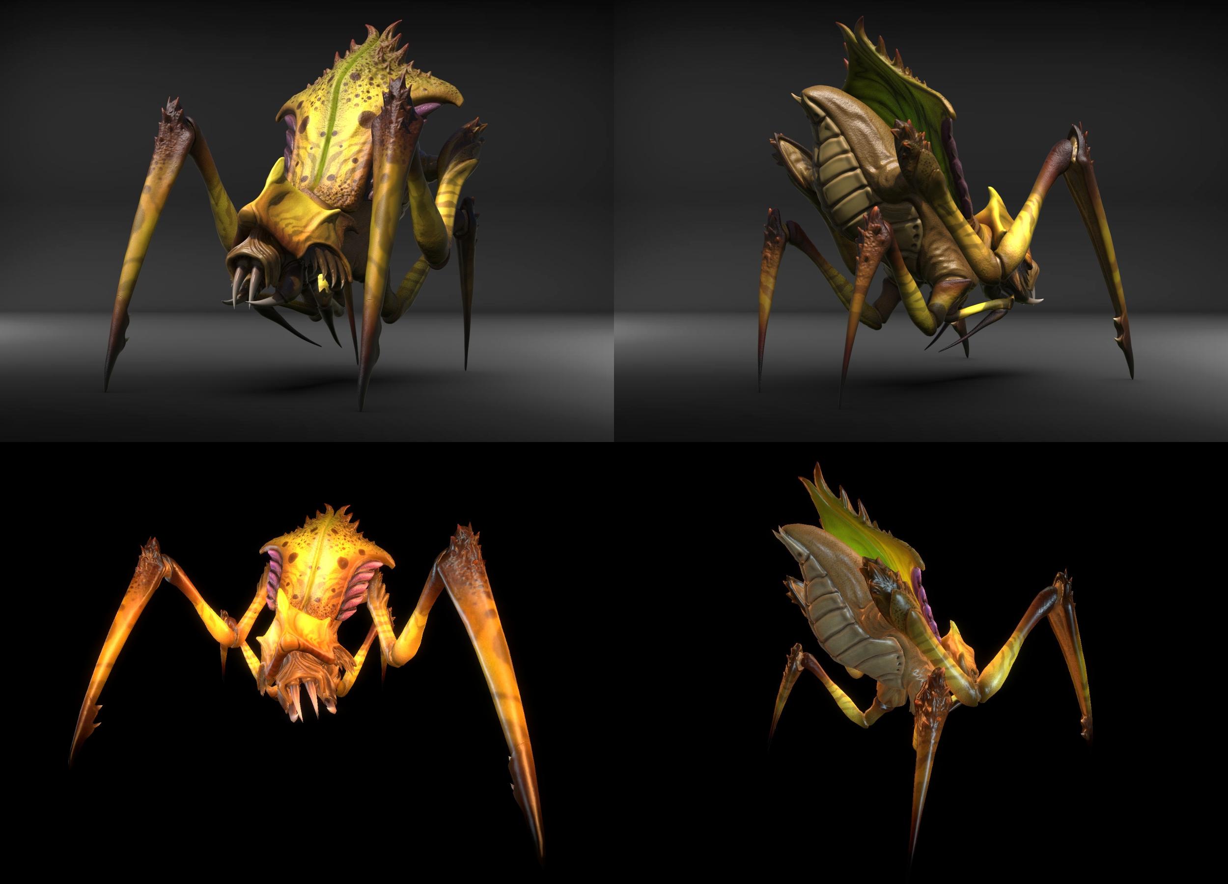
Yellow Variant 2 - Render Top, In-Game Bottom
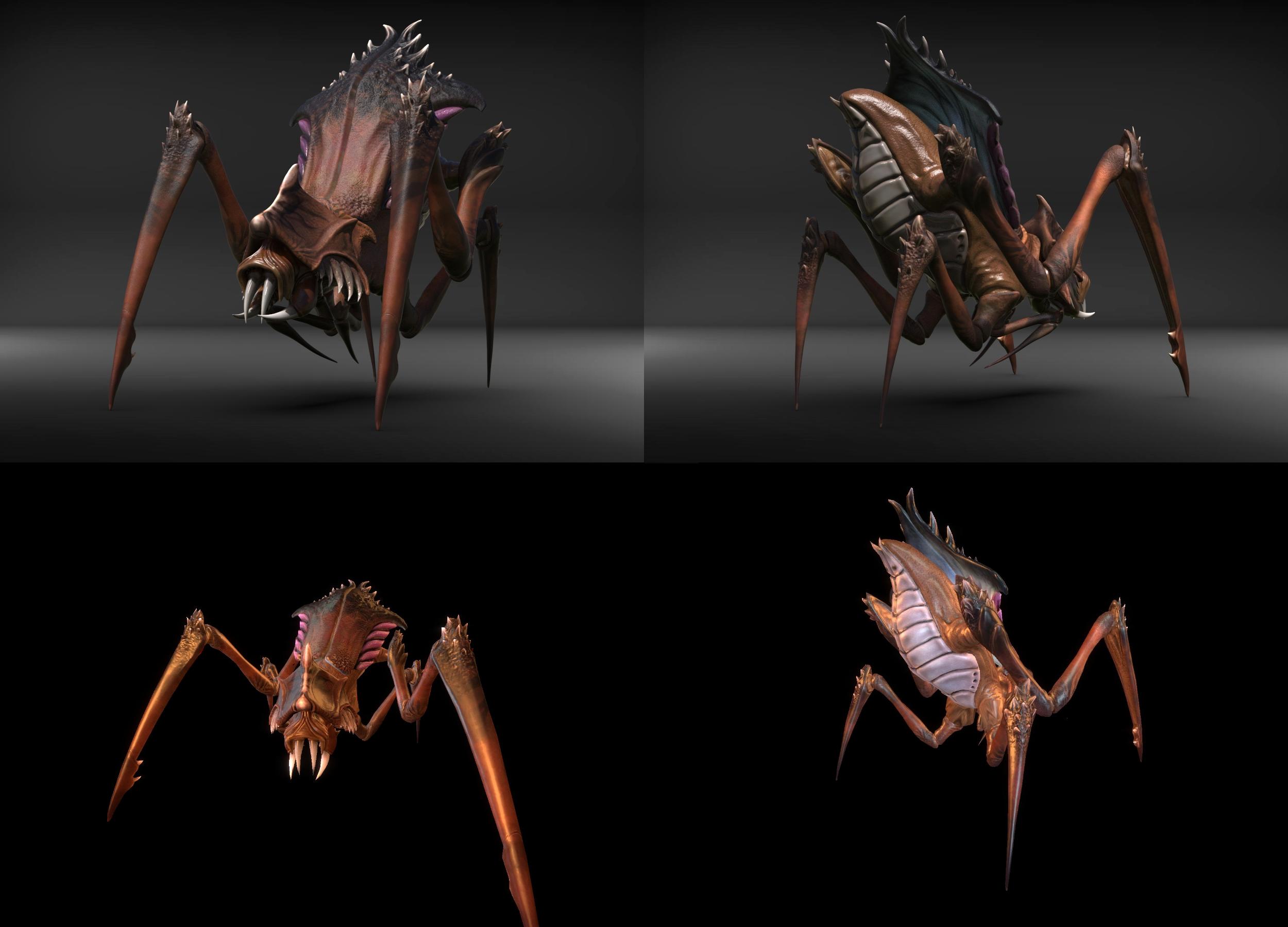
Red Variant 1 - Render Top, In-Game Bottom
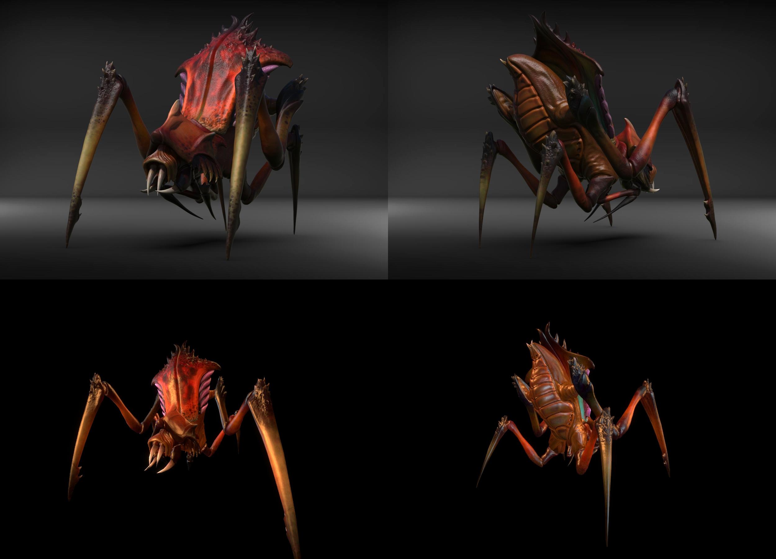
Red Variant 2 - Render Top, In-Game Bottom
With work picking up on chapter two now, we decided it was time to revisit a fan-favourite enemy from Half-Life 2 – the Antlions. Whilst more variants, cut or otherwise, are on the way, these ordinary antlions allow us to establish a base-line for the style of all of them. The four skin variants – in keeping with Half-Life 2’s four antlion skin variants – are based off of two cut Antlion soldier concepts for red and yellow skins, whilst the actual model takes heavy inspiration from the much spikier and aggressive concept art of the Antlion. In-game implementation has been much smoother and yielded better results than when we first implemented other creatures like the bullsquid due to improved understanding of phongwarps that resulted in the unique iridescent sheen you see in the in-game shots. Overall, the antlions are just a sign of what’s to come in that department. Who’s to say they won’t have a monarch in time?
Terminal Plaza Progress
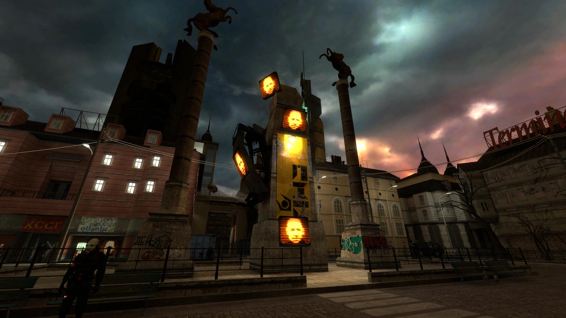
Terminal Plaza, like the trainstation, has been a regular focus for us. We wanted to meld a number of different concepts from various versions of the plaza map into one that harkened back to many different periods of the plaza’s development cycle. We also decided to re-implement one of our oldest unique ideas – a consul “obelisk”, a combination between the breencast and the consul pod. We’re deciding whether to get a custom model for the obelisk like what was designed for the consul pod or not, but for the time being, this gives the plaza a nice, foreboding centrepiece to be based around.
Overcharged Physics Manipulator Model
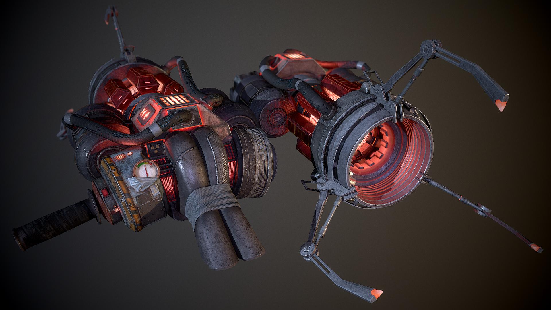
Overcharged Physics Manipulator Render
Overcharged Physics Manipulator In-Game - left ordinary lighting, right emissive textures
Having developed our own storyline ideas for when the physics manipulator can become overcharged and deadly like the super gravity gun from Half-Life 2, we decided to make a variant of our physics manipulator accordingly. As you can see, it pulses with a menacing red glow, giving off a palpable feel of raw energy and power. Demian once more did a fantastic job capturing the nature of this esoteric weapon, and we know his future projects will continue to be perfect representations of some of the most unique parts of the cut-content’s arsenal.
Alyx Vance Concept Art
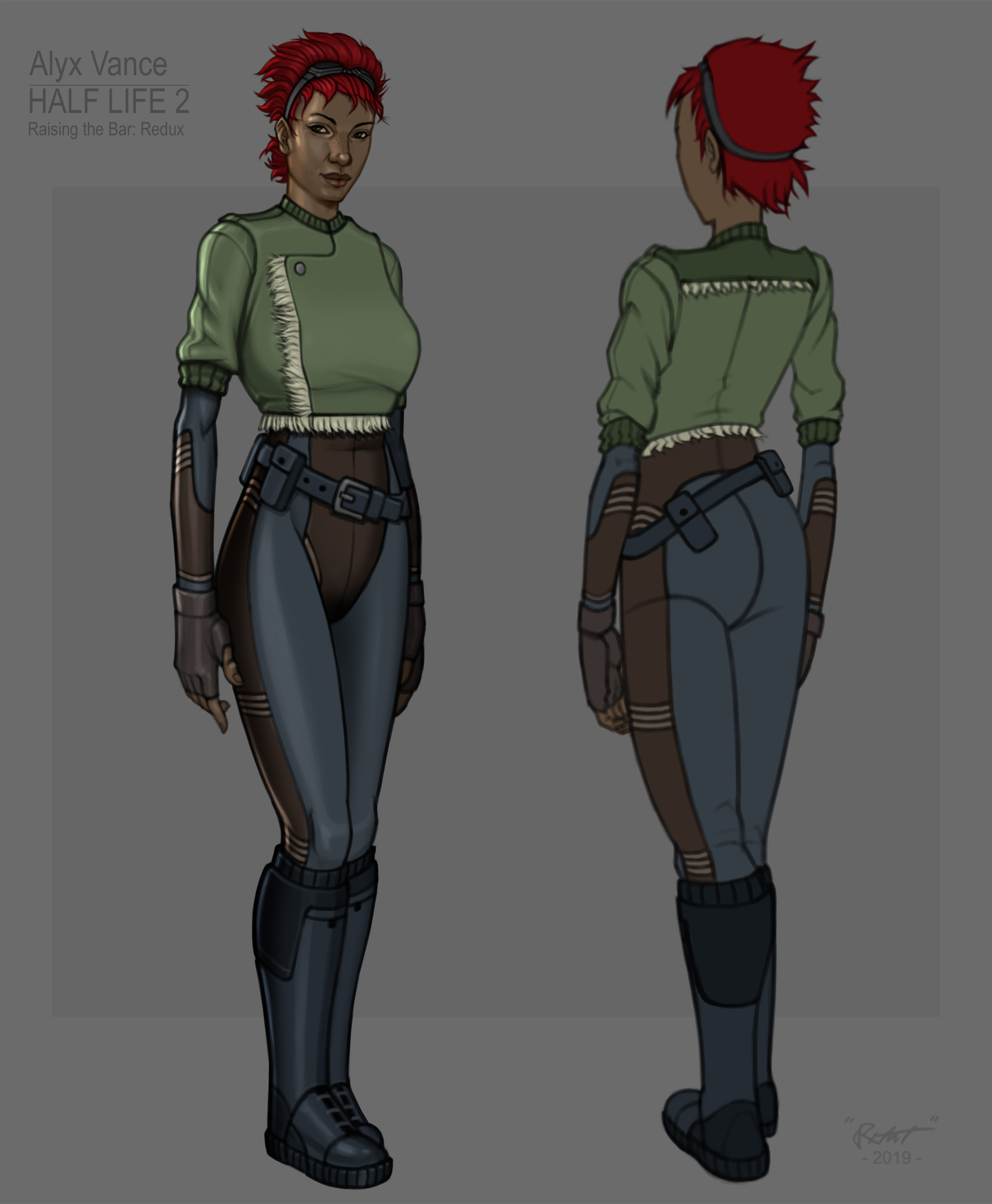
Finally, we’d like to show one of the finished character concepts created by Robert – our reimagining of Alyx Vance, as inspired from HL2’s pre-release concept art and her cut model. More character concepts have been drawn up already and will likely be shown in the interim between now and the next quarterly update. Andy or another character modeller on the team will be using the concepts drawn up by Robert to create the body and accessories of whichever character they might be modelling; we’ll then be working extensively with HL2’s base head meshes regarding retextures and facial flexes to ensure none of Half-Life 2’s characters’ iconic emotional range or look is lost in the new character models.
Finishing Up
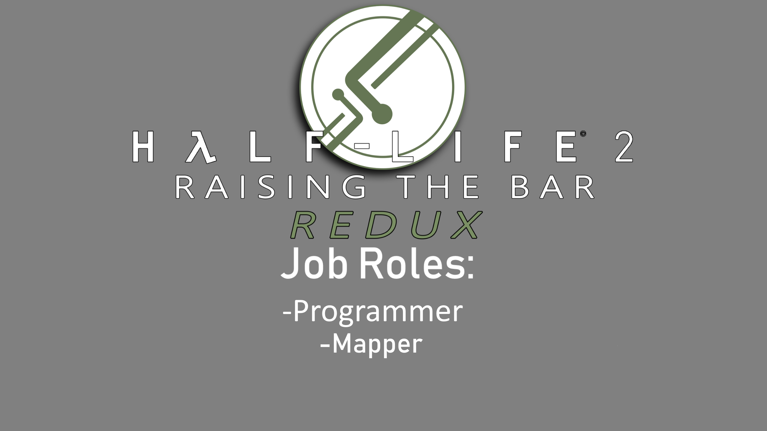
That’s all for this quarterly update. Before ending, there’s two more roles we’re looking for right now:
- A programmer to help support the current workload
- A competent detail mapper to help refine pre-existing maps and then build additional maps from the ground up
If these roles interest you, feel free to add me on Discord at Kralich#0901. Thanks for listening, and we’ll see you in September.


Admittedly, I mostly like the models shown here. Combine soldiers look nice and distinct, Antlions are nicely detailed, and the Recon Scanner has a charm to it with that big rear part. But to me the gravity gun takes the cake, it looks almost real, nice! The only one I'm not really sure about personally, is the Elite, but that's it.
Why is that support in the middle using a concrete floor texture, with visible tile seams? It doesn't look right
Media.moddb.com
Pretty sure that geometry was taken straight from a beta map and...it's also not done. Bit of a copout answer? Yes. Is it the truth? Also yes. Will be kept in mind when the map's next worked on.
Hey, as long as you're aware of it.
Another thing that came to mind when looking at the maps: add sprite halos near your light sources, instead of only having light_spots
Media.moddb.com
Here, the lamp above train schedule got some, making it look more natural, while in the previous screenshot there are none, especially noticeable on that combine light in the distance.
Sprites are definitely planned, I'm more just hoping to get all the lighting stuff I want done with the maps I'm working on and then I plan to blast through the sprites in one big pass. Also will be kept in mind, either way.
I have mixed feelings about the Combine soldiers, but the rest is awesome. Antlions actually look like huge insects now.
Attention to detail rocks! I'm truly amazed.
I love the look of the Antlions.
I like your take on the combine soldiers, I cant stop thinking that the elite's helmet looks like an egg but that's probably just me, could we possibly expect a redesign of the metro cop after this?
Yep, metrocop is on the list
the arcade looks like the citadel
Okay, you sold me on those dope Antlion models.
Loving the Beta Alyx skin, skin-tight diving suit and knee-high police boots combo are an aesthetic I didn't know this world needed more of.
But her breasts are sagging to her belly button. That's no good.
Man the Combine Soldiers and Antlions look lit! 👌
That Gravity Gun is a sight for sore eyes WOW.
EDIT: Not to mention, the Antlions are damn amazing. The combine soldier's eyes reminds me of Fallout 2.
I like the soldier's and elite look but the helmets look off to me.
will it also work for the native Linux version?
Errr maybe, not sure right now
The more "mass" you accumulate with making and showing these models, these designs, the more it defines the image of the mod, and with a broader "reach".
Like, at first - a year+ ago - your mod image would stand out mostly because of "the green", then the most defining piece by which I'd recall the mod, would be the headcrabs, and now it's becoming broader and broader gallery of this and this and that.
Out of this update I like Alyx and the antlions the most.
Alyx, because finally we get a proper (and good looking) character study for her, what a relief to see after certain recent updates in the community.
Antlions, because they're pretty cool looking and I think way fewer people should now have issues with them than with those headcrabs.
My least liked item would be the elite. I don't think you must or should stay attached to the monocular design and the colours. 'Cause we saw that in Half-Life 2 anyway. But that's your decision.
I actually really liked the idea of combine elites maintaining their weirdly inhuman single eye in our design, but it also helped make the helmet look better because otherwise there was just big blank curvy space in the middle of the helmet if we stuck entirely to the Miyazaki design. As for the colours, it's mostly because I reckon the palette does a good job in HL2 of making you know exactly what enemies are the biggest threat, because they're very distinctive from the colours of other soldiers (which is, incidentally, why we stuck with a much darker design for the shotgunners). It's a fair point, though - it's just that this is one of those circumstances I reckoned the retail design did its job well enough that it was worth incorporating into our own redesign.
Everyting looks awesome.
I'm sorry, but I don't see why this looks so good like everyone else seems to think. The red building in what is clearly an edited d1_terminal_01 looks really weird proportionally (those roof things look pretty out of place as well), the sweater that Alyx wears over an jumpsuit looks really odd aesthetically, the maps still use retail textures which in my honest opinion look extremely out of place in a beta mod and make it look like a custom level set taking place in the retail Half-Life 2 and the Combine designs look really bad and they also look like they came straight out of an weird 80s/90s Japanese anime thing.
And if anyone thinks that I am too much of a "purist", then I don't care. If you are going to make a beta mod, then at least try to stay close to the source material.
I think your expectations for the mod aren't in line with ours. We're not intending for this to be a flat remake. We're intending it to be a reimagining with our own ideas and designs thrown in. Everything we do has a very fundamental basis in the source material, which we then add to with our own ideas. We're never going to be an entirely authentic cut-content mod. If that doesn't appeal to you, I regret to say that it's never going to change.
For the record, I watched the first iteration of the terminal plaza map being made, and have myself had an active part, and everything - including every sequence - was made from scratch or adapted in small chunks. Close attention has been paid to the original map and we want it to be obvious what it is, but we are also throwing in a lot of our own ideas and details, as well as merging other versions of terminal plaza, into this whole.
For the Alyx design - several designs were conceptualised and a democratic internal vote over quite an extensive WIP period is what led to this result being what the vast majority of the team is behind. Again, it's unlikely to be changed in any major way.
We have always stuck to this vision. We are always going to. We'll adapt to feedback, but what it sounds like is you really don't like the creative direction of the mod, and that's not an issue we're going to be able to resolve without essentially throwing everything out the window. I appreciate you taking the time to attempt some constructive feedback - though I'd steer away from assumptions like what you made regarding terminal plaza - but most of your stylistic concerns are in direct contrast to what we're deliberately going for, and that means they probably won't be addressed. Others have begun to grasp this and are instead broadening the scope of their feedback to cover issues unrelated to style/creative vision like rigging, or material implementation in-game, or poorly-tiled textures in maps. Your feedback regarding the retail textures was more along those lines, for example. We listen to and take this kind of feedback on board as it's something that doesn't require as fundamental a change to our core philosophy, and overall, is much more constructive and helpful feedback.
Well, fair enough. Not really the biggest fan of it myself (replying to the 1st paragraph), but if it's what you are setting out to do, that's totally fine by me.
In fairness, I suppose I did come across too harsh, but yeah.
I'm glad we've reached an understanding. As I noticed you pointed out below, stuff like pointing out oddly tiling or perhaps oddly fitting textures and suggesting replacement doesn't always come under stylistic concerns, and is the kind of feedback we can actually work on, and that we welcome. A few people have made me aware of issues like this with the arcade so far, and it's stuff I've already got noted down to examine the next time I look at the map. Thanks again for being reasonable and understanding what we're going for.
Not a big fan of combine soldiers myself, but this:
"the maps still use retail textures which in my honest opinion look extremely out of place in a beta mod"
Textures are textures, and a random concrete ceiling doesn't become less of a concrete ceiling just because it's been used in retail HL2. This is like saying retail wooden crates look out of place, because they had a different texture in the leak (and some people have said exactly this in the past).
I'd guess you see issue in ways those textures are used, and also in ways levels are lit up, since there are some classic valve yellow-and-cyan color schemes and the like.
And this becomes an extremely difficult concept to properly criticize, since it's mostly about personal vision.
I was more thinking of that weird concrete texture on the lower wall of that Manhack Arcade map, which I thought was unfitting. Should have elaborated on that I'll admit.
Finally, something new, I was getting tired of seeing the same Half-Life 2 characters in the different mods, but there are some exceptions.
dude, those Antlion renders, they're amazing!
amazing, now this is a birthday gift for me!!!
I love just about everything here except the version of the Citadel you have choosen...
Media.moddb.com
Fair point, we're probably not sticking with the clamp citadel design, so no worries.
This comment is currently awaiting admin approval, join now to view.
i think the combine helmets could get a bit of a rework to make it look a bit more like a mask other than that fantastic work
Curb your MP7! it's WAAAAAY too big.
Here is a reference picture:
News.guns.com
We know the real-world scale, but unfortunately nothing can be done about it because we have to fit the worldmodel of the weapon to fit the combine soldier's animations. Reanimating the soldier entirely isn't really a feasible option.
I understand now, thank you
No offense but those tits sag waaay too much for such a young lady.
Is that your main focus on this article?