 An Open Window: Project Launch Day +44
The window opens once more for another peek into the development of this MOD. Strangely enough I have not run out of topics to write articles about and thus I bring you another topic related to game design. Today will be all about the difficulties you'll encounter while designing a room.
Before I begin I'd like to thank everyone who commented on my last news post and video about the emotion of fear. I got useful feedback and it was very interesting to see the many different ideas on the subject. Seems there is still a lot to be researched in that field, so if you happen to be a sociology or psychology student, this would make a great subject for a thesis.
Back to the issue at hand: level design. A game is only as good as it's level designer. He brings all the elements created by coders, modellers and artists together into one map and must make sure the chemistry is right. This goes beyond making an interesting setting and tossing monsters into it. You will need to carefully consider how the player will experience the design, which direction he'll be looking at any given time and how to create a smooth run through the map.
For AnOpWi, one of my main features is setting a theme. To make the house feel like a real home, I would have to make it seem alive. To do so, it seemed a good idea to fill the house with as much stuff as possible, since the average household is full of furniture, nick-nacks and personal belongings. So I started using the layout of my own living room but quickly foresaw the trouble I was going to run into.
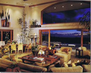
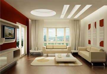
To the left you see the theme I was going for. However, making all these objects will take a lot of time and will require a high-end computer to run smoothly. What was worse, is that the design was extremely frustrating to play. Even after putting just a few objects in the room, it was hard to get around since the player collision is a square block. Where, in reality, you can twist, bend and wedge your way through, in a first person shooter this is more troublesome. Players need space to roam. This is way easier with the more minimalistic (modern) design, displayed on the right. It also makes important objects more noticeable as they won't disappear in the sea of nick-nacks.
 The image on the left is a top down view of the living room in it's current state (not final). You can see the square collision box of the player and the remaining roaming space. In this setup, the player is able to move around and between the furniture quite easily without getting stuck. If this were a shooter, I would try to give the player even more space to dodge incoming enemy fire. In some games, paths and rooms are just too crowded or narrow and can lead to a lot of frustration. This should be kept in mind especially in multiplayer maps because other players will be additional objects which cause collision.
Below is the frontal view of that part of the living room. As you can see, I'm still in the first detail art pass and yet have to add the fine details and the lighting. I will update the image gallery as soon as I finalise this art pass. Note the painting of Van Gogh's "Starry Night" as requested by Azureraider in this article.

So much for today's update. I hope you enjoyed the article and I eagerly await your comments below. If you want, you can still suggest objects and furniture for the house. Last but not least, I present you the Question of the Day.
Question of the Day:
Regardless of technical limitations, which room design do you prefer? Classical (left image) or modern (right image)?

Right. It's more clean, and you can hurt yourself more in the first one (both in reality and in-game (collisions, pushing, crushing etc.)
Do you people need a voice actor for your job? I have 3 years experience with acting, and a good quality microphone, mail :knut_karl@hotmail.com.
What about groupies? :p
If I had to choose one of those spaces I'd say the left. It's a bit more homey and despite the awful decor (those plants look half dead) I'd feel more relaxed. Also it has a real 70s key party vibe to it. Don't you agree?
Wow, my suggestion mad it in. I'm honored :D
I like the right space far more. All the clutter in the left space just makes it look untidy.
I'm especially lovin' the feature wall in the right image. See how one wall is red, with the others white? It's a really visually pleasing effect, particularly in contrast to all that neutral colour.
My own living room is a lot more like the left one, but I would much rather have the right one in a game; in presenting the player with an unfamiliar environment, you don't really want to overload their senses, I think. Otherwise, the eyes will constantly dart around, making the whole thing uncomfortable to look at.
Also, if you have that much stuff the player is more likely to think there is something significant among the mess, and if there IS something significant, the rest of the stuff will fiercely compete with it for the player's attention.
On the other hand, having a lot of stuff can make a room seem more lived in, and therefore more natural.
A way to balance this is to put things in more out-of-the-way places, for example if you mostly set stuff on counters or tables or in shelves, but leave much of the walkable room uncluttered.
No hesitation. The right one...
I would go for the right one, even if the actual decor isn't to my usual liking. From a modding perspective I would make a room with furniture more akin to the room to the right, but make it about as freely spaced as the room on the left.
whoa, just realised i got my comment backwards, what i meant to say was; Make furniture more akin to room on the LEFT, but make it as freely spaced as the RIGHT...
and i'm not sure if this method of post correction is actually allowed here.
I prefer the right one. It's simple, elegant, and beautiful. The one on the left looks like a lodge and a living room in one, which is confusing.
Even though I love excessive detail, I want a player to play a game instead of trying to jump over chairs and move couches just to form a path.
looks great....both.But I loke the right one more.
I enjoy the classical vibe of the left image, but the right image is more open, although maybe too much space may be present. Possibly a happy medium would be nice?
Both, but the image on the right is somewhat better and feels nicer, quite simple and beautiful. Keep up your work soldier, I love how you run and gun with your project.