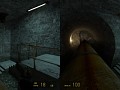
Stock HL2U maps relit with a custom VRAD I modified myself in order to fix Valve's most glaring mistakes and make the lights look natural
d1 canals 030001comb
(view original)

Post a comment
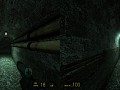
Stock HL2U maps relit with a custom VRAD I modified myself in order to fix Valve's most glaring mistakes and make the lights look natural
Before - bright arch shape contoured by dark wall, shows there's a room ahead.
After - just grey with grey, a readability mistake.
It is a good question whether one should guide player with lights. But anyway, Valve made a series of fakey leveldesign decisions. They aren't perfect but they do work. But if you try to fix one part in the chain to make it not so fakey, entire thing breaks. I couldn't let that light_spot live considering how bright and focused it was compared to actual sunlight going through grate that this light_spot was supposed to portray.
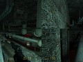
"But if you try to fix one part in the chain to make it not so fakey, entire thing breaks"
Which is what happened, the readability broke.
"I couldn't let that light_spot live considering how bright and focused it was"
Then why add the even brighter one in front of it, which swallows the background light completely? THAT is the problem, not the fact that you reduced the light behind the arch. It would still be visible if it retained its contrast.
The one in front of it was there to begin with as you can see on the left pic. For the most part, it just become a spherical source instead of cone-shaped one. I tried to keep the vanilla look more or less, I started with "complex" 1-cos(ang) math that was supposed to darken the light just as much as its spread increased but the result was still way too bright so I went for much more simple approach and stick with it.