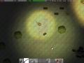
You have crash landed on a mysterious alien planet, everything is now a life or death decision. How long can you survive?
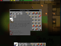
2 new types of gui windows
(view original)

Post a comment
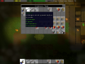
Description
changing the style and colour's of the tooltip boxs
the top one has a icon of the item next to the name and has good stats coloured in green, the bottom one has no icon of the item but it has a black background so the text stands out.
Do you have any ideas or like either of them?
I prefer the bottom one simply because, just like you said "the text stands out" :)
do you like the image at the top left of the tooltip like the top one?
Ye I think its nice to an image of the item there but I don't think it's a "must". Afterall what people look on the items description is an overview of that particular item.