Background
During the revisions I have identified several points of improvement in the visual part of the game, more specifically aimed at drawing points of items on the screen for the user to interact or receive information.
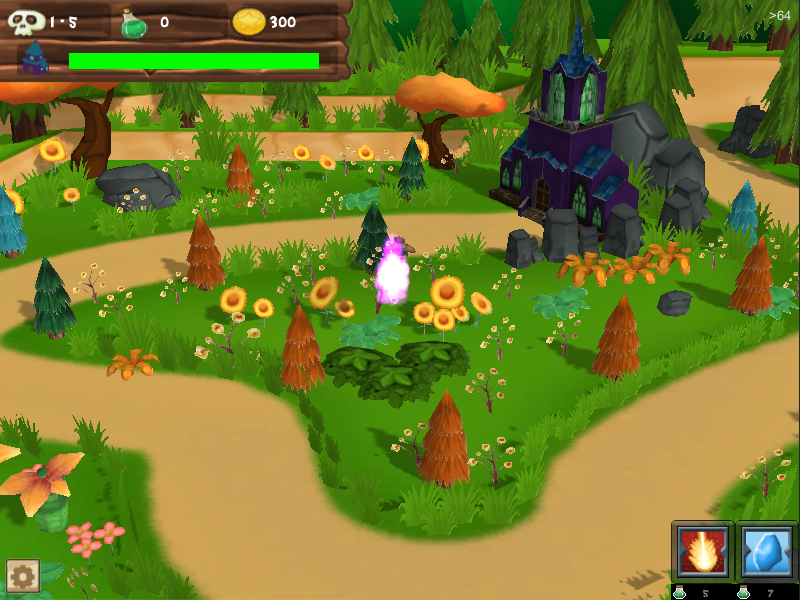
The first point was to redo the area containing the information of the match (waves, energy base, potions and coins) in order to take a smaller area on the screen and which also does not cause any kind of problem for the player. During my tests I have identified that clickable objects that were behind the bar are not available information correctly.
Map
The first part of the review was dedicated to the game map, increased the size of the icons of the worlds and I improved the design of the stars for the worlds already released and completed.
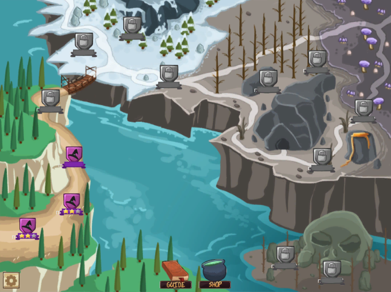
Another point that I was making the configuration buttons that appear in the lower left corner a species of grouper button that turns on/off as the player clicks. So the "sub buttons" appear (or disappear) according to a player's action.
HUD
With the new HUD style that I created, the elements are best placed on the screen and with a disposition more free that allows you to view more of the scenery during the match. Special buttons are being updated in style, still need to refine it a little more, but the principal ideal now is already defined.
Prefabs
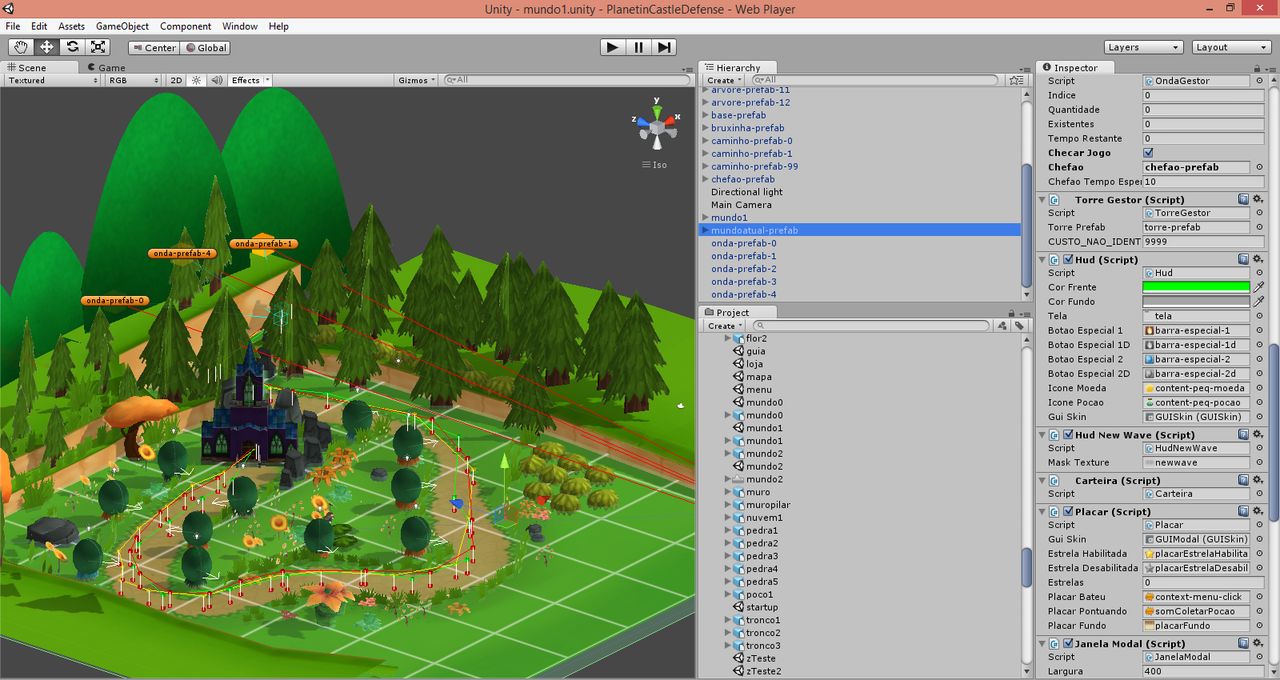
Another updated review process of the prefabs was used so that I can share as much of variables between the objects. My internal Manager user interface (HUD) suffered some changes and they can be changed via editor at Unity to work better in debug the game.