This is the second part of my WebKit primer series, where I introduce various aspects of WebKit and CSS3 and how we are using them in Overgrowth. Check out part 1 here!
What are CSS transitions?
I'd like to draw attention to one of the most awesome and envy-inducing features of WebKit: CSS transitions. While the feature was a serious technological undertaking, it's actually quite simple in theory: CSS transitions smoothly animate from an old style to a new style.
What does that mean exactly? Well, I use this all over Overgrowth to make the UI seem smoother. For instance, in the server browser, when you click on "show filters":
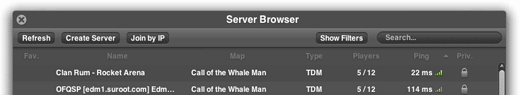
The height of the filter container is transitioning smoothly from 0px to 30px. This is defined in CSS with the property -webkit-transition:height 200ms ease-in-out;. To trigger the animation, I simply change the style, and WebKit handles the rest.
What about JavaScript animation?
In non-WebKit browsers, you can simulate animation by rapidly restyling the element through the DOM (Document Object Model) API. That's how the animations on the Overgrowth website work. This works for all browsers, and is not especially difficult (due to JavaScript libraries like jQuery). However, it's not optimal for a number of reasons. For example, you shouldn't need to load a heavy JavaScript library to perform a common effect -- animation is clearly a presentational issue and belongs in CSS. Additionally, when the rendering engine is transition-aware, cool things like hardware acceleration become possible.
Why is this big?
Animating a filters box (as shown in the above animated GIF) is hardly rocket science. So what makes CSS transitions so cool? It's easy to go on about performance gains and not having to rely on a heavy JavaScript library, but the fundamental advantage is the separation of logic and presentation. CSS controls how the site looks, so it is where cosmetic transitions really belong.
Here's a more complicated transition to help illustrate the point: our chat system. As you might remember, when people are chatting in multiplayer, fancy chat bubbles smoothly animate into existence from the bottom of the screen. I went a little overboard and made it so that when you send a message, the text input field itself seamlessly transforms into a regular chat bubble. Using CSS transitions, that was quite clean and easy to do.

So how does this work? Essentially I have a class (a set of CSS definitions) for my bubbles called "active". When the "active" class exists on a bubble, that bubble is drawn like a text input field -- it has a translucent background-color, accepts text input, has an "enter" icon, hides the username and timestamp, and has a 0px right and left margin. To switch between an "input bubble" and a regular bubble, I simply remove the "active" class from the bubble, and bam, it's now a regular bubble.
However, here's where the magic comes in. Without touching an additional line of JavaScript, by defining these -webkit-transition properties, suddenly the animation comes to life.
.input .container { -webkit-transition:margin 0.5s ease-in-out; }
.name,.timestamp { -webkit-transition:opacity 0.75s ease-in; }
.input .inside { -webkit-transition:background-color 0.5s ease-in-out; }
The only JavaScript required is to remove the "active" class on the bubble, and after that, WebKit handles my animation natively. If I want to change how fast the transition is, what transitions into what, which properties are animated, or anything else relating to the transition, I simply change the CSS.
Next time, I will talk about a related feature, CSS animations, and what we use them for in Overgrowth. (permalink)
Track us on ModDB (visit our page)
Please join us here too:


