Fidelity vs. Freshness
Ideally in a game project you have the time, budget, and man power to make a world that is both beautiful, tight, emotive, and indeed light on art recycling. But depending on the project it can become clear that you can't have it all, and the best projects adapt to this, resulting on a coherent art style reflecting the amount of time, the initial vision and resources at hand.
I've been playing the classic or "vanilla" portions of World of Warcraft again, and it is a game that did everything right when it comes to art direction. When the game came out, I was quite a bit younger, (10 years younger) and I was more interested and focused on the ever climbing level of fidelity in games. Ever since I saw the bump mapping in the original Halo, I had a major interest in it. So unfortunately, I wrote WoW's art off. "It doesn't have bump maps!" "The characters have fewer polygon's than Everquest 2!" and so on. What I didn't realize then is that Everquest 2 is full of recycled art: same bone structure and animations for every player race, samey looking armor and faces, a smaller variety of enemies, props, and locations. Because WoW had an aesthetic with a lower bar, lower fidelity graphics, and a style that made its simplicity beautiful, it allowed for a much more interesting world, with a lot less recycled art. And I feel that games with this hand crafted nature where every area feels detailed, real, chaotic, and full of the variety we see in our world, are the real winners in the art category.
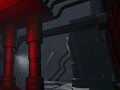
So with an indie budget, we too have to make these kinds of adaptations to be successful with our art. The Peregrine is a very large ship. The idea of exploring a very large ship, solving puzzles, and getting spooked, was indeed my initial concept for this game. And a very large ship needs a large amount of props and other environmental details. And though the ideal might be the 20 hours or more spent on each perfectly crafted prop in Alien: Isolation it's not feasible in a 2-3 man project. That being said, I plan on making a game that looks better than the sum of its parts, a game that doesn't feel cheap.
In this video I demonstrate the workflow for Ganymede Hollow's aesthetic. It's dirty, retro'y, and hopefully atmospheric in the end. Thanks for reading or watching, and stay tuned for more info about the game.