It has been one month since Crash Force was released on Steam Early Access. During that month, we have gathered feedback and suggestions from our users. A lot of the feedback was pointed to the in-game UI at first and we released a new work in progress UI for users to test and provide feedback. Fortunately, the response to the new UI was positive and users felt more immersed in Crash Force. We are constantly working on the in-game UI and adjusting it to meet the users’ needs as best as we can, but will not release more information for the time being.
The Home screen of Crash Force looked like this:


As you can probably tell the Main Menu has been revamped. While the design has changed we are also introducing new features to Crash Force. The home screen now includes Game Modes, where a player can choose a game mode and proceed to queue up. Players now, select from the Play tab, the Quick Play option, then choose One Man Wolfpack, and the queue timer pops up.

After the system searches for available lobbies, the player will land in the new lobby interface. In the lobby, the user can select a hovercraft, a Skills Tree slot, chat with other users in the lobby and finally see what map is available next on the rotating map queue. Rotating map mode and the queue up system (plus spectator mode) will be discussed in a later article, so stay tuned!
In the old main menu user interface, the player had to complete a "wizard" of options, where the user had to select a hovercraft, decals, skills trees slot, game mode, and then queue up and eventually land in the old lobby interface as shown below in screenshots.


We feel that the new Queuing up system will provide easy of access to players when joining an in-game lobby, or creating a new lobby. We have moved the Hovercraft's skins and Decals out of the queue interface and the lobby and instead moved them into the Craft Gallery tab.
Our newest feature, which was also a suggestion, was to provide more features in our main menu UI, regarding Crash Force’s hovercrafts. We have listened, and we are introducing a new preview hovercraft mode called Craft Gallery. In this mode, players can preview the skills (in text at the moment) of all available hovercrafts, decals, skins of hovercrafts and give their models a spin in free-view mode.


The user can preview which and how much each of the stats of the selected hovercraft, will change when from a Skills Tree slot.

All the abilities and the hovercraft's weapons are available to read.

Players can now customise, preview and purchase their favourite hovercraft skins and decals in the skins and decals tab. When a player select a purchased decal or a purchased skin for a hovercraft, that skin and decal will be applied in the next match. We have removed the skins and decals purchase from the shop. When a player select a skin (even if it was not purchased yet), and head to the preview hovercraft tab and preview the skin before purchasing it.


In the Preview Hovercraft screen, a player can rotate to 360 degrees the selected hovercraft and even take cool snapshots to share with the community ;)
Next up for revamp was the Profile tab, now renamed Career Profile. In the old User Interface the Profile tab looked like this:


As you can probably, guess the text size was increased in the Overview tab, the statistics of the player are cleaner, and the player can see how many or if they have available XP Boosts and/or Reset Tokens.
The old Skills Tree tab looked like this:

While it was easy to navigate through the old menu for the Skills Tree, everything felt bulky with larger text and all the clickable actions and buttons were all away from the centre of the screen. In the new menu for the Skills Tree, we have re positioned the Skills Tree slots to the left, closer to the description of each skill of the tree closer together, while made the different tabs of the tree (Attack, Defence and Utility) look more attractive and button-ish.

The ranks tab of the Profile in the old UI was not visited by a lot of the testers, as it was overcrowded and dark themed.

The new Ranks tab is still a work in progress, but we tried to show the progress between the ranks, and make all the icons larger and cleaner.

The Shop was the next tab of the Main Menu that was revamped to fit the new Main Menu user interface look. The old Shop included purchases of Skis, Decals, Insignia, Reset tokens, Lumen purchases and XP boosts.

The new Shop now only has purchases of Lumen, Skills Tree Reset tokens and XP Boosts per win. Additionally, we have created a confirmation pop-up when a purchase is made, as it was suggested by our testers.

The previous Options menu was sometimes unresponsive and looked a bit crowded.

The Options Menu was adjusted to fit the new Main Menu look, and subtle changes to buttons, grids and responsiveness.

The Exit button from the old Main Menu user interface was removed from the main tab, and now a power off button was added to the top right of the screen (as it can be seen from previous screenshots), with the addition of an exit warning.

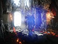
The in-game user interface was revamped a couple of days after Crash Force entered its Early Access period on Steam. The pre-early access user interface looked like this:

With the first patch of Crash Force, the user interface was adjusted to meet suggestions of alpha testers of Crash Force and a treat for all the followers of Crash Force with a brand new in-game UI. This previous in-game user interface has a lot of similarities with the new user interface introduced in this patch, but was a huge change compared to the pre-early access user interface. In the old UI, the abilities where placed on the right of the screen and where difficult to find while playing. In the new UI, the abilities moved to the bottom centre of the screen, and the icons where made larger and a more futuristic look.
The map was moved from the top of the screen, to the right side of the screen and modified to the new UI feel and look. The health, energy, dash and turret rotate mode(z), where all moved to the middle of the screen, so the player can check them at a glance. The scoreboard was removed from the map section and now it is situated on the top of the screen. We also included the player's kills and deaths with the team statistics and the match timer. Lastly, the primary and secondary ammo text was enlarged while sitting alone in the left bottom side of the screen.

In the latest patch, we enhanced the borders around the ammo and map, while slightly remade the health, energy and abilities look to match the Main Menu user interface feel. Finally, we cleared the look of abilities and cooldowns buttons and text size as it was requested by the testers.

While the latest patch (1.3.2289) had a lot of improvements on the Main Menu and In game aspect of the user interface, not all changes and features are included in this article. We released bots which was a very strong suggestion by our testers, a new queue up system and a spectator and lobby mode! Stay tuned, an article of the rest of these new features will be made available!
If you are still reading this, thank you for your time, you are awesome! :fistbump:
You can find people to play Crash Force with on our Discord Server here:
Social Media Links if anyone wants to follow us:
Facebook: Facebook.com
Twitter: Twitter.com
Instagram: Instagram.com
If you have questions, requests and want to ask us anything please feel free to do so.
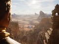
PS: One last thing for those that managed to reach this far down in the article, we have a new sequence screen between queue, main menu and match! Small glimpse before the next article: