Hi again everyone! I've been hard at work all week, and I am ready to show some drastic redesigns of textures, signs, models and even structural elements of the chapter entitled 'Labwork'. In keeping up with these changes, Im going to have to completey rework the Engineering decks, but the Commons will remain largely unchanged; what I have of that is only concept work anyway.
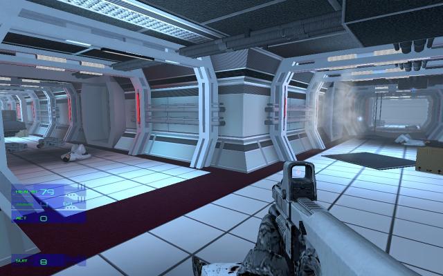
I took some advice and added a pop of color to the floor, with a reworked floor texture that should really spice things up. I also changed the ceiling texture, to contrast against the rest of the textures in the corridors.
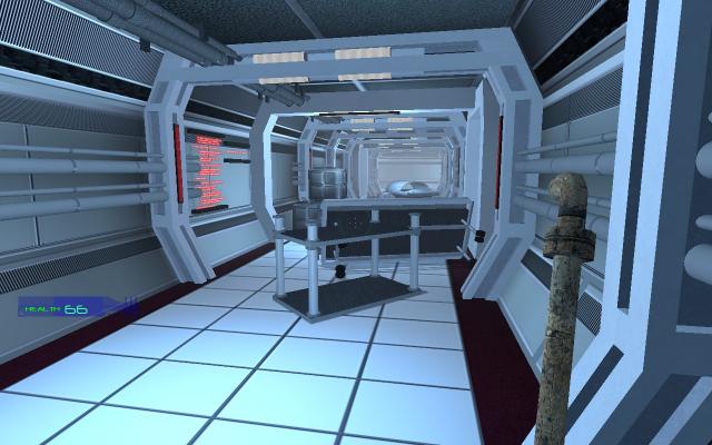
I also completey reworked the signs over some of the doorways, giving them a new shape and all new, much better font and appearance. I went with a art style just like in the DataTab overlays, but in red instead of blue. I think the red gives a perfect contrast to the whiteness of the map, and the new signs really fit the overall art direction I wanted to take. I also completely changed the lighting again, though there will be some dark areas and areas lit only by fire.
Speaking of fire, Ive been adding more destruction to the map. There are now areas where the roof has caved in from the above decks, spilling debris and structural parts into the corridors. Fires rage uncontrolled as the fire supression system is offline. (even a message included in the info center's scrolling text, which is up next)
The are now Information Centers in the corridors; and you can read the scrolling text and find out some clues as to what is happening in different areas of the Labs (and other decks, later in development) This not only helps the backstory develop, but add some needed detail to the corridors.
Ive also been reworking some models; so far I have completey redesigned the computers you see - I felt that for so far in the future they resembled todays laptops too much. They still have a familiar feel, but instead of an encased screen, display the information on a holo-screen - you can shoot right through it if you want to (and see a bit through them) Many of these will also have animated textures in the future.
Lastly, the most drastic change was to the structural supports that rib the hallways. I was testing and looking at what to improve, and decided they were to blocky and plain. I spent most of the day today remodelling them and making the changes in what I have built up to this point. I think this change really adds a level of detail the corridors desperately needed. Im also working on new weapon skins, something drastically different for the Pulse Rifle ( I havent pictured it in a while) and the P-90 laser SMG. Ive also been playing around with various melee weapons, with a Pipe in for this round. Nothing is final on that front though.

Awesome looking stuff, hits retail quality at some points, you know? The only thing that brings it down is the HUD. Doesn't fit to well to me, but well, that's always something the community can easily redo. The whole mod looks professional, sans the HUD.
Thank you very much :) That means a lot. It is possible I will redo the HUD; I havent done any coding yet and to do a new HUD I have to code the new panels in. I wont promise it, but its definitely not out of the question.
Im going to PM you :P
Oh and for the trackers: I should have just waited for the news update to get authorized. I wanted to get those screens up though; I hope you forgive me for a little 'update spam' now and then. I have a few screens of models Ive been working on but I'll go ahead and hold off on those for now.
:P
Looking good, It'll be great to see what you get done with a little coding! You've definitely got the design ability!
agent00kevin, WOW! That looks truly amazing, you took ALL of our advice quite well and created something really nice looking. For the most part I have no criticism's/advice I can honestly offer this time around as you have surpassed my own ideas for the level.
The only thing I can comment on is the "stiffs" lying on the ground. They look a little to static. For instance, look at the two on the top screenshot, their in the exact same pose. Not only that, but it just seems like an awkward pose to die in. Perhaps rest them sitting against the wall passed out? You also may have put to many, in most cases it wouldn't matter but if you have to few different scientist skins then your gonna ruin immersion when you walk past the same guy dead in lots of different places. But then again I'm actively TRYING to see that stuff while I play.
Really glad to see someone listen so well to the advice of others!
These are welcome improvements :D
Yep I agree those stiffs look abit like they might be doing sit-ups or somethin heh.
You would expect their legs to be flattened out and feet turned out abit (lay flat on the floor n relax), fingers would be curled in abit etc..
Ofcourse how/where they're positioned is based on how they died too, if in a hand to hand fight w/ or w/out blood, shot/stab wounds, a toxin etc..
You could position one by a wall or something like GiffE said as if he inhaled a toxin, another could be laying face down amongst some boxes or debris like he was trying to escape and fell dead, maybe lil puddle of blood on the floor by his face etc..
You could put one someplace near a panel, or on the inside of a door w/ his arm kind of up the wall if possible w/ a lil blood smear, kind of like he was trying to access that panel or button to escape or something. Hmm, maybe one sort of laying over a cart reaching for a panel.
The only thing about these stiffs is, are they really dead or the undead, perhaps now they're human corpses but become something else later!
I am very impressed! Great work!! I cannot wait to give this a spin!
Dude the mapping in this game is getting better and better, I just hope you find someone who is better than you with C++ to make that HUD better, as it is something that doesn't fit the game IMO. But great job with the rest of the things, i'm liking the updates.
it really does amaze me that some people think that the HUD isn't that good, or shouldn't fit this game type. because i do like it, but this is just a great example of personal taste. and that is something i like to warn you for Agent00Kevin. when i started mapping and modding i too listened very carefully to what people said and thought of what i made, and immediately changed anything when they thought it didn't fit or was wrong in any way. but then lateron other people started to complain on that, and suggested i should change it in to something else, (and in some cases was what they suggested that what i had in the first place). so, all i want to say is that it is very good that you listen carefully to what is said by us as trackers, but, a lot of what is suggested is just personal opinion or taste. when someone doesn't like the HUD it doesn't mean that it is badly made, because that it isn't, when you ask me. On Moddb i read a lot of comments that say; this is bad, or that doesn't look right. but what they should say is, I think this is bad, and I think that that doesn't look good. so, i already said it before to you but will say it again, listening is good, and in a lot of cases the comments are right, but in a lot of other cases it's just there personal opinion and taste!!
i wanted to say this for quit some time now but each time i forgot till now, in one part you have a red deadly lases behind a door. through the movies you showed here i now know i can delete that red laser by throwing something at it, through it. otherwise i just would think that that exit was blocked and the laser wasn't destroyable. am i the only one that does think this?
and love those glass looking barrel things on the wall that you shoot at and explode, and the red animated text texture on the wall.
keep up the great work!!
leon
I really like this, looks great.
I think the problem with the HUD is it creeps up the side too much and hogs attention.
Yeah I think Ill go ahead and see how it looks just a little lower sometime in the future. Kinda all clustered down in the corner.
Try using a more Half-Life/Half-Life 2 style HUD, that way we will be more used to it.
Its not really a HL2 mod though. It is a total conversion which means owning any Source game will do. Since it has nothing to do with the HL2 universe, having a HL2 hud would not fit well. Its just like playing HL2 then playing any other first person shooter - after a level or two you become accustomed to the new layout :)
Environments lack a bit of bump mapping and feel too smooth. Overall, it's good though. Keep it up!
Thanks :) This news post is old too; I have added bumpmapping and lots of other things have been added/changed by now. I somehow deleted the newest news post and was left woth this one on my page :(
There will be an updated post soon!
Maybe it has no really links, but the design really looks like the one of the film "Cube", it's excellent !
Impressive environment, just keep this oppressive atmosphere !
Oh man things are getting hot in here. I love that use of flickering lights.
Whoa I see the vid now, I like the sounds, the marquees and haha a *hover-gurney*, we can ride around on that thing right ?! :P
Things look nice and interesting, curious what that thing was you shot on the wall.
It would be nice if when the gun fired its tracers were more like thick light tracers you might expect from some kind of futuristic laser pulse rifle as opposed to the really thin bullet ones but thats just minor..
This is really great work Kevin! :D