Please take notion that the game is still very much a work in progress, most if not everything you see here is subject to change.
Alright, another week another theme.
Let me make this clear from the get go, I started making art back in October, this game was born in November, so now you’re wondering how I managed to do all the art for it thus far right? Well, that’s the whole reason I decided to write this blog in the first place, to explain how someone like me, who in October never made art before, does what I’m doing now.
Let’s talk about what the game has the most of, scenes. You know what I’m talking about, the game consists of “rooms” or “screens” or well, scenes. I knew I wanted to make a point and click game, but I was unsure of how to go about it since I needed to stick out somehow.
Before I even attempted to make art for the game, I did research, a lot of it. I watched animated movies, cartoons, anime, played other adventure games, etc.
Then it hit me. “I’m going to use an artstyle that strives on it’s weirdness.” You know who uses weird art to great effect? Tim Burton.
So at this point all my research went into Tim Burton’s works or stuff inspired by it.
Movies like Corpse Bride, Nightmare Before Christmas and Frankenweenie were big inspirations.
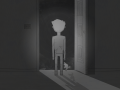
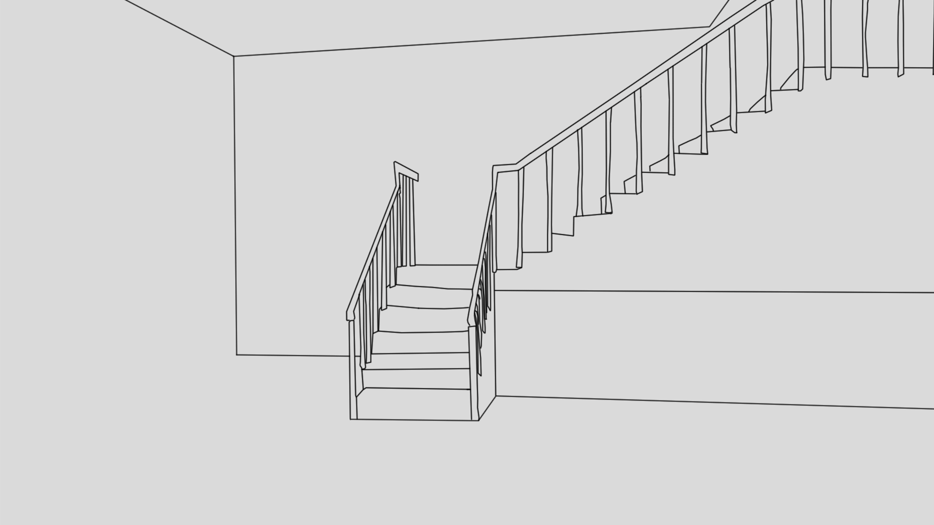
At the start I was rocking art that was looking like this:
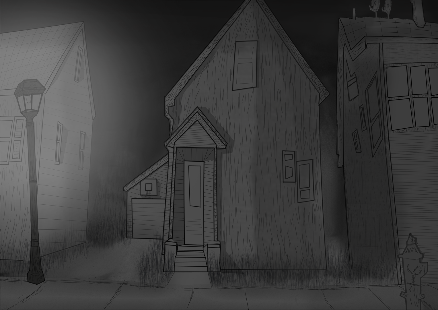
But it didn’t quite look the way I wanted, the idea was there, but I lacked execution. So I practiced, I made more scenarios, I watched a few too many youtube tutorials and then these happened.
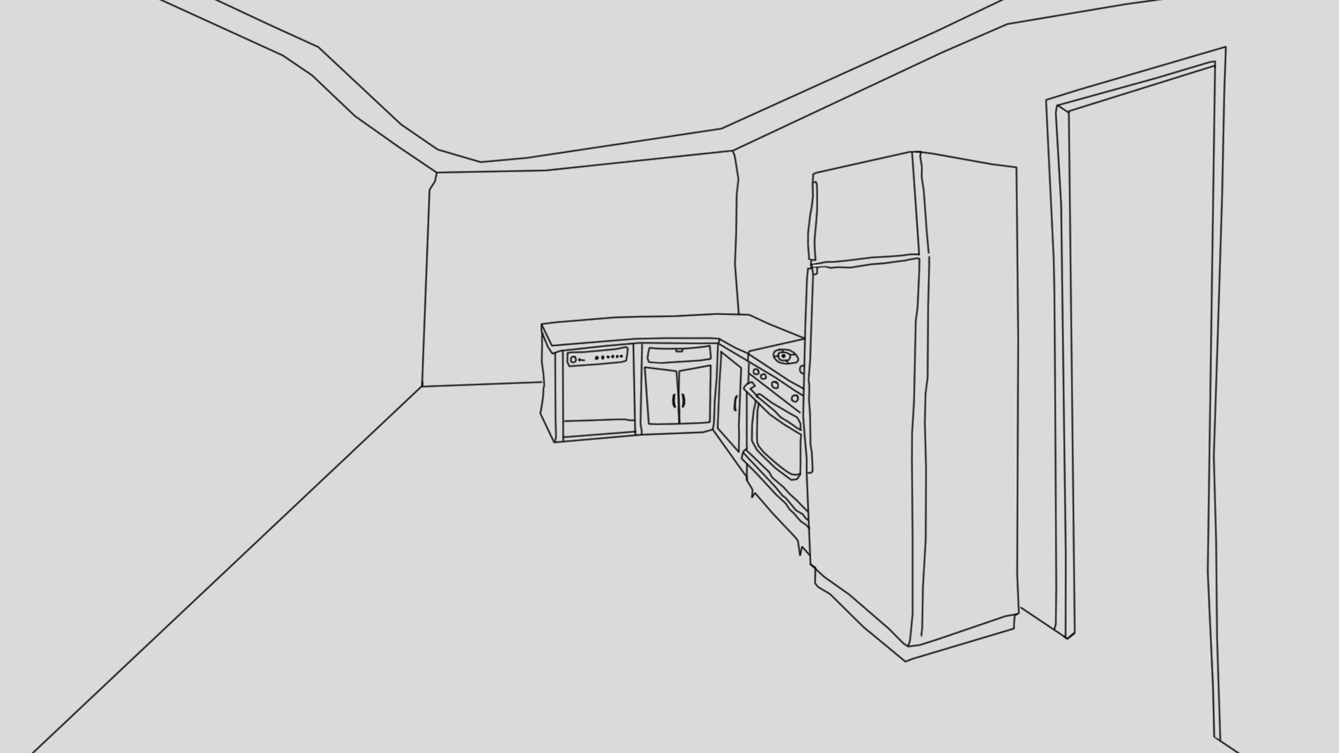
I was so close I could feel it, I knew I was improving but I also knew it could be more stylish, it needed more of everything.
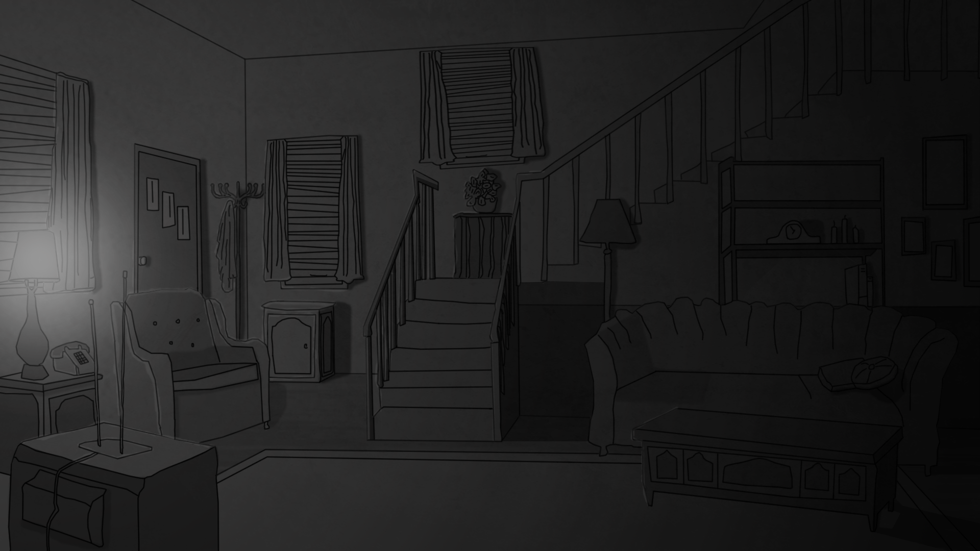
At this point I heavily invested at looking into grayscale art, since it was what I was going for, black and white gives it that vintage, something’s weird vibe.
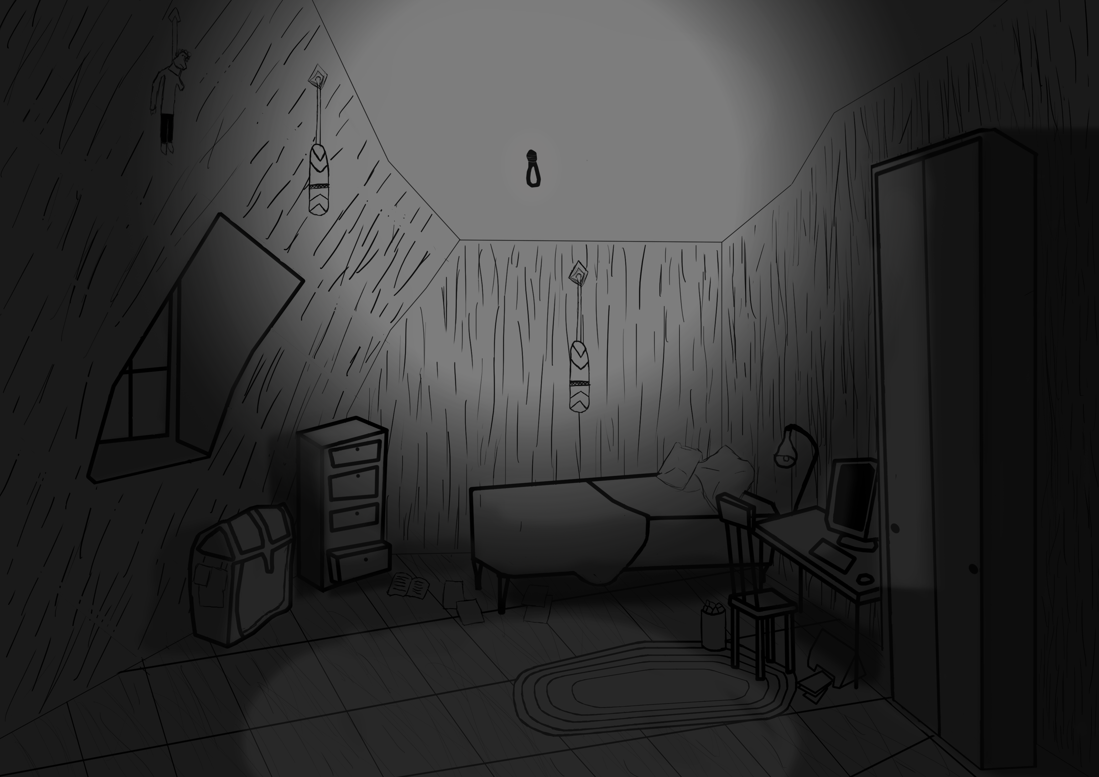
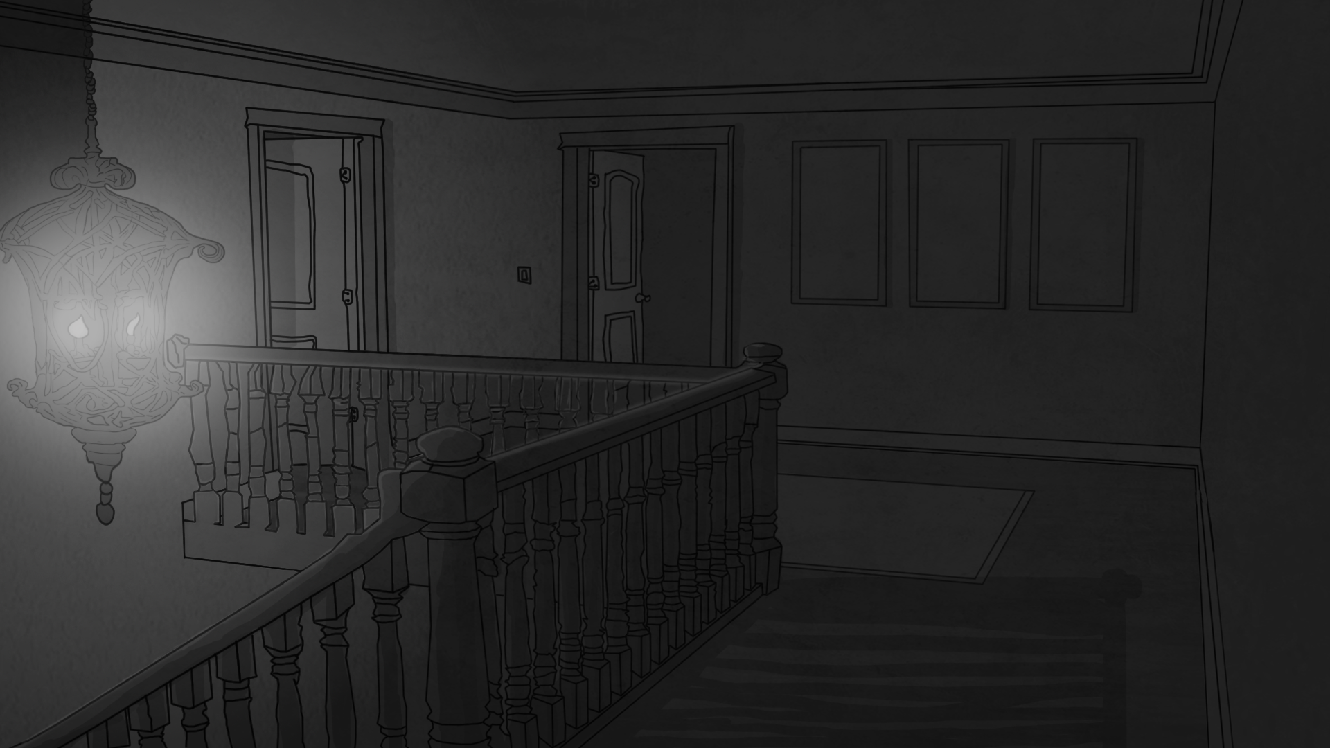
After a few more tutorials I was able to make these:
MUCH better. Things pop up now, and better yet, I can use highlighting to bring player’s attention to items in the scene, small things like a little shine (heh) are incredible at telling you “hey pick this up, it’s important and stuff”.
That’s it for this week, next week we’re talking about enemies, oh boy…
Interested in the game? Follow us here!
Facebook: Facebook.com
Twitter: Twitter.com
Gamejolt: Gamejolt.com