UI Redux Pt 1 image - Star Wars: Thrawn's Revenge II: Ascendancy mod for Sins of a Solar Empire: Rebellion
From the makers of Thrawn's Revenge: Imperial Civil War, Ascendancy is a Star Wars mod set after the Battle of Endor in the Star Wars Galaxy. Fight for galactic ascendancy as multiple factions from this period in Star Wars history.

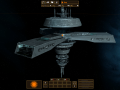
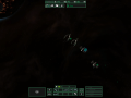
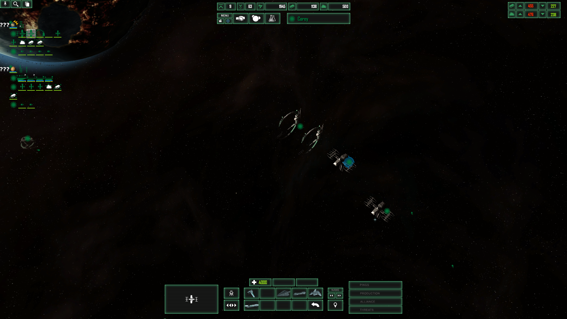
As we discussed, we're reworking the UI for 0.95 again based on the feedback we've received, as well as finishing other parts of it (Fleet Logistic screen)
Here's a rundown of what we're doing:
1. Keep the minimalist style/rearranged so the gameplay field is as unobstructed as possible.
2. Unit/ability/tech icons not achromatic. Keeping overall ability/research icon style of simple symbols that communicate what they do, but more colour to help differentiate at a glance.
3. Alert windows now text instead of pictures. More compact, and now I find them a lot more useful.
4. Rename button now says name, as opposed to being an arrow pointing up.
5. Planet icons: You'll see them later.
That already seems to be a considerable improvement, will enjoy seeing what you guys do with the planet icons.
Very nice, I can't wait to see how this goes. So far, it looks like a heavy improvement, and just this quick glance seems to be far more pleasing to the eye than the previous version.
I also really like how you're going with a more unique UI, and moving away from the default Sins-esque styled UI. The 3d'ish models for the ships in the build menu, instead of the 2d sprites is a great touch as well.
That's absolutely amazing! It's by far the best UI I've ever seen in sins :D
Congratulations ^^
Clean&simple;. I would maybe experiment with horizontal gradient of that green glow- so it would be darker and more transparent at the ends.
Well i'll be damned, a mod developer actually listened to me and people like the outcome...who knew :P
good work boyz
That designer you hired there must have been expensive. ;)
AWESOME!